One Room Challenge Week 1 – Renovating Our Townhouse Master Bedroom Suite
As if I hadn’t gone crazy enough with all of the studio renovation chaos (I still love you though new meeting room), our house reno is now in full swing too! If nothing else, my insanity should make for excellent free entertainment via IG stories and possibly a major news channel if things get really good.
To make things doubly exciting, we’re participating in this Fall’s One Room Challenge and I’m so pumped! It’s going to be pretty epic renovating our master bedroom and bathroom suite, and not just because of how currently hideous it is, but because we’re in realllly good interior design company.
If you haven’t heard of Calling It Home’s ORC before, it’s a six-week series featuring 20 different design blogs (see them all below!) as they start from the ground up on redesigning a space. Every Wednesday for six weeks you can tune in to see the progress in all of our spaces! And again, because I’m clearly highly pregnant and insane, we’ll be making over our master suite!… in six weeks. Why? Because babies don’t wait to be delivered.
So here are the before photos and feel free to judge. I had to use a featured photo from this bedroom makeover post just to not accidentally burn down the internet with our current before situation plastered everywhere…
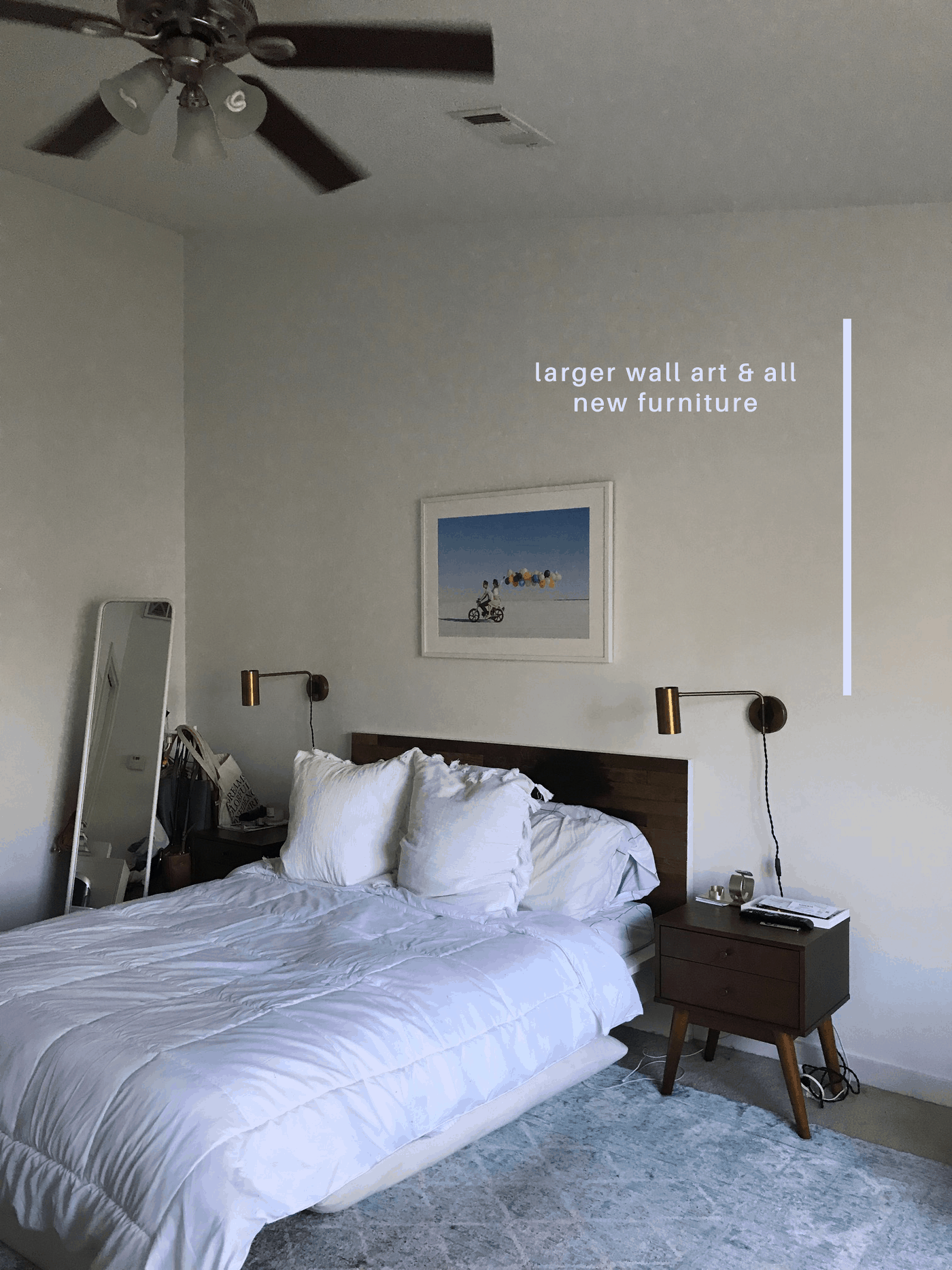
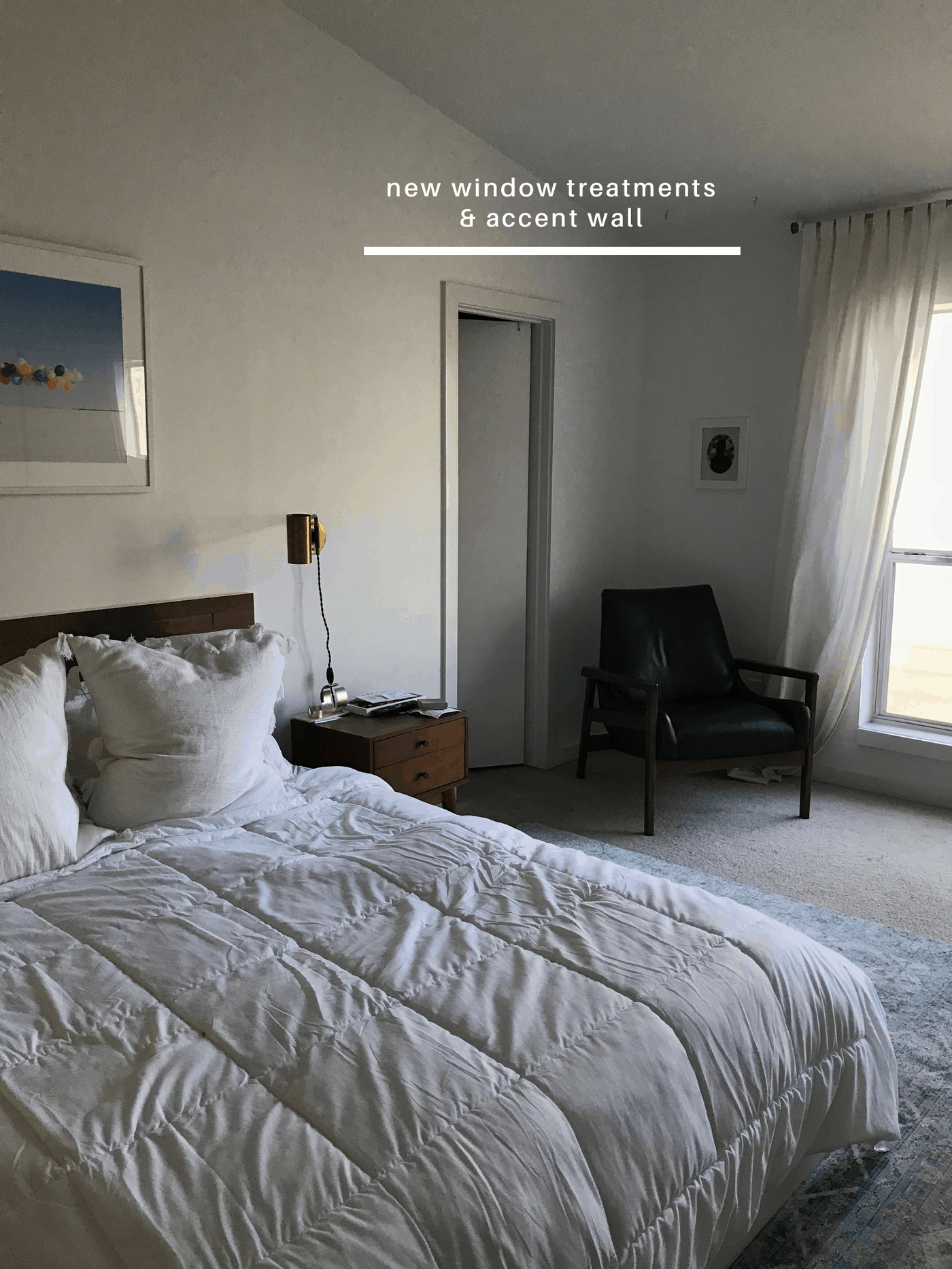
Please excuse the horrible iphone photos, but I figured what the heck, it’s not going to look pretty either way. I tried to break down the main pain points on each photo, and next week I’ll be giving you the rundown on our full room design plans and inspiration!
My number one pet peeve about this space is the old carpet. It was there before we moved in and does NOT get along well with pets. Very happy to see that go ASAP!
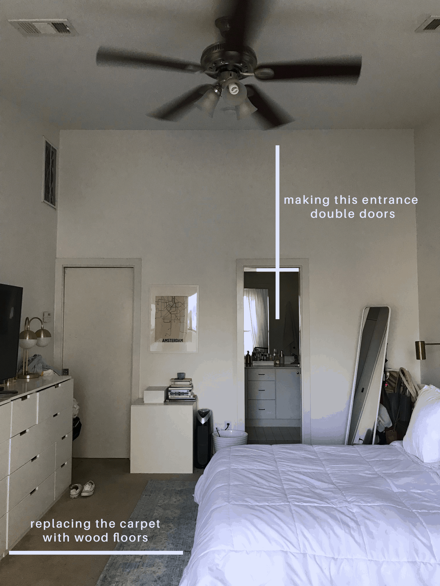
It’s also just full of odds and ends instead of intentional furniture pieces. Basically, it’s an IKEA graveyard right now.
You can also see how section off the bathroom is even though it’s literally in plain sight, so the idea is to add more natural light to that space with double doors.
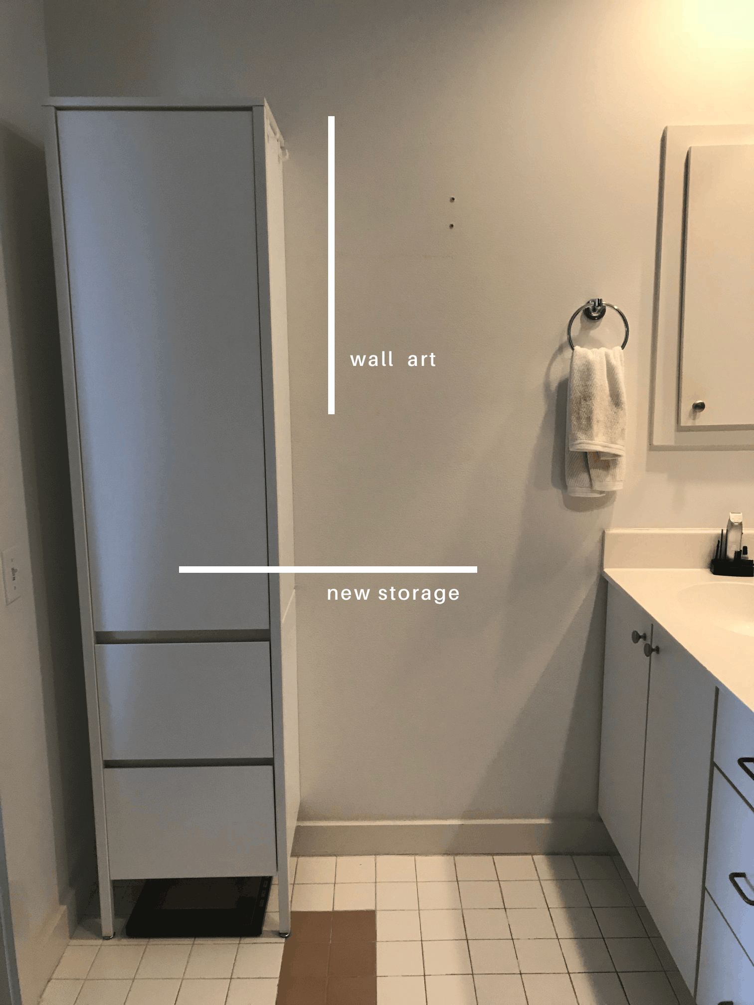
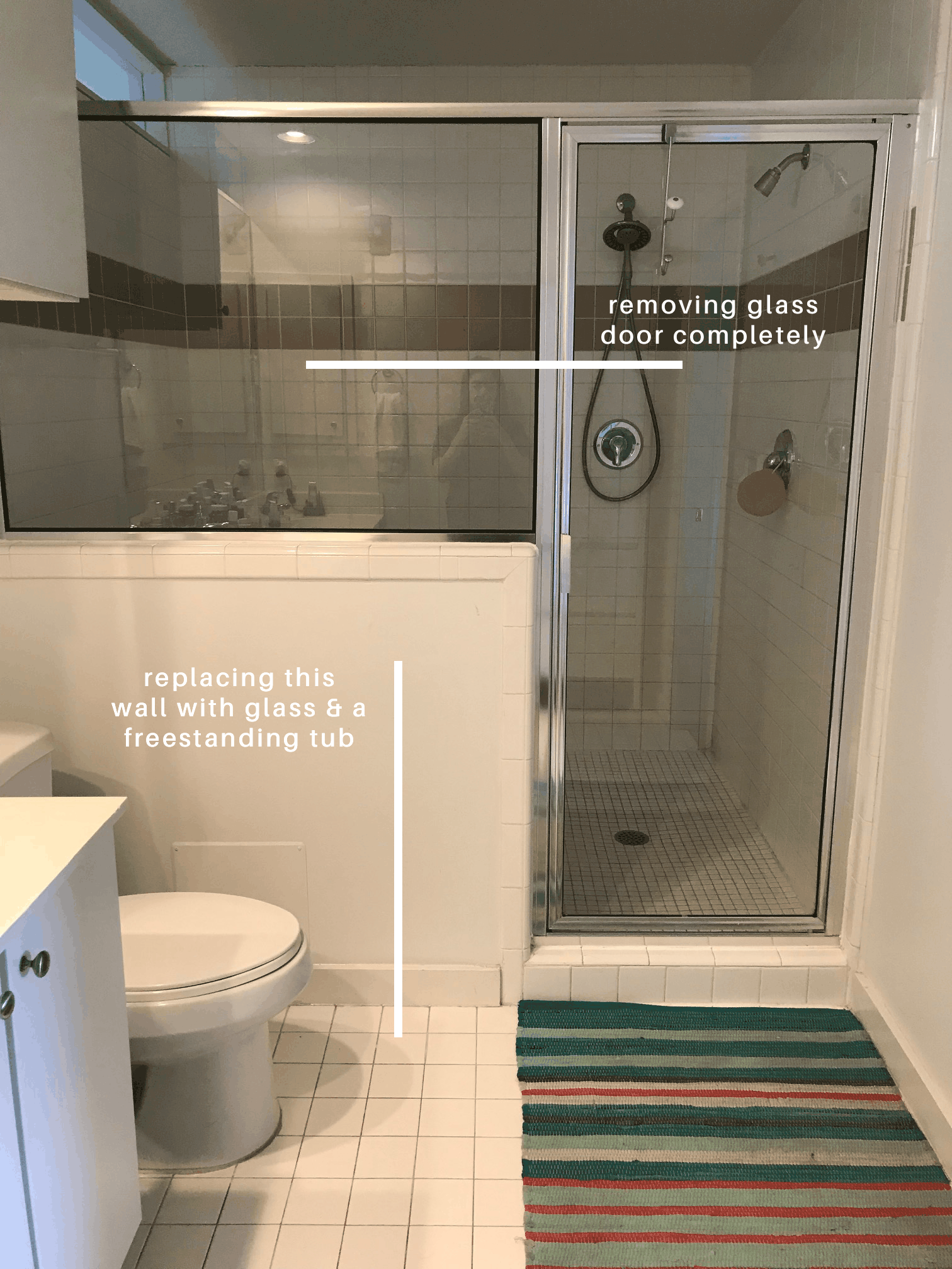
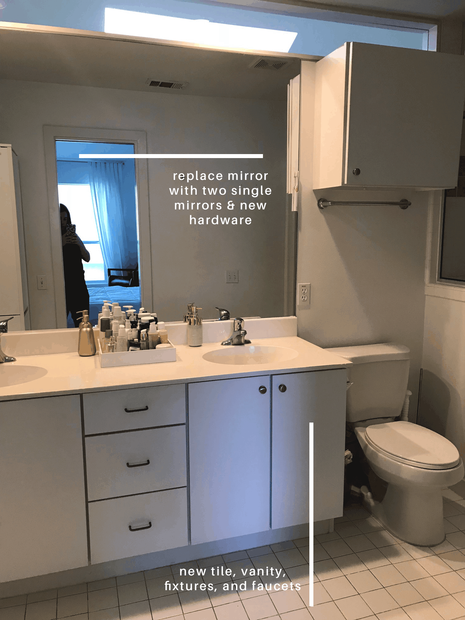
In summary: everything’s gotta go! I know I mentioned this when we first bought our house, but it was definitely designed with the intention of being a rental which means everything is as cheap as it gets. We’re super excited about upgraded bathroom fixtures like you wouldn’t believe!
Now while you’re waiting for some design inspo in next week’s post, you can check out the rest of the participants from this One Room Challenge round below!….

Boxwood Avenue | Coco & Jack | Design Manifest | IBB for DWD | The House That Lars Built | Little Green Notebook | The Makerista | Making it Lovely | Old Brand New | Old Home Love | The Painted House | Megan Pflug Designs | Pink Pagoda | Erica Reitman | Sacramento Street | Simply Grove | Jill Sorensen | Sugar & Cloth | Vintage Rug Shop | Waiting on Martha *
Media Partner House Beautiful | TM by ORC
Please note that we may earn a commission for some of the above affiliate links. However, products featured are independently selected and personally well-loved by us!
This is going to be a fantastic transformation! I can’t wait to follow along.
thank so much, Brenna! xo
Oh my goodness… you are a good brave woman! Pregnant with very sad hardwood floor troubles – and doing the one room challenge. #myhero
haha brave is really a kind way to put it! thank you Lisa, this means a lot! xo
I’m so excited you are doing this! Can’t wait to see how amazing your room turns out!
thank you, Melissa! :)
Can’t wait to see it all! I dream of a master with an ensuite and large closet, so I look forward to seeing how you go about it!
yay! so glad to have you along for the journey, Ariel! xo
Based on your work and meeting room, this is going to be beautiful.
aww, thank you! So glad you like it!
The free-standing tub is going to look so great! Can’t wait to see the transformation and excited to be doing this alongside! xx
Thank you, Chloe! So excited you are too! :) xo
Um, this is a lot of work for anyone, especially someone expecting. Hang in there and delegate!
So excited to follow along since I’m doing master bedroom as well!
Ahh, that’s so excited! Can’t wait!
This transformation is going to be huge! So excited to follow along. Cheers doll! xo Kat with Waiting on Martha
Thanks so much for the love, Kat! xo
Can’t wait to see!!! And gurl, if you need some original artwork…I’d be happy to hook you up! My new rainbow and cloud pieces might be up your alley! :)
Can’t wait to see the finished transformation!
Gemma
http://www.fadedwindmills.com
thanks so much, Gemma!
OOOOHHHHH girl! I can’t wait to watch your progress!
haha thank you Paige! xo