One Room Challenge Week 2: – Townhouse Master Bath Design Plan
I’m going to be honest up front here and say that we’re only t-minus five weeks until the final room reveal for ORC and we haven’t even started on our master bath renovation. So naturally, it seemed like a good idea for our One Room Challenge week 2 post to share our master bath design plan so that I can pretend that we’re farther along than we actually are.
Here’s the deal, when Hurricane Harvey came through Texas, it made it near impossible to land a contractor on any smaller home projects because A LOT of people lost everything. So who are we to compete with people that need their entire home gutted and rebuilt when we’re just looking to remodel a bathroom before our baby arrives?
There’s a whole lot more to our current construction woes than that (you know this already if you follow along on IG stories!), but trust me when I say the fear that we may not get the bathroom complete in time is VERY REAL.
But let’s not discuss the bad and instead focus on the pretty gold things. Like our dream gold shower kit and marble everything. As a quick reminder, these were our before photos of our master suite that we’ll be renovating…

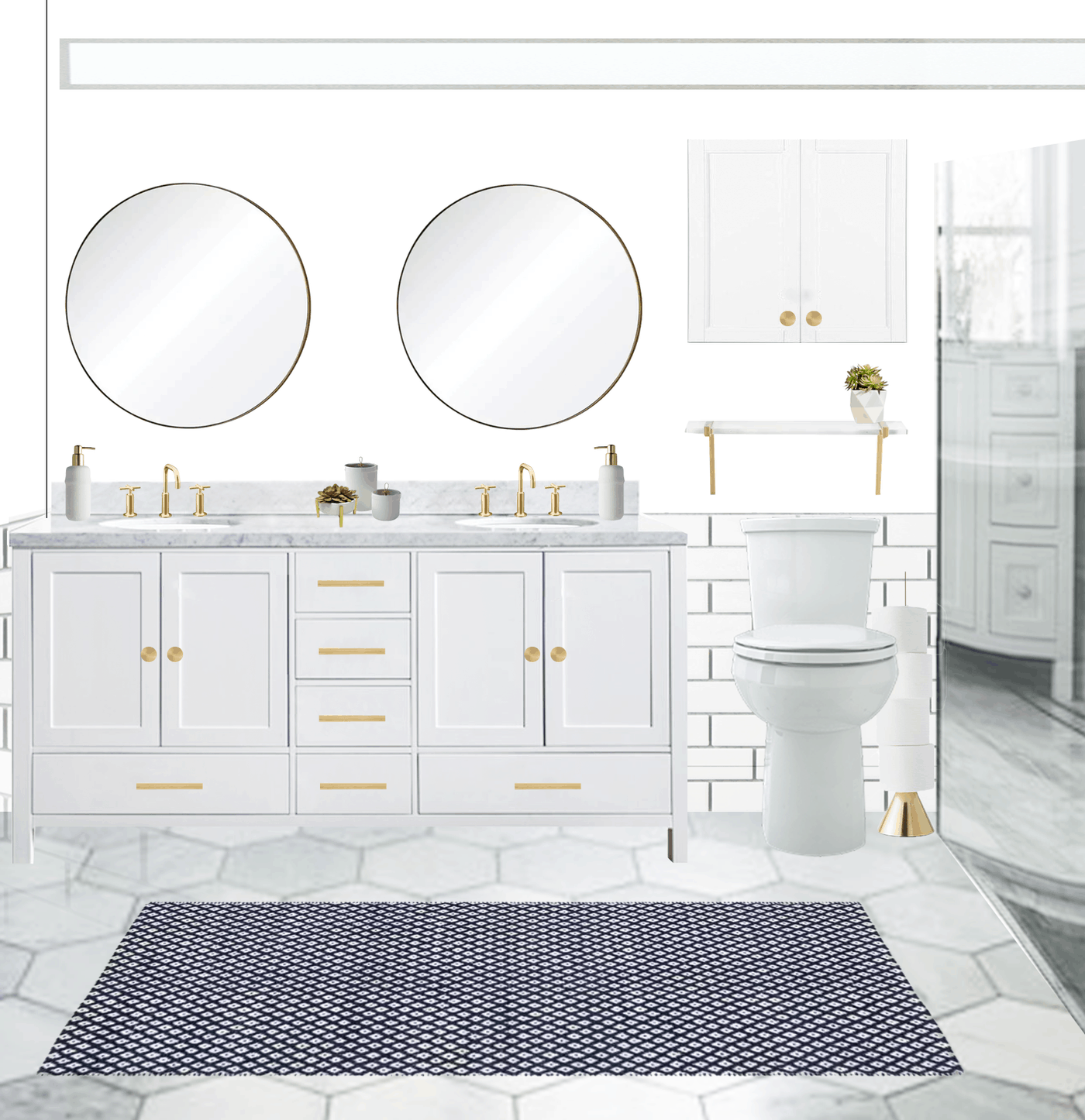
And this is the visual plan for our new master bathroom. While I haven’t picked out all of the little styling details just yet, this gives you the general gist of it! One major change to note is that instead of having a tiny pocket door for the bathroom, we’re switching it our for these True Craft double doors from Metrie with a gold Emtek hardware set.
Essentially we’ll be gutting the current bathroom and replacing it with updated fixtures in the exact same placements/layout. The only exception is removing the weird dividing wall between the toilet and walk-in shower with a glass wall instead. Also removing the current built-in tub with a modern freestanding one.
The current “custom” (I use that word lightly as it’s the CHEAPEST materials ever, haha) vanity is getting replaced with this one from Overstock, and thankfully it has countertops and sinks already built-in which cuts out quite a bit of work and time. I’m very excited to see the new gold faucets and knobs from The Mine with that marble top!
All of the tile is getting ripped out as well, and we’ll be replacing it with large marble hexagon tiles for the floor, and white subway tile for the walls. Our big debate now is — which grout to go with for the tiles? Should we do light grey for all of it, or white for the floor and grey for the subway tile to tie the two together?

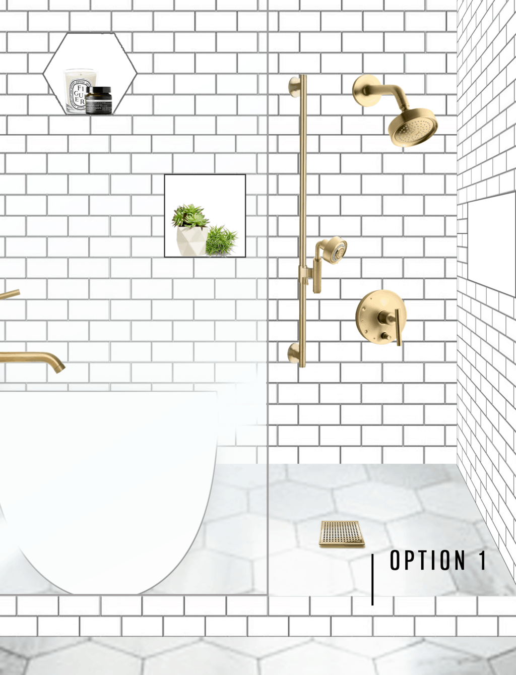
We’re also trying to decide if we should do some cool built-in tiled shelves like the hexagon and square shapes that are tiled with white grout to stand out a bit. I think they look really cool in the design, but I’m nervous about how they’ll actually turn out in real life and/or will future buyers of our house think it’s too out there?! So many adult questions to consider here, haha.
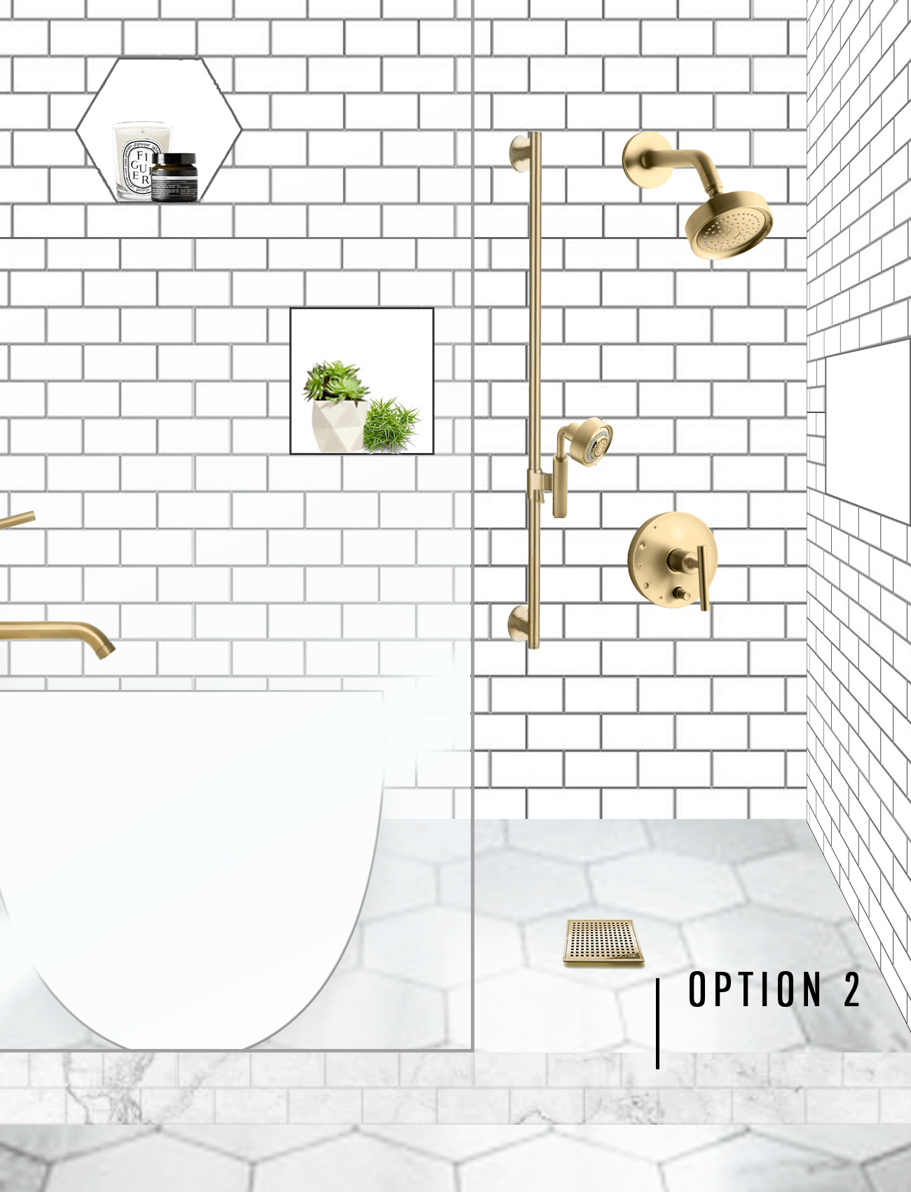
Since we’ll be using a glass wall on one side of the shower and no door on the other (#overlymodern but we love it, lol), we’ll HAVE to tile in a barrier for the sake of maintaining water (like the subway tile line above).
Do you think that we should keep the white subway tile for that border like in Option 1 or do a marble subway tile to blend into the floor more like in Option 2 below? 
I like option 2 for the shower setup better, but hubby likes option 1. Help us decide!! Also, my apologies for my design work making our freestanding tub look like an oversized sink in the above photos, ha! I do what I can!
You can click through all of the bath products we’ve already chosen to include in the space below, I didn’t want to bombard you with 592587 paragraph links, but let me know if you have additional questions on resources! And yes, we really did pick out THAT much from Overstock. So good, you guys!
I’ll be sharing our design plan and reno updates (thankfully we’ve already gotten to work on the bedroom) next week. Stay tuned, and be sure to check out our Week 1 ORC announcement here.
Room sources:
gold bathroom faucets from The Mine / gold cabinet pulls from The Mine / gold faucet drains from The Mine / freestanding white bathtub from The Mine / gold shower valve from The Mine / hexagon marble bath tiles from Overstock / white subway tile from Overstock / gold handheld shower from Overstock / gold shower slidebar from Overstock / round gold mirrors for vanity from Overstock / slidebar trim in gold from Overstock / acrylic and gold shelf from Overstock / framed ocean print from Overstock / navy blue runner from Overstock / marble and white vanity from Overstock / gold bathroom doorknob from Emtek / true craft doors from Metrie
Don’t forget to check out all of the updates going on with the other ORC participants below —

Boxwood Avenue | Coco & Jack | Design Manifest | IBB for DWD | The House That Lars Built | Little Green Notebook | The Makerista | Making it Lovely | Old Brand New | Old Home Love | The Painted House | Megan Pflug Designs | Pink Pagoda | Erica Reitman | Sacramento Street | Simply Grove | Jill Sorensen | Vintage Rug Shop | Waiting on Martha *
Media Partner House Beautiful | TM by ORC
Please note that we may earn a commission for some of the above affiliate links. However, products featured are independently selected and personally well-loved by us!
I am loving your story and blog! It’s so inspirational. I’m wondering which software program(s) you’re using to plan aside from lightroom for the photos. Thanks!
Hello! I love this and I am trying to update my bathroom too. How did you make this moodpboard / collage? x
Hi Genevieve! We used photoshop to put together the room design. xoxo
OMG I love your design. I can’t wait to see the final product. I do have a question, the vanity you picked has nickel handles, will you change those out or are you mixing and matching the metals with your shower?
thank you Diana! And yes, we’re planning to switch those out to the same brushed gold look. xoxo
We are also planning (and in construction!) on our master bath reno. I have most materials picked out, except the tile – tile selection is overwhelming (and my husband officially is “letting me choose”, i.e., not participating in the process).
Did you consciously choose a glossy subway tile (not a matte)?
I went with glossy because I thought it would be the easiest to wipe down quickly (as things tend to stick to matte more!), plus it adds a bit more light reflectiveness since our shower in in the corner of the room without windows. The brighter the better in my book!
I also like the contrast of option 1. I think option 2 with the marble subway and introducing a new tile makes it look “off.” Although it it were me I would use the marble subway tile EVERYWHERE because I just love it so much. Also, totally gotta concur about the niches. Build one. or two. Or a big one. The shampoo/soap/face wash storage is a turn on not turn off for prospective buyers. And you don’t want to keep them on the floor and have to bend over all the time. Just my two cents. Looks great!
that’s all a great point, Stephanie! Definitely need to keep that all in mind. Thanks so much for sharing! :)
I like the contrast of Option 1.
that’s a great point, Yolonda! thank you! xo
Your design is beautiful but I want to throw you a little curve ball. I love the look and idea of all glass open showers but in reality we all have shampoo bottles and crap in the shower. So when you walk in all you see in your beautiful shower are those things. Which you need and use. My suggestion is to consider keeping some version of the half wall and put your niches back there. Here’s an example from pinterest https://www.pinterest.com/pin/178807047684999332/ and this https://www.pinterest.com/pin/85357355415703447/
Thank you for the thoughts, Susan!!! Dually noted! xo
Do you follow Young House Love? They recently did a ton of tiling in their beach house renovation, and they did showers with subway tile similar to what you are talking about. Might be a good way to see a “live” example of Option 1 :) Good luck!
Totally going to go check it out, thank you for the tip! xo