One Room Challenge Week 3 – Townhouse Master Bedroom Design Plan
How has it already been a week since my last ORC update?! Time flies when you’re renovating/scrambling through life, I guess! In case you’re just now tuning in, you can see my week one announcement and before images here, and week two bathroom design plan here. For our One Room Challenge week 3 update I’m sharing our master bedroom design plans!
Keep in mind I still have quite a few little details left to iron out as far as what we’re including in the final design. Hopefully this will give you a general idea of what we’re going to be working with as far as the big pieces though, and I’m SO excited to see it all come together. Let us not forget the horror that was the before photos.
When it comes to the bedroom design, my biggest concern was keeping the space equally as bright. I already sleep like a dead animal, and now with a baby on the way, I’m looking at full on zombie dead animal status. That said, I still wanted the space to feel very different even though we’re keeping the same general layout of our furniture and what not.
The featured photo (above) is the gist of the design if you’re looking directly at our bed. We’re doing all of the wall Sherwin Williams Extra White (because that’s the white we used for the rest of the house and want to make it flow throughout), and a wallpapered accent wall behind our bed only.
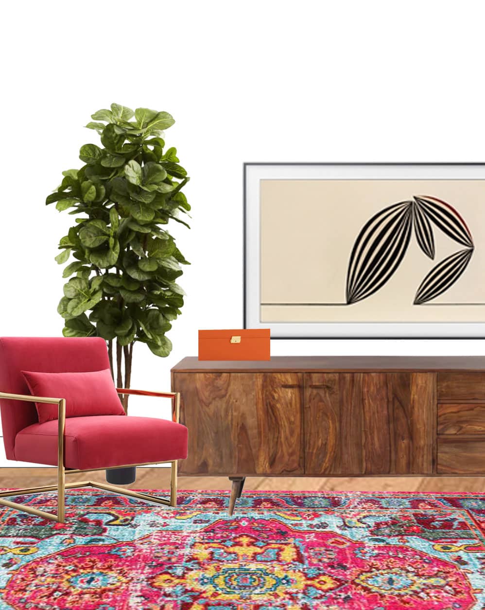
We’re also bringing back this beloved Nuloom rug from Overstock that I used in this room last year that everyone goes WILD over. I still love it so much, and since we got a new rug for our living room makeover, I’m moving this one back upstairs to replace our current. bedroom rug.

The above photo is the wall opposite of our bed where we’ll have a credenza, accent chair, laundry hamper, TV, etc. I am literally DYING to own one of the Samsung The Frame TV’s. It looks like artwork on the wall when you want it to, and functions like a typical smart TV any other time. I mean WHAT THE WHAT?! That’s literally all of my TV dreams come true. Maybe it will happen, maybe it won’t, but dang it looks good in design mockup, ha!
Our general color scheme is a bit…unorthodox… for most adults. I’m basically using this marble print from Overstock and this mint and gold Ferm Living wallpaper as a guide for what colors we’re going with. Plus a touch of navy and emerald green. Is that crazy?! I didn’t want to get too stuffy with the decor because that’s just not us, especially in a space where we spend some portion of every day in.
As for artwork placement, is it too boring to do one large print or two smaller side by side prints over the bed? Filling the blank space on the walls is definitely what I’m having the hardest time with when it comes to quick decision making. Right now we have one medium print above the bed and it feels a bit small and misplaced, so that’s adding to my doubt I’m sure. Let me know your thoughts!

white ceiling fan from Craftmade // dark oak platform bed from Overstock // navy and gold end table from Overstock // gold glass top console from Overstock // pink velvet chair from Overstock // white 3 drawer dresser from Article // modern gold sideplate lock from Emtek // solid wood mid-century console from Overstock // white square baseboard from Metrie // white craft door from Metrie // round gold door knobs from Emtek // ferm living wallpaper in mint and gold confetti // Sherwin Williams Emerald Interior Extra White wall paint// curtain rod in light gold from Overstock // variable widths autumn hickory engineered wood flooring by Pergo from Lowe’s // distressed abstract oriental rug in multicolor
Note that I broke the product selects into two categories: one for staple pieces and one for smaller decor accents. Otherwise, we were all going to get motion sickness from trying to scroll through everything at once.

pink marble hanging print from Overstock // white and gold table lamp from Lamps Plus // gold lucca pillow set from Article // navy rattan hamper from Overstock // large silk plant from Overstock // gold leaf oval tray from Overstock // ‘Floating’ by Karolis Janulis framed print from Overstock // gold free-standing easel mirror from Overstock // fig tree from Overstock // gold floor lamp from Article // ‘Two Travelers’ by Karolis Janulis framed print from Overstock // white marble desktop phone cradle from Overstock // orange jewelry box from Overstock // throw blanket from Overstock // white marble wedge bookend from Overstock // amber gold velvet blackout curtains // green plant in black planter // bowie handwoven pillow from Pom Pom at Home // gold pom pom pillow from Pom Pom at Home // pom pom at home indigo dot pillow
Aside from my endless artwork questions, that’s all I have for you this week! Be sure to check back next week for actual photo updates of progress and installs as we’ll be halfway through!
In the meantime, you can check out the rest of the ORC bloggers participating in the Fall One Room Challenge below. Plus you can see the behind the scenes in action on our IG stories, as narrated by yours truly.

Boxwood Avenue | Coco & Jack | Design Manifest | IBB for DWD | The House That Lars Built | Little Green Notebook | The Makerista | Making it Lovely | Old Brand New | Old Home Love | The Painted House | Megan Pflug Designs | Pink Pagoda | Erica Reitman | Sacramento Street | Simply Grove | Jill Sorensen | Sugar & Cloth | Vintage Rug Shop | Waiting on Martha *
Media Partner House Beautiful | TM by ORC
Please note that we may earn a commission for some of the above affiliate links. However, products featured are independently selected and personally well-loved by us!
I think artwork above the bed would look better. If you do artwork over the side tables, it will still leave an empty space above the bed since the headboard is so low. Plus the lamps on the nightstands will balance out the empty space without the need to add anything above those.
Ahh great point, Stormie! Definitely would help to give the wall a nice balance! We’ll have to keep that in mind. Thank you! xo
Hi, I would say you should go for two pieces above the side tables, also I am curious what software are you using to create the virtual room.
Hi Ali, we used photoshop! xo
so slick! love the sideboard and the chair at the end of the bed.
thanks so much Ariel! :)
Over the bedside tables, for sure.
Duly noted! Thank you Yolonda! :) xo
Maybe a triptych above the bed would look good as opposed to one large painting. It would give you design variation as well, depending on how the images are framed and positioned.
Ohh, that’s a great idea June! Definitely need to keep that in mind. Thank you! xo