One Room Challenge Week 3: The Dining Room Design Plan
Hellooooo to week 3 of the One Room Challenge! Last week I shared the run-down on visual design plans for our living room portion of our open floorplan. This week it’s all about our dining room design plan.
Since we have quite a bit of color happening in our living room design, I wanted to keep the dining space more neutral, especially since we’ll be using it for entertaining content around here!
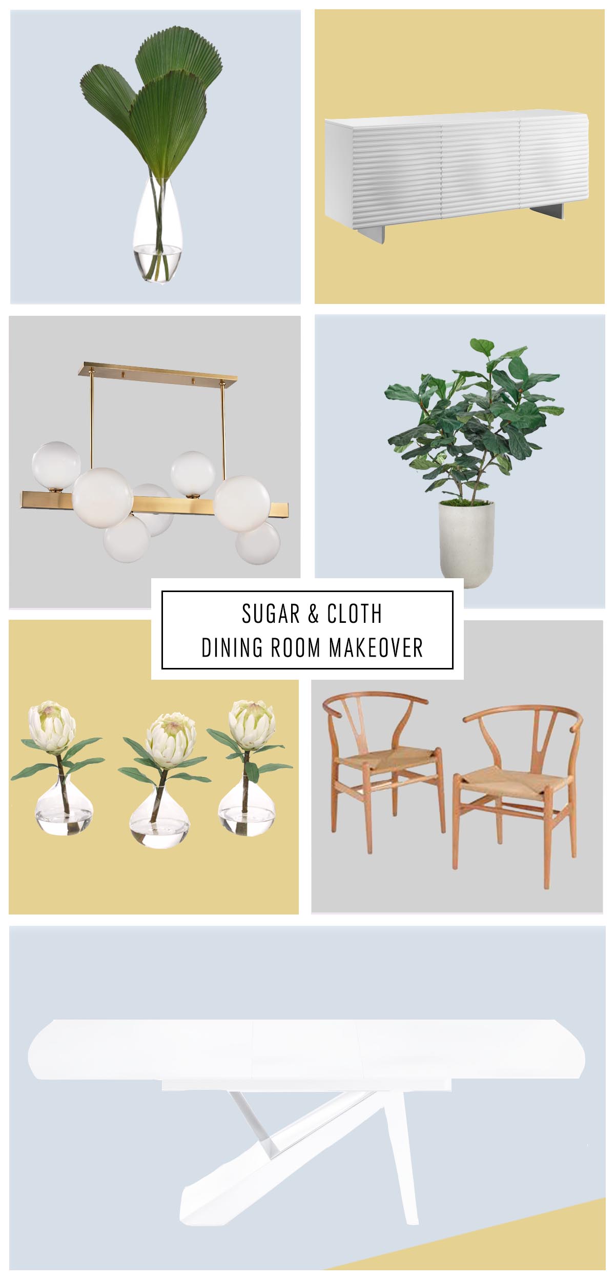
The featured photo is the general idea of the room placement and the below round-up graphic gives you a better idea of the specific elements by themselves. You know, in case something is unrecognizable via my photoshop skills haha!
I’m still on the fence about not having a rug underneath the table and what I should do as far as general decor in the middle of the table…
For instance, I don’t love the idea that rugs can get dirty very easily under the dining table, especially when you have a toddler running around like we do. I do love that rugs visually ground living spaces, so we’ll see if I end up changing my mind on that.
As for decor on the tabletop, this can always change seasonally but I do like having a staple piece that fills the space so that it doesn’t look too stark on a daily basis when we’re not entertaining and things like that.
I may end up reusing this elongated gold bowl from our old dining room since it will be the perfect size and shape again.
DINING ROOM DESIGN PLAN ROOM SOURCES

- Simple Living Tia Y Dining Chairs in natural
- MOON high gloss white buffet
- B Modern White Dining Table
- Hinsdale gold chandelier by Hudson Valley Lighting
- Fan palm in a glass vase by NDI
- Faux fiddle fig by NDI
- glass protea set by NDI
The construction crew at Genesis has been working hard behind the scenes on replacing the flooring, plus patching and prepping the scuffed places and popcorn ceilings from the previous owners.
We did run into one MAJOR hurdle that we found out about after peeling up the only vinyl flooring that showed you in week 1. Let’s just say it cost us a pretty penny! Any guesses on what it was?!
I’ll be sharing the full scoop on that in next week’s update post, so check back in on Wednesday!
Here are the links from the other participant’s posts to stay in the loop until then…
At Home With Ashley | Casey Keasler | Dorsey Designs | The Farmhouse Project | Home Made by Carmona | House of Funk | House of Jade Interiors | House Seven Design | House That Lars Built | Inspired by Charm | Jana Bek | Jessica Brigham | Kelly Golightly |Murphy Deesign | The Pink Pagoda | Sarah Gunn | Sherry Hart Designs | Sugar & Cloth | Veronica Solomon | Vintage Revivals | Media Partner BH&G | TM by ORC
Please note that we may earn a commission for some of the above affiliate links. However, products featured are independently selected and personally well-loved by us!
This space is going to look amazing. I love the modern pieces you have picked out.
Thanks, Jocelyn! Picking out the furniture has been the fun side of renovating!
So fun, I love what you’ve come up with!
Thanks, Kimberly! It was soo fun to pick out furniture!
Such a gorgeous design, love it!
Thank you! XOXO
So fun. Come decorate my house :)
Ok! Do you live in Houston? :)
I love the style! It’s so fresh and modern!
Thanks, Anna!
I have 4 little boys, and we put an interior/exterior rug under the dining table; it’s super easy to clean, holds up to all their running and crawling on, and there are TONS of great options for color/pattern. They also tend to be relatively inexpensive compared to interior-only rugs. You may want to explore this as an option for your own space!
Hi Abbi! That’s good to know, especially that you have 4 boys and the dining table rug is still holding up. That’s amazing!
Love the chairs and the Mid Mod vibe! :)
Thanks, Angela! We were going for that vibe!
Love the table! such a fresh design
Thanks, Ariel! We love that the table can extend also if we have more guests!