Sugar & Cloth Studio Kitchenette
photos by Jared Smith
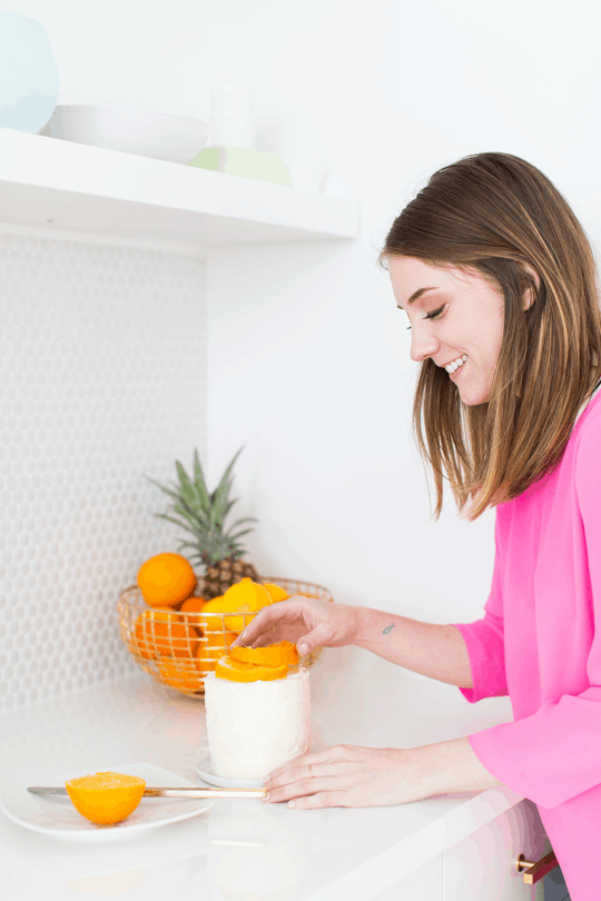
I know I’ve shared a few peeks here and there, but the new Sugar & Cloth studio kitchenette is finally complete!… for the most part. Technically I still have two more shelves to fill with colorful dinnerware and an extra cacti or two before it’s really done, but hey, considering it looked like this to begin with, it’s finished it my book! Plus I have to keep some things a mystery otherwise you’ll fall asleep with coffee in hand by the time we make it to the studio tour.
We teamed up with the lovely folks at Lowe’s for the bulk of the studio renovating, and though 20 tubes of caulk, paint rollers, brooms, mops, scrub brushes, knee pads, nails, screws, grout, paint, and a thousand other little sweet nothing may not seem like much, it’s actually a part of everything you see here! I really don’t think we could’ve pulled if those millions of trips to Lowe’s with a list full of questions and materials hadn’t happened.
Don’t worry though, I’m going to give you the full run down on how we kept everything within budget, all of our sources, AND the secret to our $36 countertop! Seriously, I would not even joke about that!
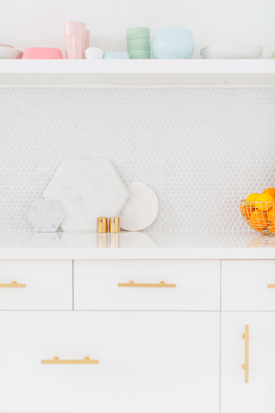
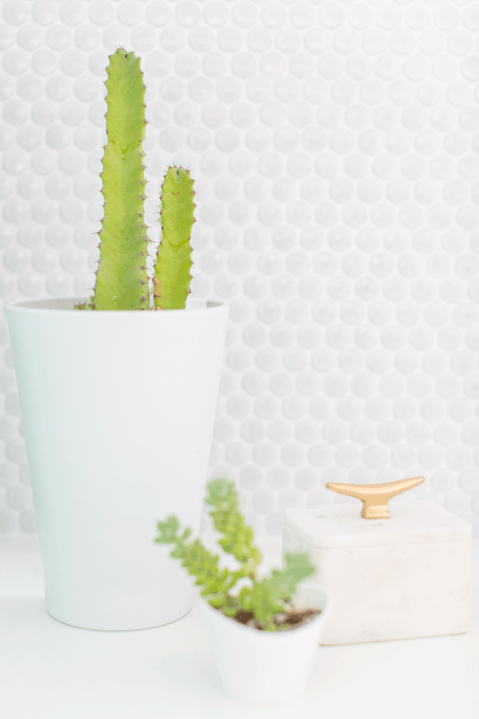
I obviously wanted to stick with my token white and gold theme, but with a few more pops of color here and there than in the last studio for more photo ops and vignettes for future workshops and videos. I also really wanted to stick with the modern/mid century vibe I’ve been going strong with lately, and cacti are TOTALLY winning on all of the above. Prepare to see plenty more of those in upcoming posts!
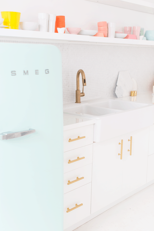
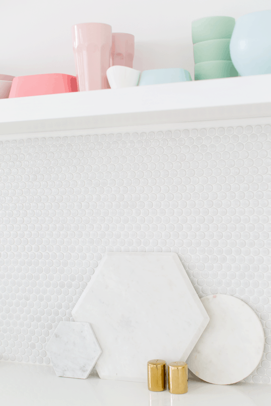
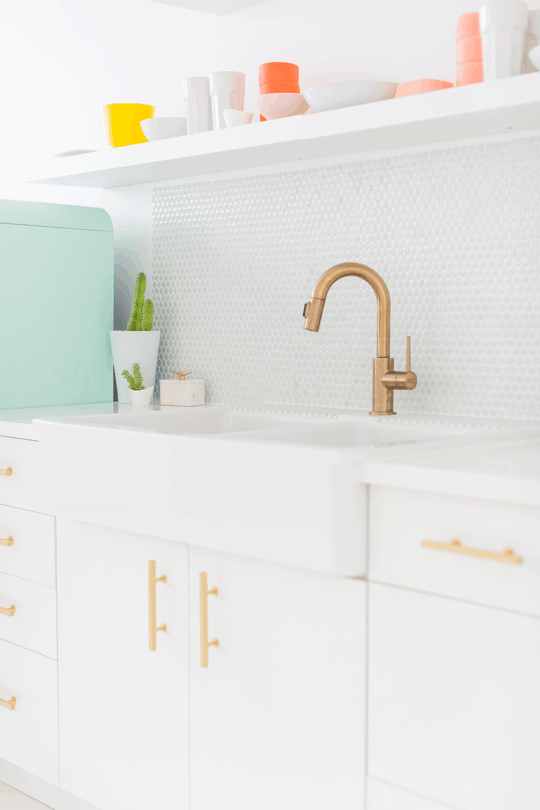
Since the kitchen doesn’t have full size appliances, I wanted to add some token elements that would make it feel like a kitchen in the midst of a wide open work space, which meant a backsplash was a must. This penny tile added a major midcentury vibe (strike that, they’re polka dots, what’s not to love?!), was budget friendly, and it makes it look like our retro Smeg fridge found it’s true love. I can just see them slurping spaghetti noodles with each other now…
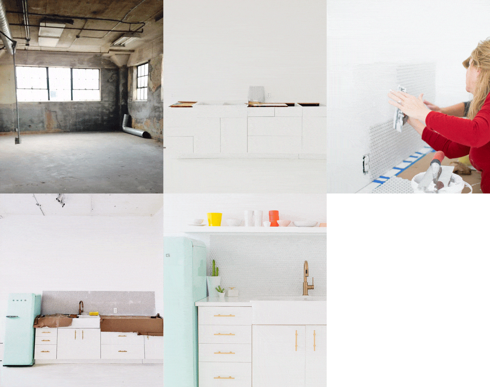
Instead of splurging on a tile saw, we just used tile nippers to create the straight edge on each end of the backsplash without using trim pieces to keep it minimal. We made a few mistakes with installing the grout though (definitely should’ve referred to the Lowe’s how-to sooner, oops!), and had to reapply a top coat of grout because of accidentally using too much water when wiping the excess away the first time, which caused little air bubbles to dry and pop.
We also realized after the fact that the penny tile sheets themselves tend to have varying colors, so in the end they actually look more marbled than plain white, which was an accidental WIN(!) considering my dream would’ve been to have marble if money and time would’ve allowed.
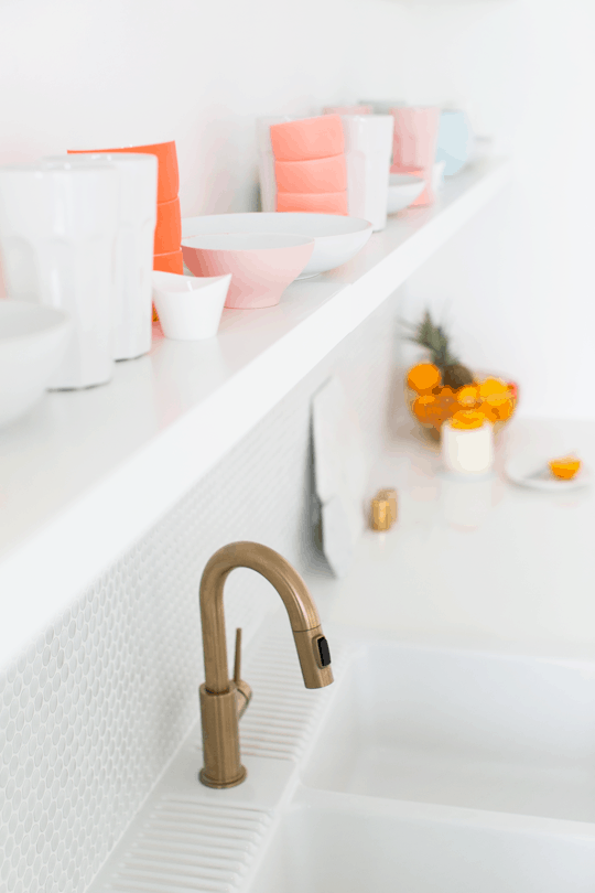
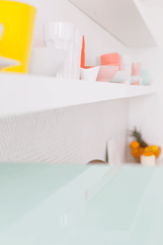
The brushed brass drawer pulls and faucet are my second favorite things in the space. They totally add the trendy, modern feel while tying in my love for all things gold, and colorful dishes mixed with everyday white dinnerware make the floating shelves act as built in artwork.
We actually cheated a tiny bit with the shelves because they weren’t long enough to run the entire length of the countertops, so we installed them right next to each other and caulked the seams and then painted the faces of them the same white as the walls so they’d blend in.
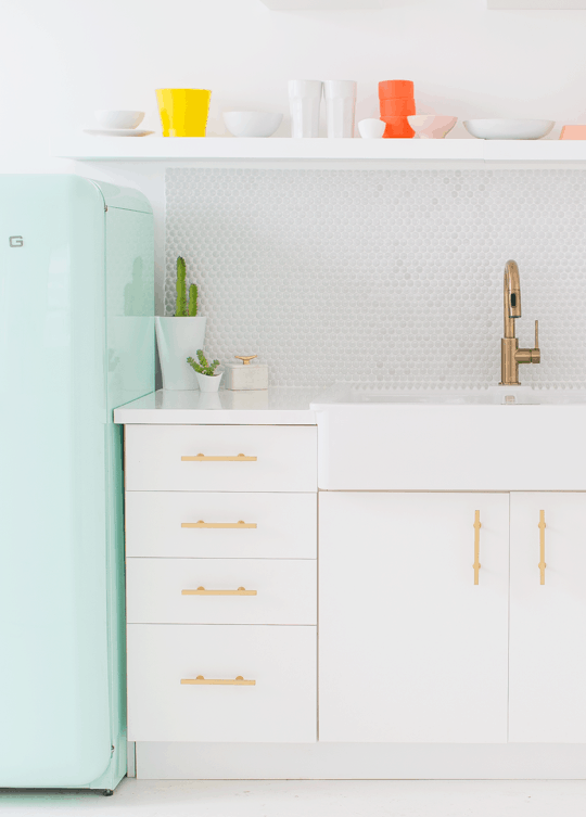
Lastly for the countertops, we just could NOT afford a custom high gloss or acrylic version but I wasn’t a fan of the laminate look at all. So my Dad being the genius that he is, decided that since we had a few extra white lacquered table tops from our workshops, that he could use the rotary saw to cut one down to size for the small counter space.
To make it fit to size, he cut the width of a tabletop down to 25 inches (so the counter would rest just past the cabinets), and placed the rough cut end towards the wall, and the other rough cut end from sawing it in half (a piece for each side of the sink) underneath the edge of the farmhouse sink on both sides. Once we installed the backsplash and caulked the edges, we had a completely finished high gloss counterop for the price of a $36 tabletop that looked seamless! The man is a mastermind, I tell ya!
So, what do you think?! I’m excited to get the rest of the shelves finished to show you, too!
Sources: gold faucet // drawer pulls // backsplash // sink // cabinets // floating shelves // Smeg refrigerator // large marble hex board // small marble hex board // round marble board // gold wire fruit bowl // colorful dishes on shelves, various sources
This post is sponsored by Lowe’s. Thanks for supporting the brands we love that keep Sugar & Cloth running, and bringing you bigger and better content!
Please note that we may earn a commission for some of the above affiliate links. However, products featured are independently selected and personally well-loved by us!
Hi! Do you mind sharing where you got the barstools? I tried searching yout page but I couldn’t seem to find a reference to where they are from. Thanks!!
Hi Kate! Apologies! We totally should’ve linked them. They are from Wayfair. They’re actually an old style so we cannot remember the name. Unfortunately, it’s not available online anymore but Wayfair has other great stools!
We really love your blog, it has nice content, Have a nice day!
Thanks Cedric!
The main thing I love for actually copying is the dishes for my kitchen! Can u help as far as general sources? The whole kitchenette is a masterpiece, definitely an inspiration! :-)
Good way of telling, and nice piece of writing to take information about my presentation topic, which i am going to convey in school.
Love the new kitchen, where did you get the pink and white tumblers from? im wondering if they are clear glass ones spraypainted? thanks !
I LOVE IT!!
I love the rainbow of dishes on the open shelving! This turned out so great!
Love, LOVE, truly love this! What an inspiration! White never looks so good and the gold and aqua – superb!
have been dreaming of a fruit basket exactly like the one you have styled your space with! can i ask where you found it? thanks!
Really beautiful – love the penny tile and the great idea for gloss countertops! The fridge and colored accessories add a lovely touch. :)
Totally gorgeous!!!
I’m in awe of your kitchen. Where did you get your succulent planters? They look so nice!
Holy smokes, Ash! It looks amazing! And the penny tile is the best part! Well, ONE of the best parts! Good job all y’all!
Beautiful! So clean and cute! LOVE that fridge!
Wowser! Looks absolutely amazing!
Wow that looks amazing! Oh and the refrigerator is a dream. Where did you get those cute plant pots? I am having so much trouble finding plain white ones without it costing an arm and leg.
SOOOO GOOD! I love every detail of this, and those countertops are genius. Also, Smeg fridge = my dream.
Nice! I really love the mint blue fridge! :)
So awesome! Gorgeous! I adore the colours; everything looks like it is perfect in place. Wow!
Ash! It looks so, SO good!!!! Lots of awesomeness happening here. The open shelving, the tile backsplash, the brass drawer pulls, everything.
GORGEOUS!!!!
It’s so pretty! Y’all did a great job!
Beautiful, beautiful, everything looks awesome. It shows the most important it’s not have a big space & lots of money but creativity & ingenuity. Thumbs up to your daddy, too.
What a beautiful and delicate kitchenette you’ve got there!
Cheers,
P&F
preppyandfunny.wordpress.com
Gasp! So gorgeous Ashley!
Wow I love it. Can you tell me the name or maker of the brass faucet. that is EXACTLY what I have been looking for and I could not find it on the Lowe’s site. Thank you!
there are two links within the text, and a link in the sources list :) It’s from Wayfair!
Swoon. What a gorgeous space!
I just adore everything about this space!! so much beautiful inspiration. Awesome job!
It looks beautiful!
Looks amazing!