How We Styled Our Guest Room for Listing & Home Staging Tips
You all may recognize this room from our guest bedroom makeover (before the home staging!) from a few years ago right here! I’ve always loved this room and really wanted it to feel welcoming and versatile for guests. That said, it’s also a pretty small space to work with.
Since we’ve been prepping our house like crazy to list it for sale, I wanted to pair down on some of the pieces in this room and give it a little refresh for the home photos.
And in perfect timing, Stage.com actually approached us a few weeks ago about sharing items from their expanding home decor section and the tropical glam decor was calling my name! I mean, this room literally screams “tropical glam”, don’t you think?!
So I decided I’d break down some of my home staging tips and thought processes behind the updates we made to this room…
Guest Bedroom Refresh and Home Staging Tips
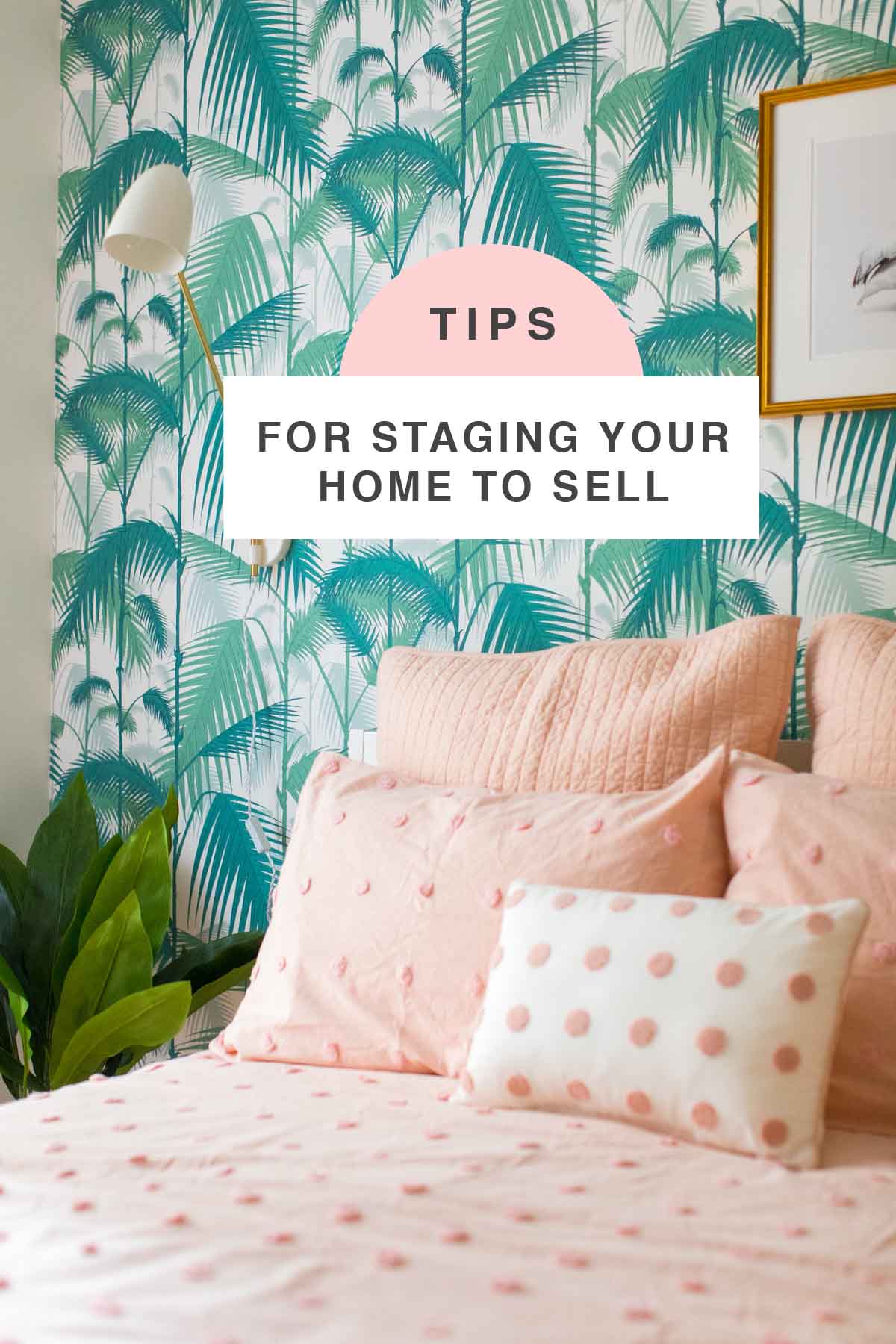
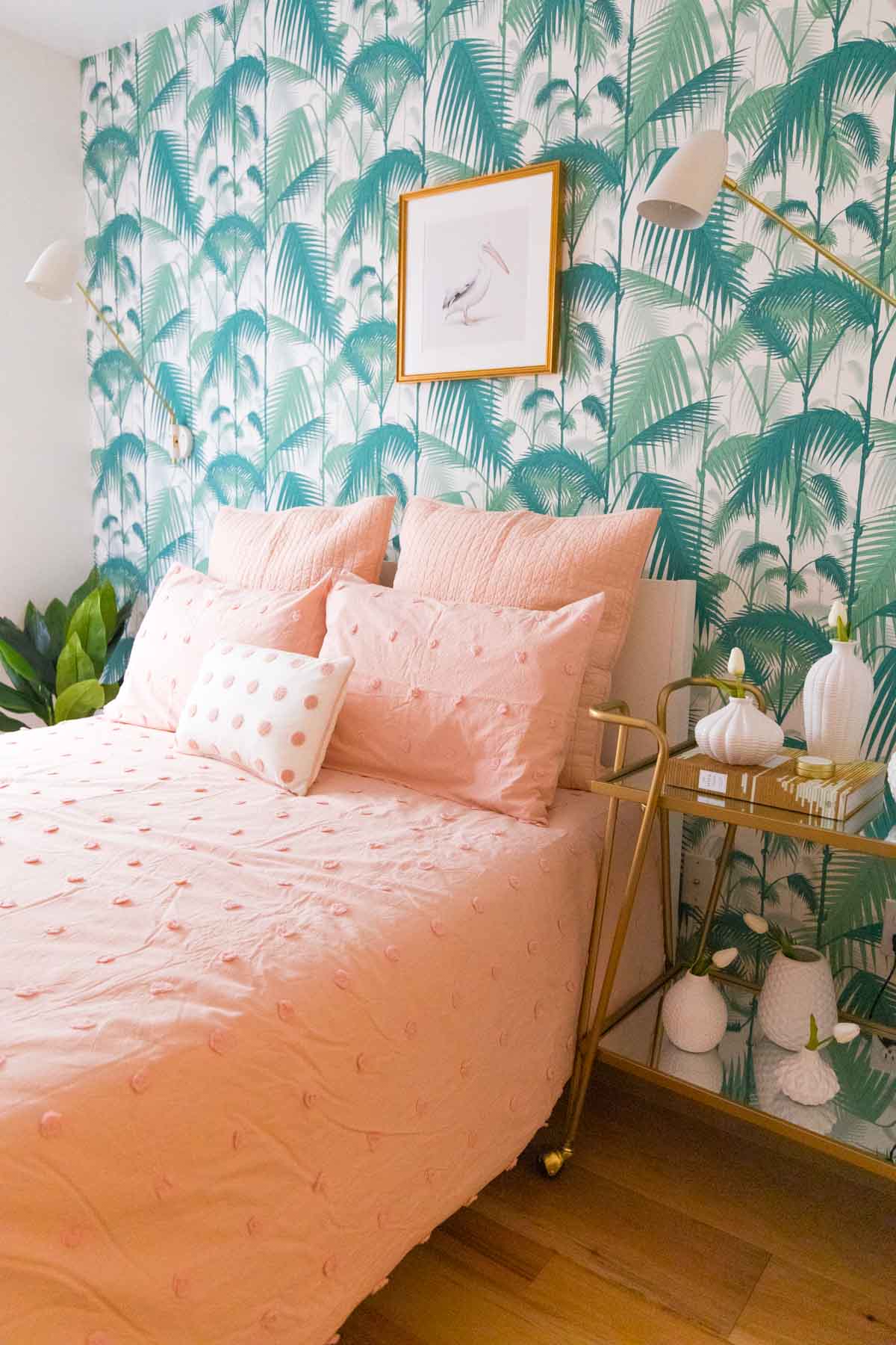
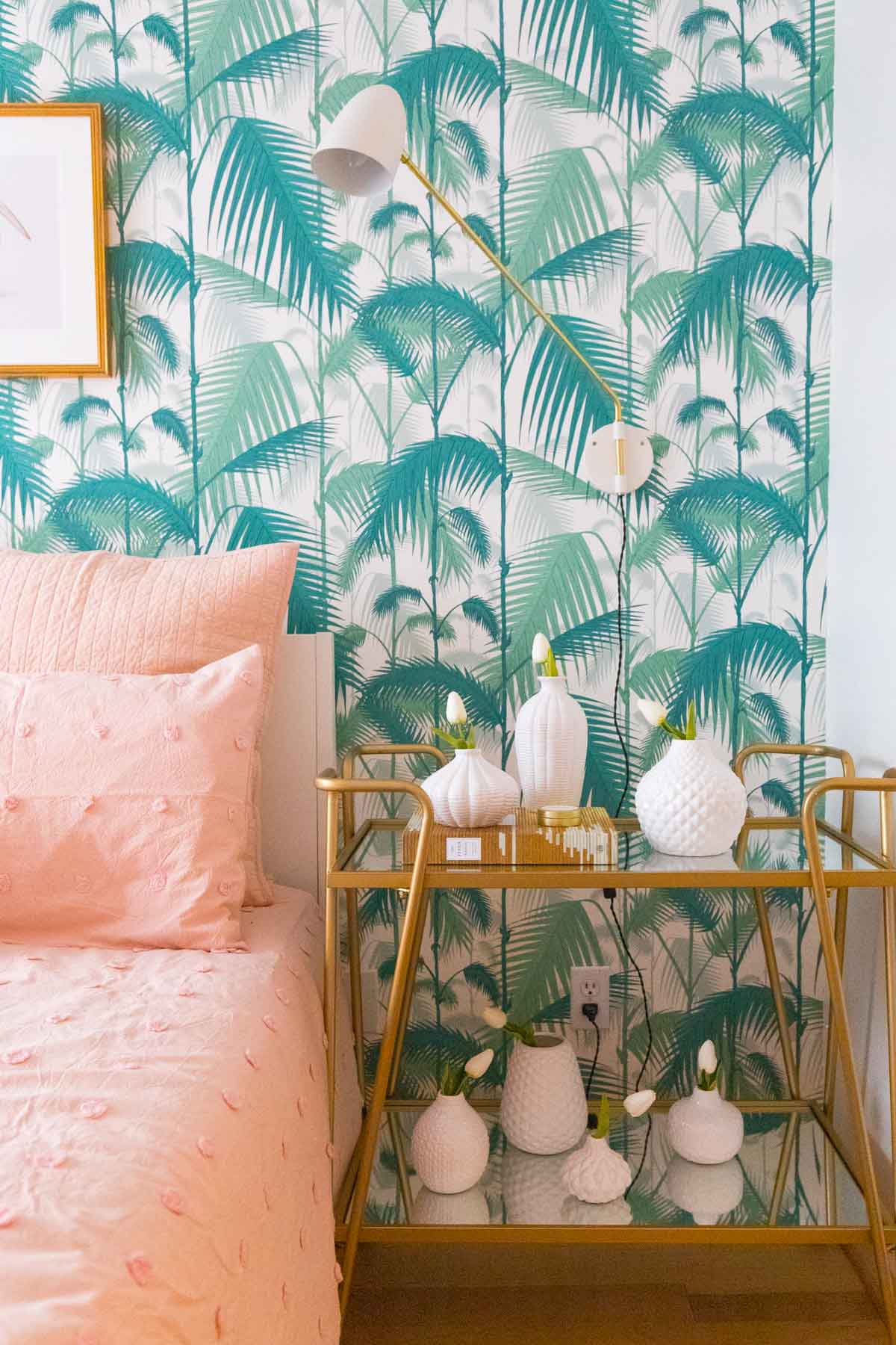
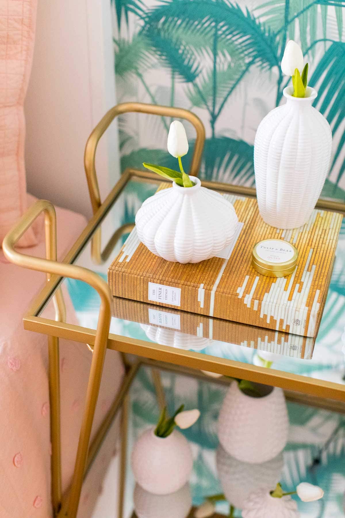
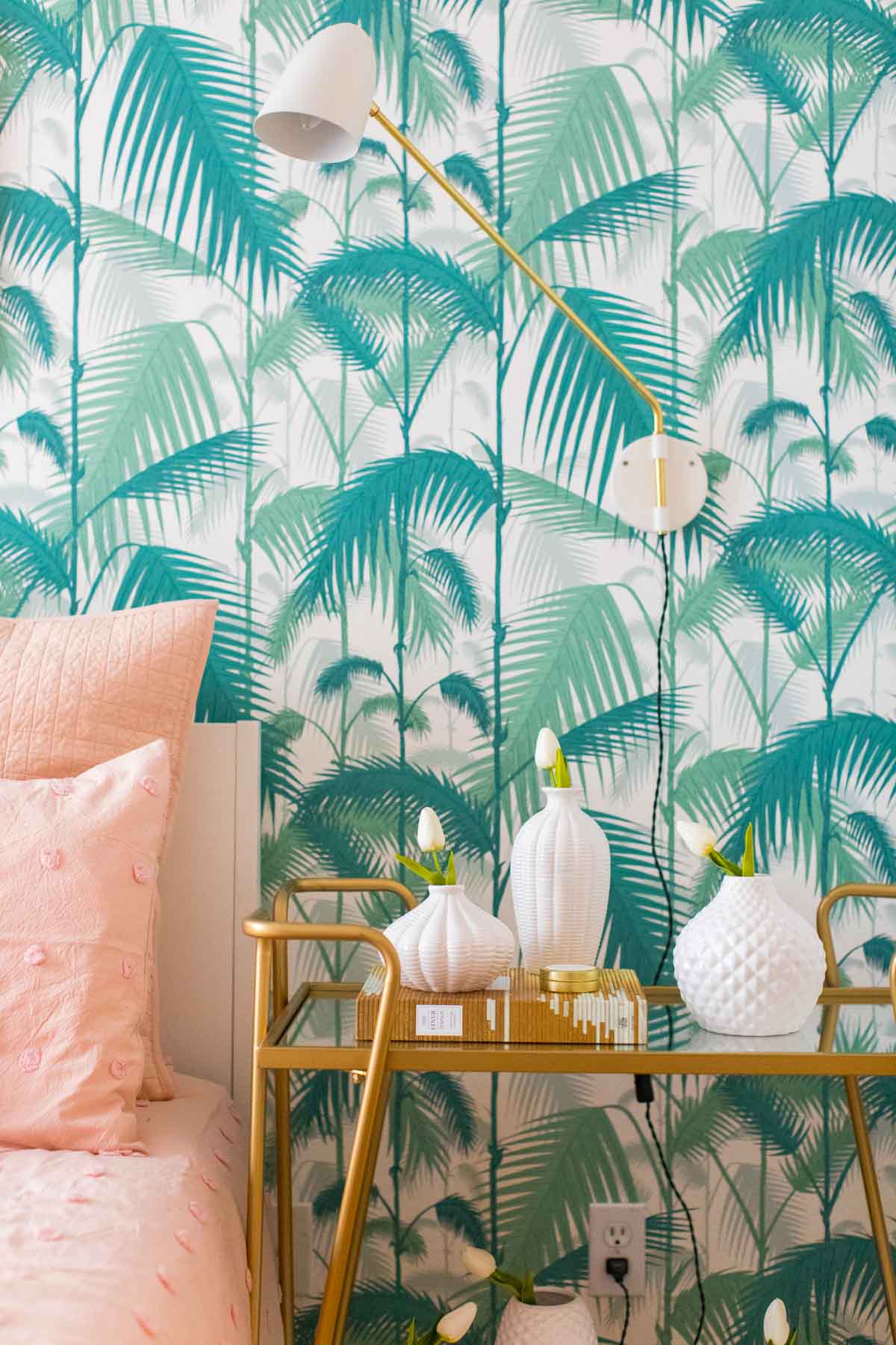
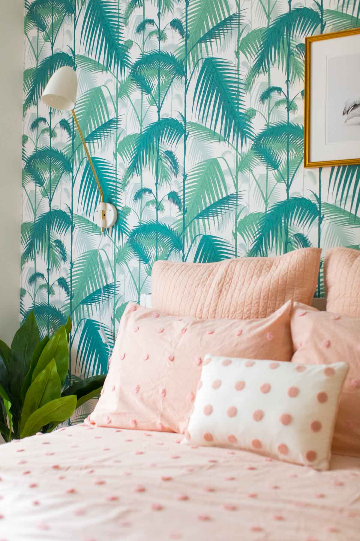
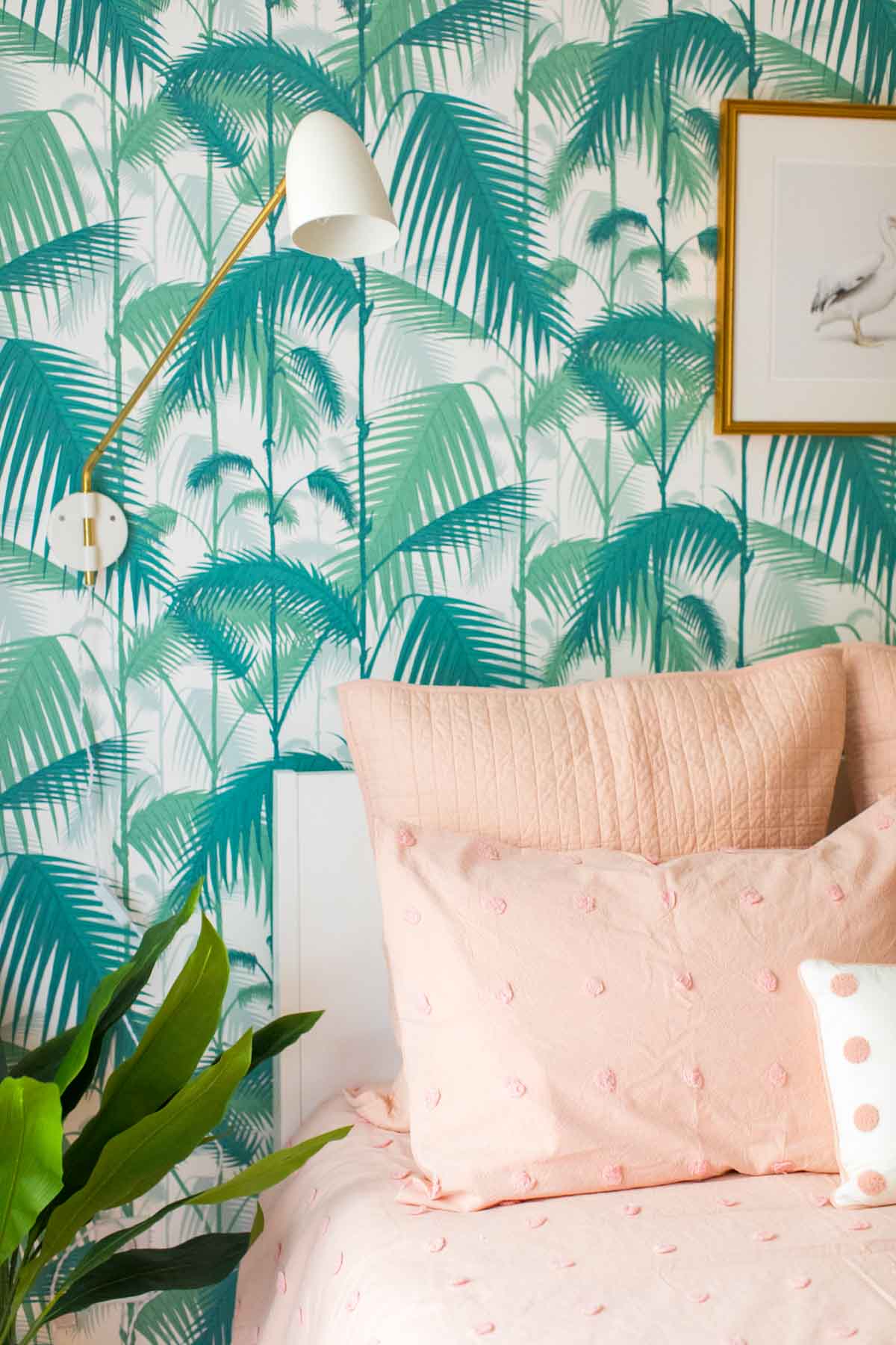

When we originally completed this room, it had two large campaign dressers that doubled as side tables. While I loved them and they were super practical for guest storage, they made the room feel a lot smaller.
So I removed both of those and replaced one side with a single faux plant and used this gold and glass bar cart as an end table next to the entrance. Since the bar cart is open and has mirrored finishes, it immediately felt airier!
I also opted to remove the rug in this room since we recently had new hardwood floors installed so that you could really see the upgrades. I replaced the texture that the carpet added to the room with this statement comforter set with accent pillows in a soft peach. I LOVE the white version of this comforter as well, super versatile!
Since the room already has plenty of color happening, I kept the rest of the decor neutral with a modern white vase set and single white tulips for the bedside table along with a single white curtain panel for the window to help reflect light into the room.
5 Home Staging Tips to Sell Your House
- Remove personal items — When it comes to selling your house, the fewer family photos and peeks into your personal life the better! You want buyers to focus on the home, not the story of the people living there. That goes for the knick-knacks on the fridge too!
- De-clutter — While you’re at it on removing personal items, think about the phrase “less is more”. In order for a space to feel open, sizable, and clean, you may need to remove furniture that’s too big for the room or pair back areas that are over-accessorized. This is especially important in closets. People love having ample storage, but if you have every closet packed to the brim, it’s hard to visualize the space they’re buying.
- Light and bright — Nothing is better than a room that gives you the feeling of a breath of fresh air! Bright, airy spaces give just that feeling, so be sure to open up the curtains and take away the blackout blinds to breathe a little life into your home.
- Clean and odor-free — No one wants to walk into a dirty home with weird smells, especially not potential home buyers. That means you need to clean like ALL of the Moms are coming by for an inspection stat! When it comes to de-odorizing, be sure that you’re not over spritzing on the fragrances either. Think crisp and clean like fresh laundry.
- Don’t forget about the entrance — After all, this is the first thing buyers will see, so make it as clean and memorable as the inside!

In case you’re not in the market to list your house any time soon, you can browse the new Stage decor in-store and online. It gets refreshed weekly so that should keep your design wheel spinning for a bit!
This post is sponsored by Stage.com. Sugar & Cloth has chosen to donate 5% of all sponsored campaigns to charity, which you can read more about right here.
Please note that we may earn a commission for some of the above affiliate links. However, products featured are independently selected and personally well-loved by us!
From this article you will get to know about the tips for guest room refresher for staging home.This article gives suggestions on limitations and delimitation of such selection. I enjoyed reading while going through this article and this is the best link for gaining all the information about it. I found this Fbclicensed.builders Having loads of data, if possible do have a look
Great post,Thanks for providing us this great knowledge,Keep it up.
Thank you! XOXO
I’d like to be your guest please!
Come on over!
I just love the colors you used. It turned out so cute!!
Thanks, April! We totally wanted to make this room super colorful!
Love how bright and welcoming this turned out! Lovely!
Thanks, Beth! Every room in that house is bright! We hope whoever buys the home won’t mind…
Your guest room is beautiful! Such great tips!
Thank you so much, Stephanie!
ok, I LOVE it! this is darling
Yay! Thanks, Rachael! XOXO