A Before and After Simple Bedroom Makeover for Zach & Caitlin
A Before & After Of A Simple Bedroom Makeover — It doesn’t get much better than a before and after simple bedroom makeover as an engagement and house warming gift, does it?!
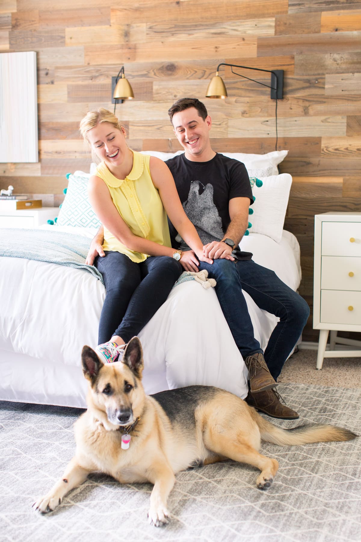
I hope you all are ready for some home decor action coming up. Because we’ve been very busy with this whole makeover thing!
I blame my out of control desire to be a homeowner. Basically, no one with an empty room is safe around me these days.
First up is a before and after simple bedroom makeover that we worked on for Jared’s sister, Caitlin and her fiancé, Zach!
They got engaged a few months before us, PLUS bought a house the same weekend. Talk about lots of Smith family confetti throwing my friends. You don’t even know!
I also happen to pride myself on having loved Caitlin before Zach (simply on account of knowing her before they met). But that’s a love story, I’ll save for another time.
The house they bought was already pretty updated… minus dark wall paint, some poor lighting choices and a few not-so-modern hardware/window fixtures from the previous owners.
Of course, we included glamour shots of the said ugly fixtures in the before shot below…
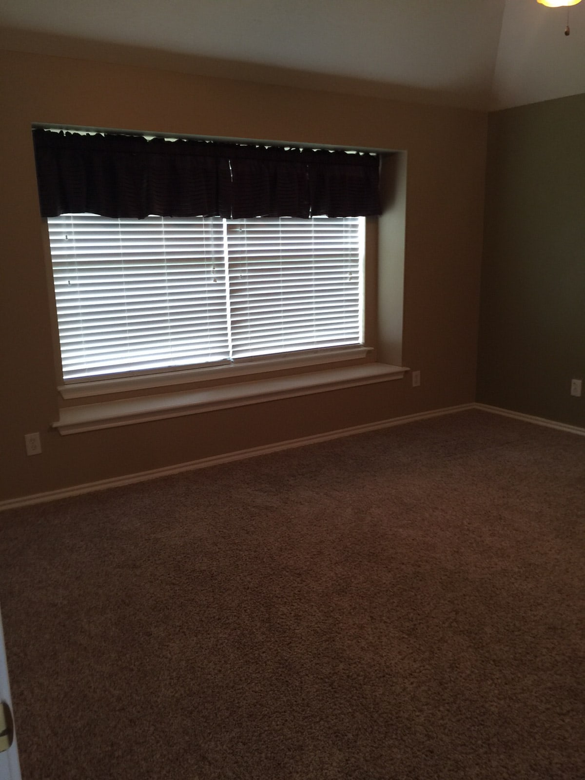
If this doesn’t prove that poor room lighting doesn’t make all the difference in the world, I don’t know what would!
They did most of the leg work before we got there for the fun furniture part. The first thing that had to go were those window treatments.
They also painted most of the house a pale, modern grey for a neutral tone to build from.
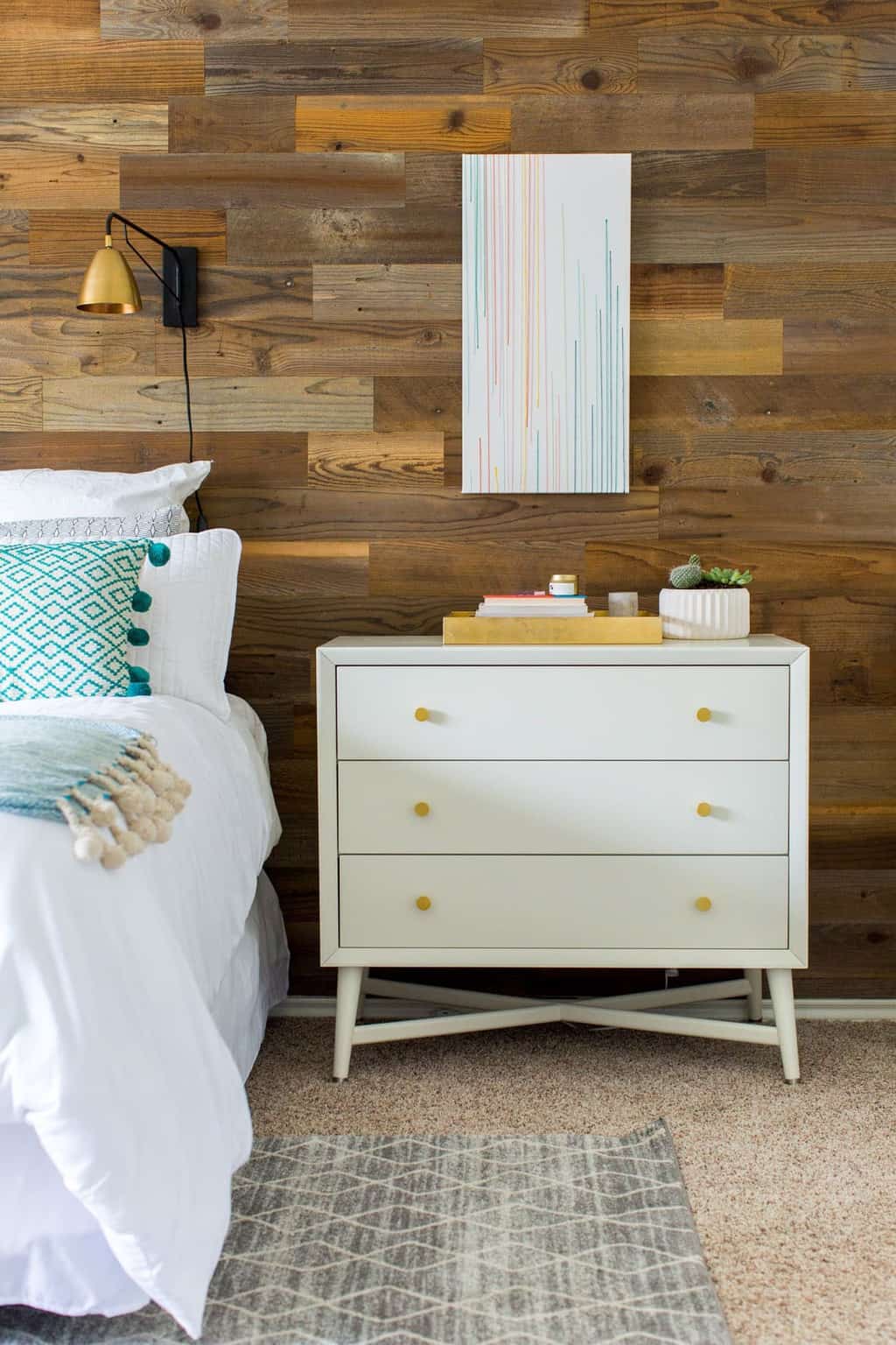
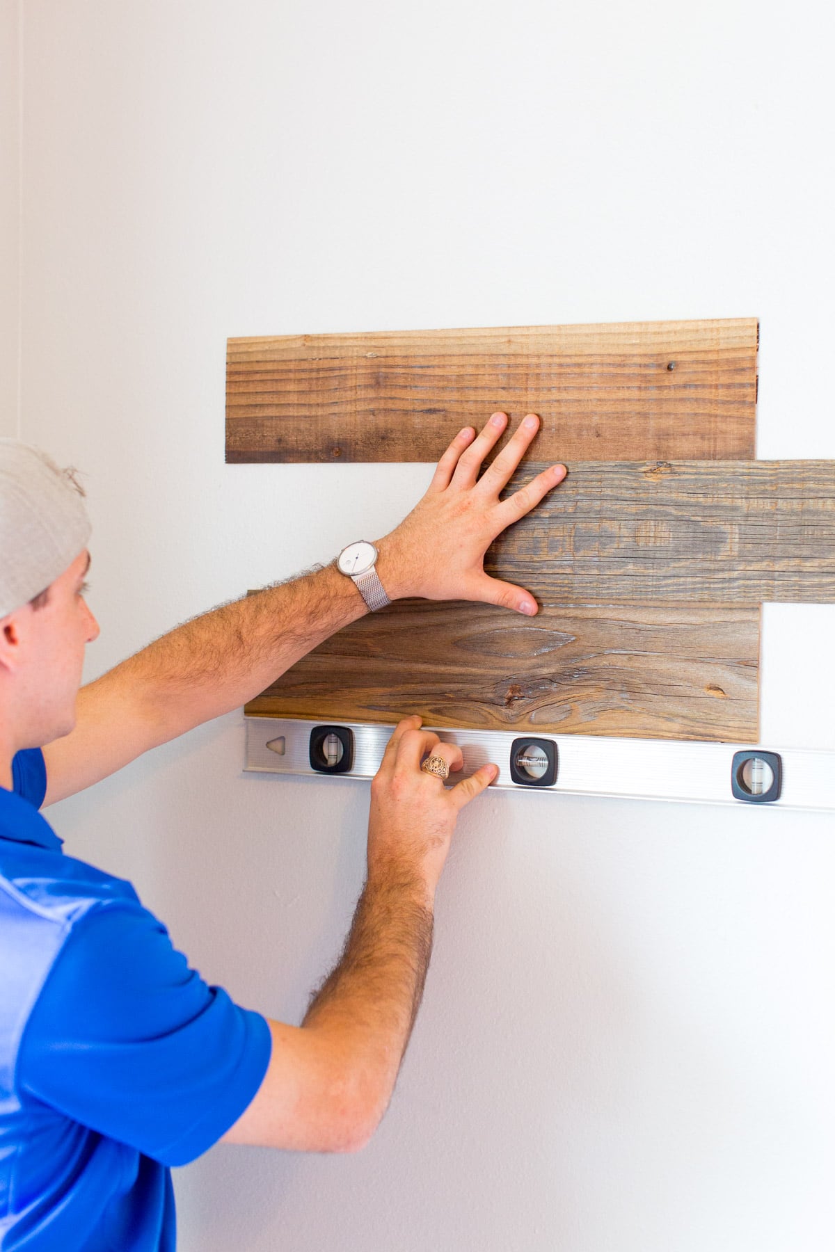
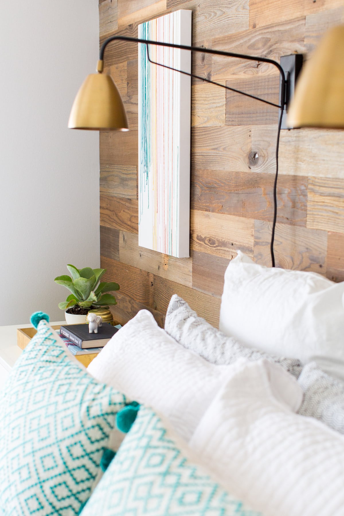
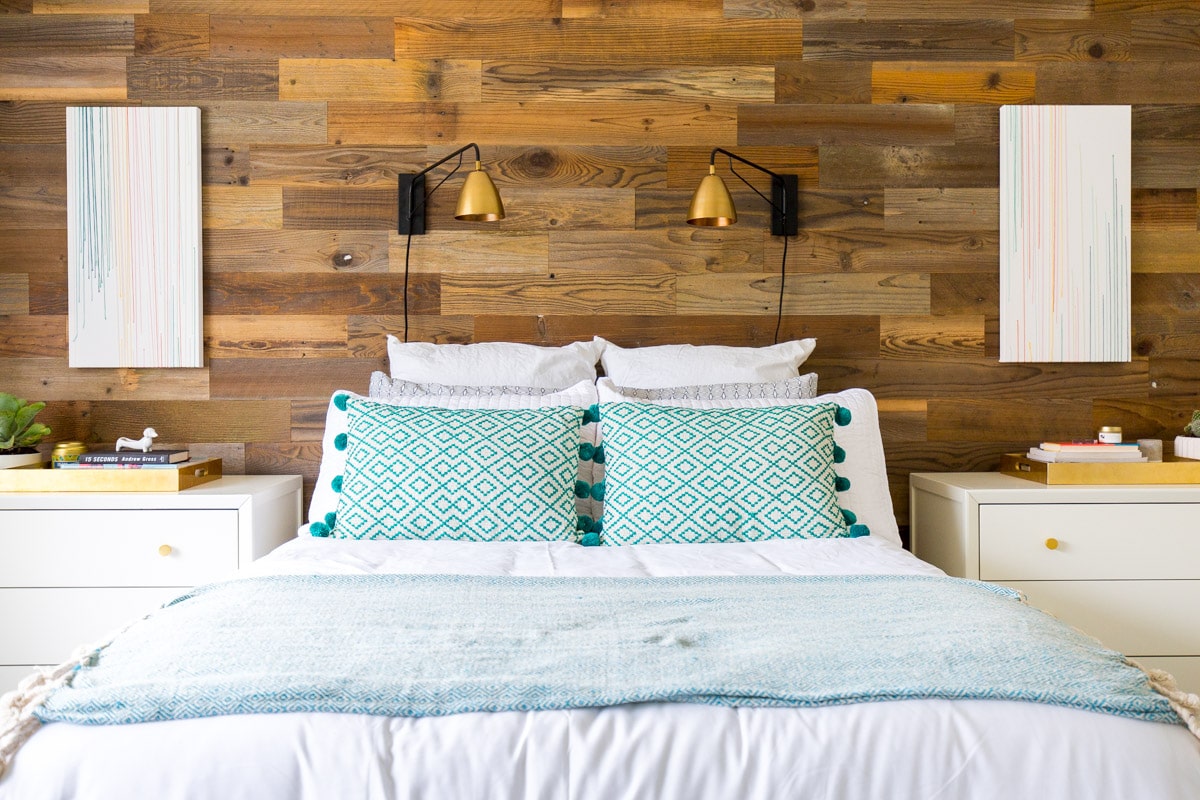
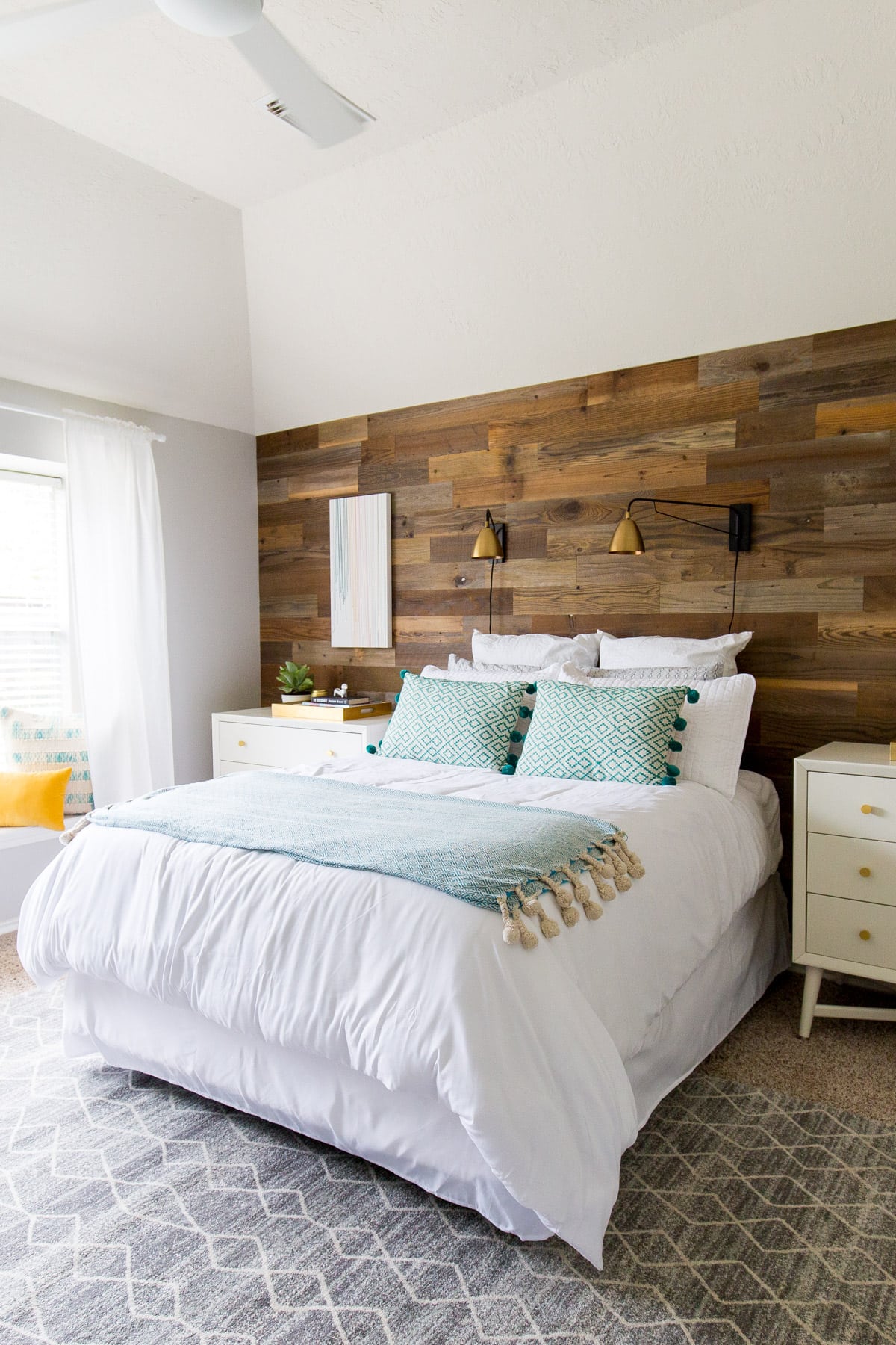
To play off of our popular DIY Stikwood headboard project, Zach really loved the idea of creating an entire Stikwood statement wall behind the bed in lieu of a traditional bedframe.
In an ideal world, we would have replaced the carpet with hardwoods like the rest of the house. But we kept this update super simple by only switching out minor elements.
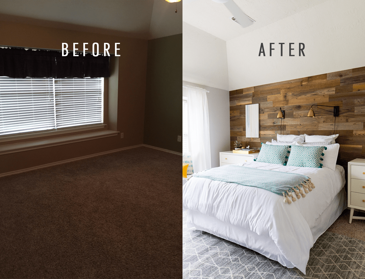
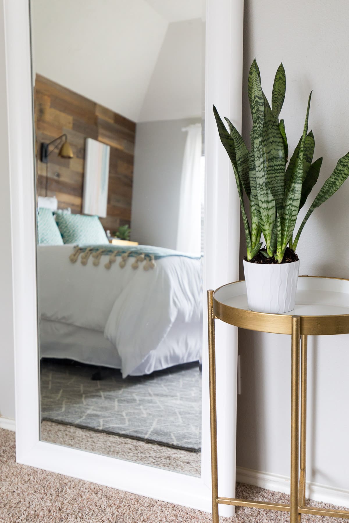
To break up the carpet from the finished Stikwood wall, I chose a neutral grey rug with an abstract pattern to layer on top of the carpet. It seems counterintuitive to layer carpet on carpet, but hey, whatever works in the visual department!
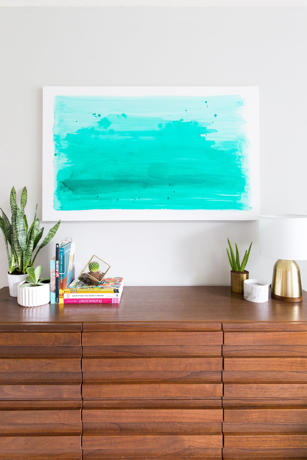
I wanted to keep the lighting and artwork on the Stikwood wall simple so we weren’t covering it right back up, but I still wanted to distinguish the spaces over the white Dwell Studio dressers (we switched the original knobs out for these gold versions) that we used in place of nightstands. Instead of trying to find artwork in our budget that was the right size, color, and style for above the dressers and the other side of the room, I just whipped some up myself using blank canvases from the craft store.
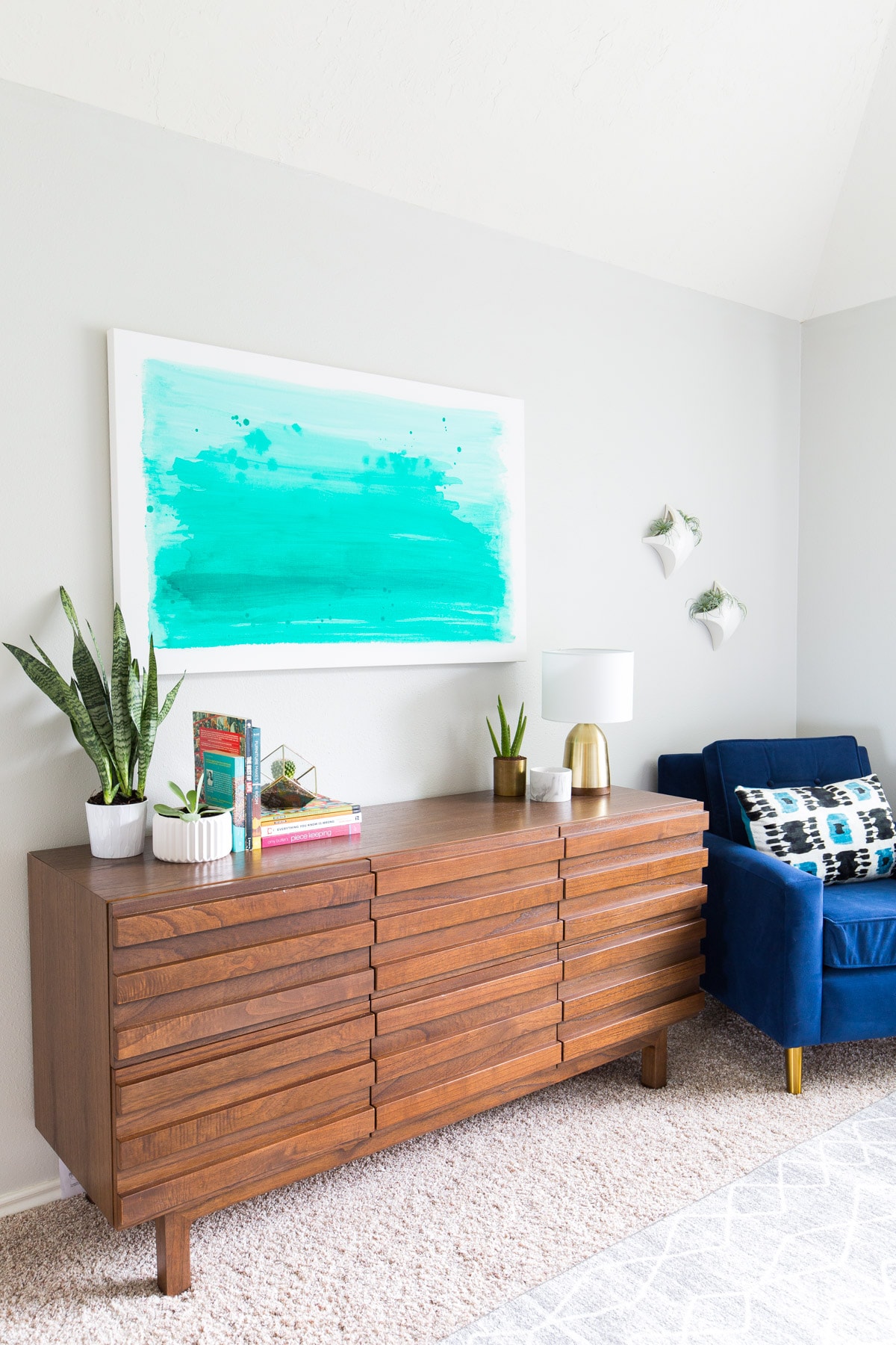
The two pieces over the dressers I made my gluing strands of embroidery thread in neutrals and colors that would pop. For the opposite wall, I painted a teal watercolor print to tie in the fun pom pom pillows on the bed.
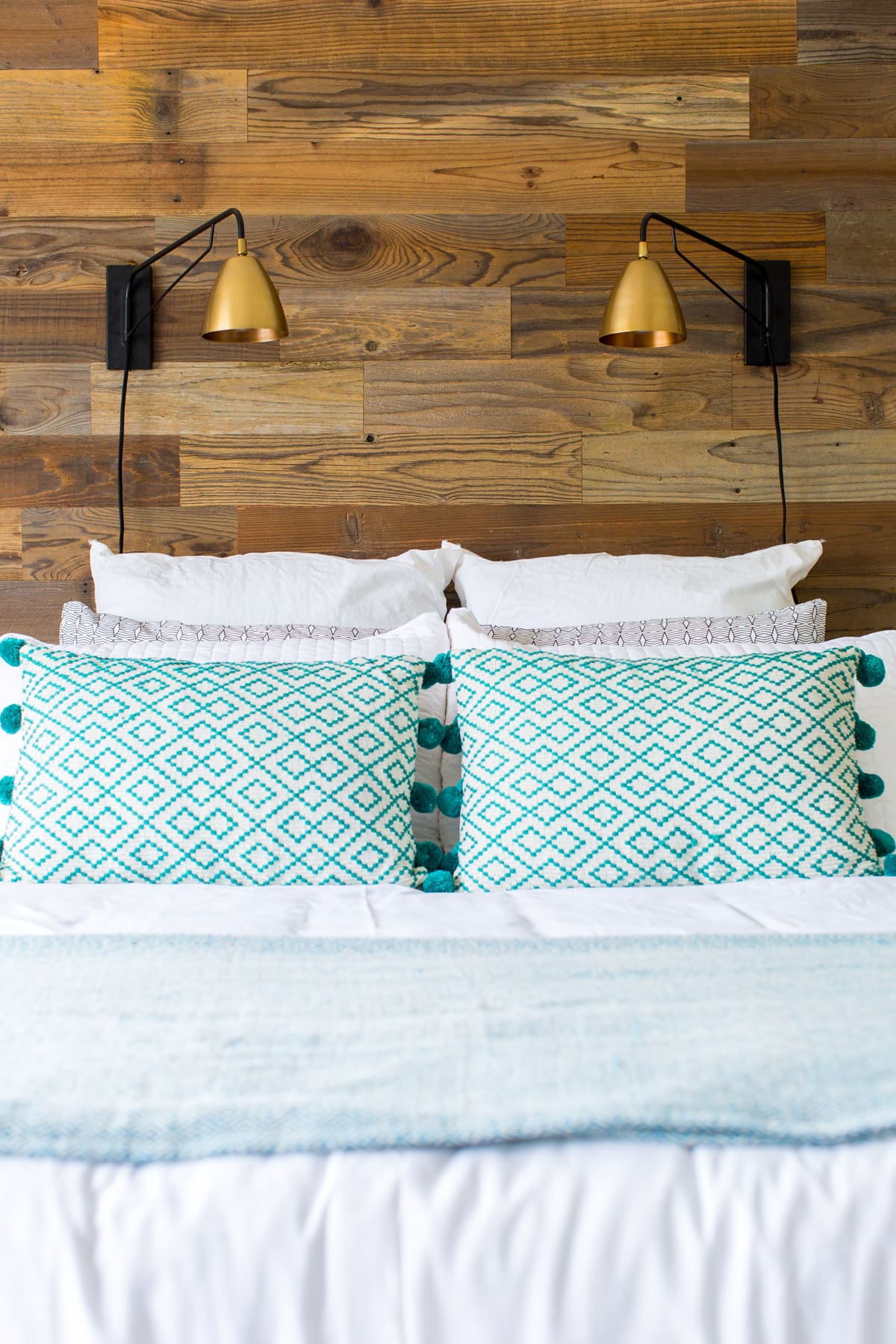
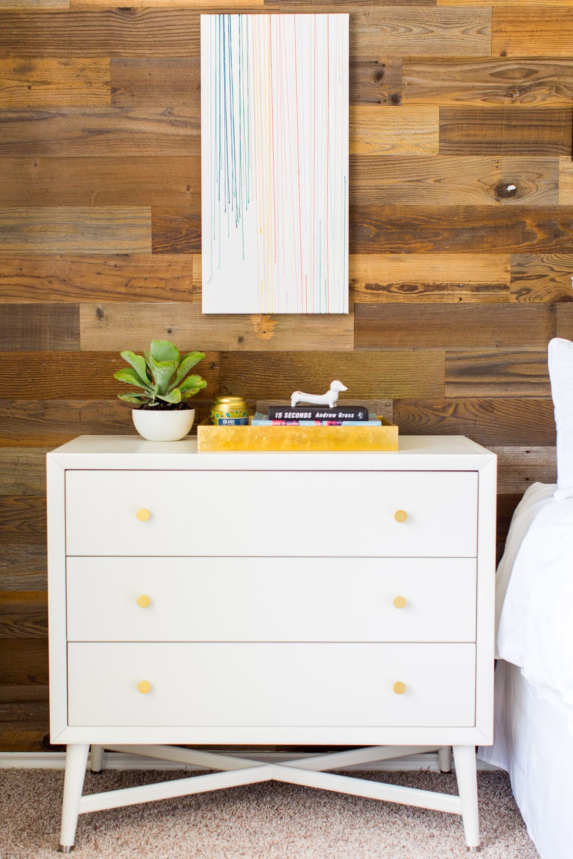
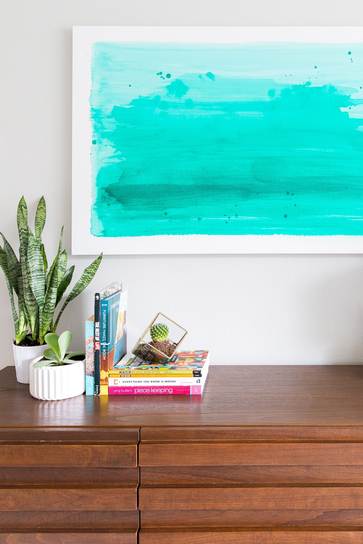
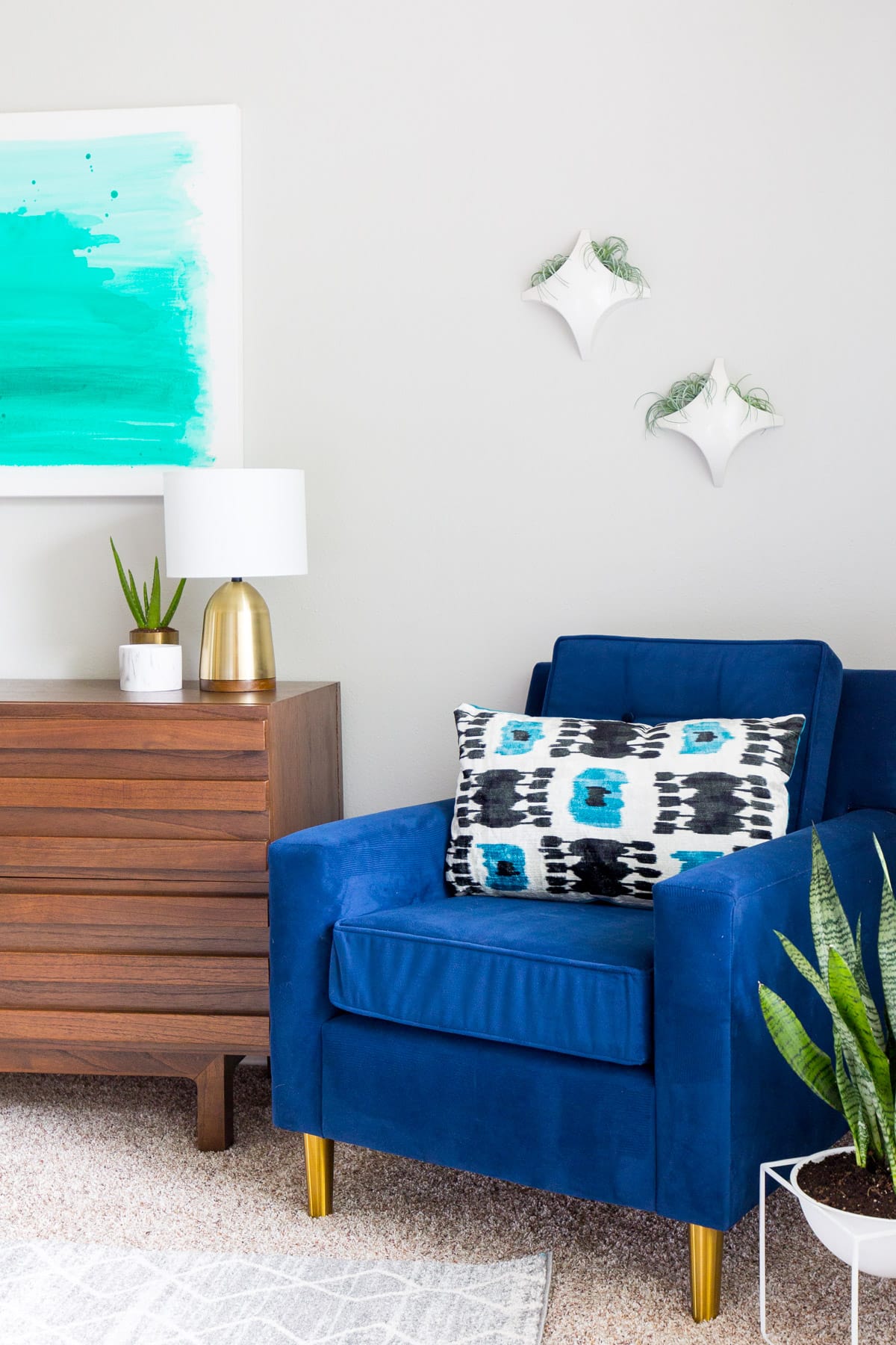
The opposite wall of the bed was a bit trickier because it was too big for just the statement dresser that we chose but not quite big enough for a full chair and lamp to go with it as a reading area.
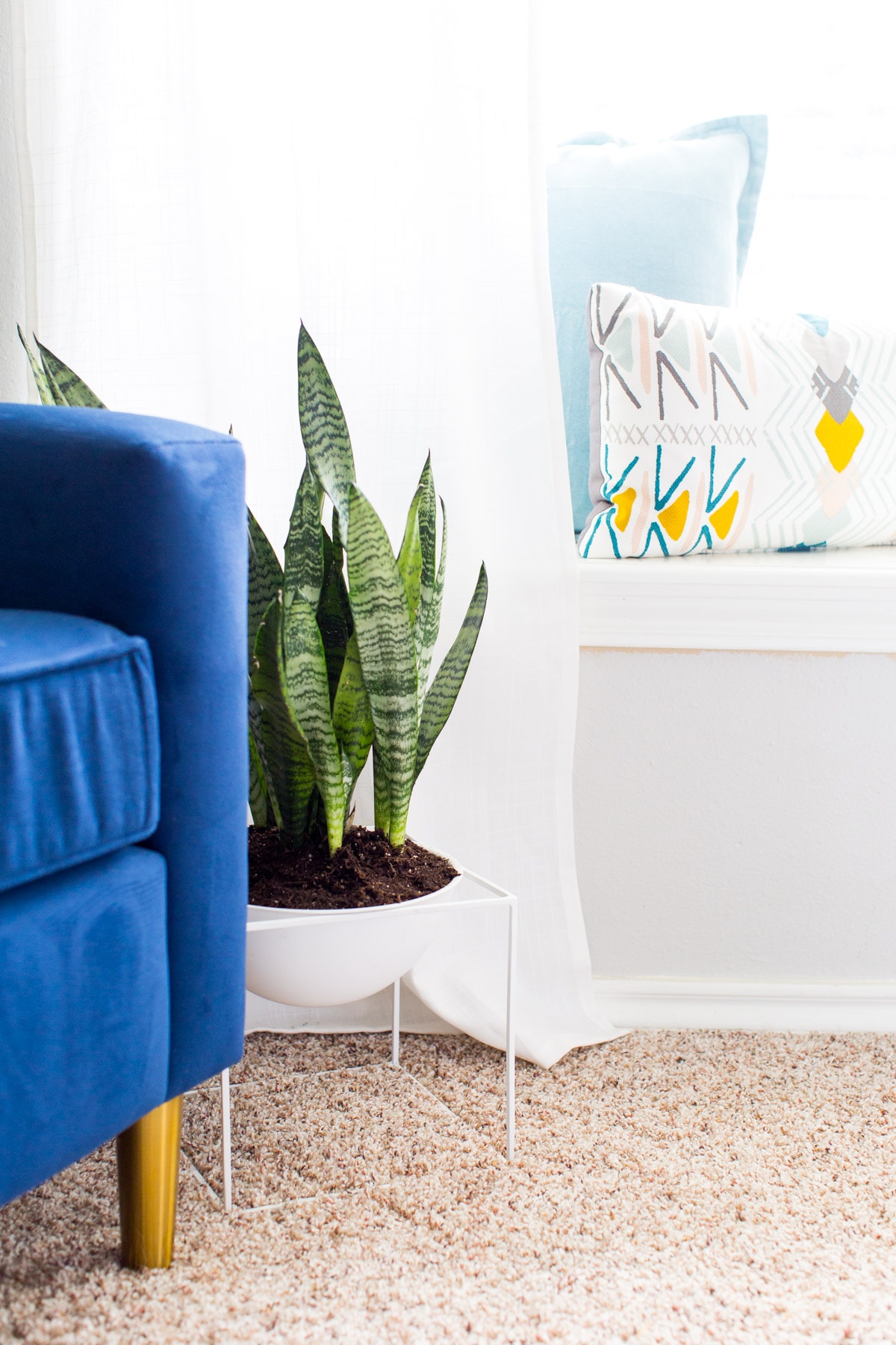
I ended up going with a cool mod planter with a snake plant nestled with this velvet navy side chair, and skipped the floor lamp idea so it wasn’t too cluttered.
How To Balance The Furniture Placement In A Bedroom
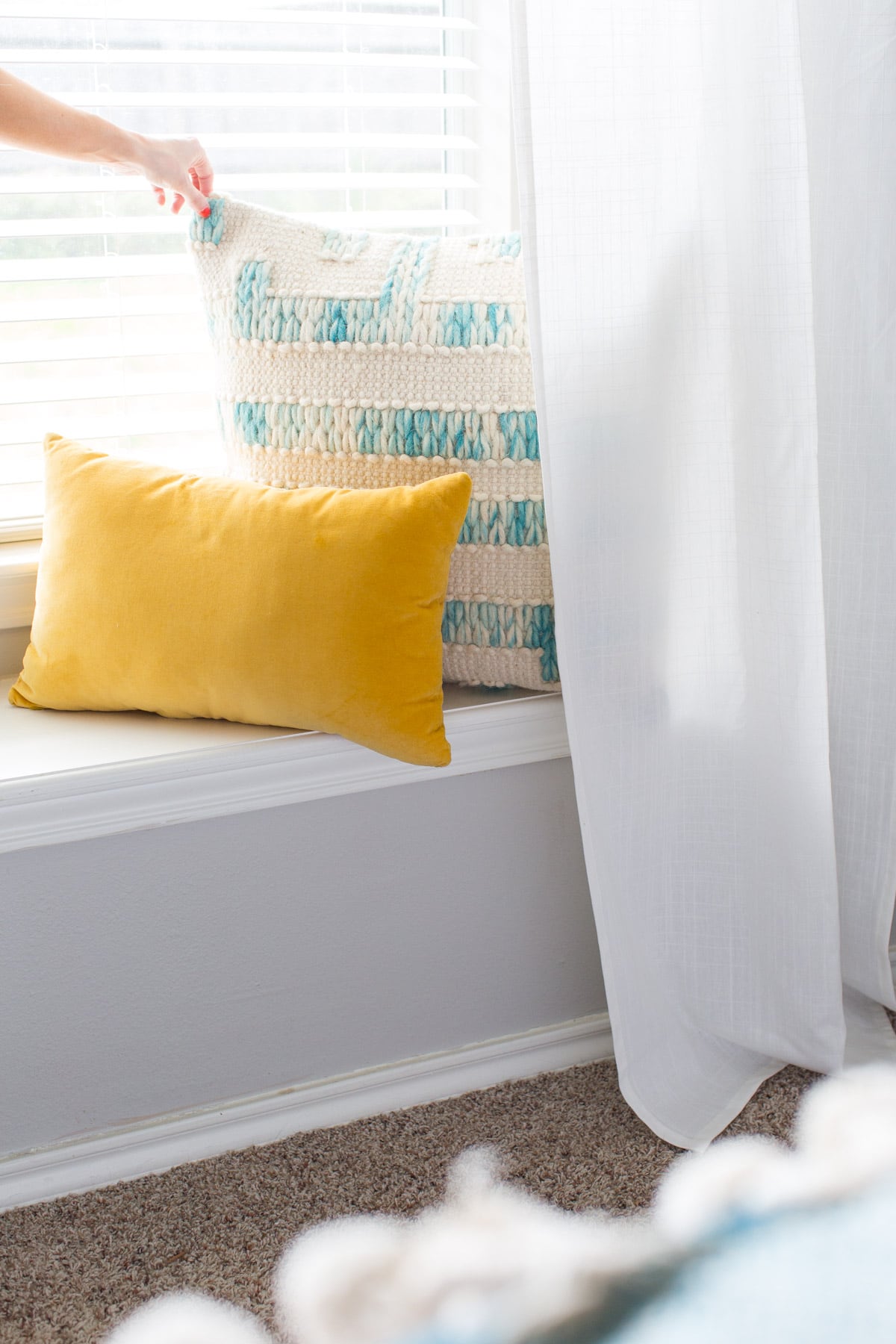
To make sure the room didn’t feel as though it only had furniture on two sides, we added thin white curtain panels and accent pillows on the seated window ledge.
I also used a cute gold accent table with an oversized floor length mirror leaning next to it as a focal point at the entrance of the room.
Also not pictured are the pretty hilarious candid photos we took in the midst of trying to sneak their fur child, Frank into a picture.
I figured I should stop at about 20+ photos this time around.
What do you guys think of the before and after simple bedroom makeover?! Things you love, don’t love?
It was awesome getting to gift this room facelift to them. And I’m excited to share a few more we have coming up in the next few months.
We may or may not even be giving a room makeover away, wink wink!
Simple Bedroom Makeover Room Sources
- Stikwood Sierra Silver
- White mod planter set
- Gold round mirror set
- NuLoom dede grey rug
- EQ3 burrows dresser drawer
- Light blue woven throw pillow
- Pom pom pillows
- White full length mirror
- 3 piece white duvet set
- Lucille floor lamp
- White ceiling fan
- Gilded pop up side table
- Pom pom throw set
- White footed geo planter
- Matching white side dressers by Dwell Studio
- Navy side chair from Wayfair
- Bronze wall sconces from World Market
- Gold lacquer tray from West Elm
- Patterned shams from West Elm
- White bedskirt from Target
- Ikat velvet throw pillow from World Market
- Gold dresser knobs from Target
- Large watercolor artwork I painted myself on a white canvas
- Side table artwork I DIY’ed within embroidery thread
Please note that we may earn a commission for some of the above affiliate links. However, products featured are independently selected and personally well-loved by us!
Looks great! We love the carpet on carpet look – definitely not counterintuitive. And at least if you do swap for hardwood later, you have a rug already! Beautifully styled – huge fan of the room!
Great content and the looks really awesome that every home owner can refer through.
Love the Dwell Studio dressers especially with the brass knobs. Considering buying the same dressers…but need to know the clearance underneath them and can’t get answer…even from Dwell. Wayfair says the legs are 4”…but I can’t magine that measurement is accurate. Can you please advise?
Where did you get the two matching wall lights over the bed from?
Wow – this is so good, Ashley! Lucky them. :)
Carrie
http://www.wearwherewell.com
Thank ya! Just call us fairy godmother, haha!
Wow I absOLUTELY LOVE THE ROOM TRANSFORMATION! THE STYLING IS BEAUTIFUL, THE POP OF COLOUR PERFECT! XX
Thanks so much, Sophie! It was so much fun to put everything together.
Love the room setup and modern chic decor!! The colors flow so well And it all balances out sO nicelY! Awesome!
So glad you like how it turned out, Cory!
I always have A hard time Placing furniture in the beSt locAtion within a room to NOtonly maKe the best Ofmy sPace but to add that grEat FinisheD look. How sweet to flip a room fOr a soecial friend. Looks fantastic With a unique style!!!!
It was such a fun project — totally agree on placing furniture!
That custom headboard completely changed the room! Amazing. I want to do this now.
Totally! The headboard was definitely my favorite part of the room :)
looks so good! i want those wall sconces
us too! haha:)
Very nice! I like the wood accent wall. I’m curious though – did all of that new light come from just painting the walls? You mentioned lighting changes – did you change the ceiling fixtures, too?
painting the walls lighter colors and removing the previous window treatments that were covering up the natural light is what changed the space so dramatically. We did switch out the original wood fan with a modern white one from Wayfair, but we didn’t turn on any lights for the final photos! it’s crazy what a huge difference paint and curtains will make!
What a lovely room, lucky couple! I’ve been seeing that lamp everywhere (the one on the dresser), and I so want it even more now!
I love it too! I thought it was going to be taller than it actually was, but once we hung the artwork it balanced it out nicely :)
Looks great!! I would have sworn that dresser was vintage – so good! I love the carpet you picked too – we have a hodge-podge of Ikea & UO area rugs in our place (pet rabbits hate walking on wood floors) but I really wish we had gone with something more like the rug you used! Great job! :)
I know, right?! I loved it so much, the gold knobs really made it pop, too.