5 Cool Graphics You Can Make to Grow Your Following in Under 5 Minutes
Fellow creatives, this is sooooo going to be your jam! Literally, I think I said out loud approximately 578 times while visiting the PicMonkey headquarters in Seattle back in April.
I’m not sure what whole I’ve been living in, but I was very much not familiar with what PicMonkey is currently all about and now I’m very much their number one fan. A self-proclaimed, overly-excited spokesgal actually. ANYWAYS, I’m sure you don’t actually care about my cheerleader tendencies, so let’s skip to the good stuff.
To start off this love affair, I’m sharing 5 cool graphics you can make to grow your following in under 5 minutes with PicMonkey. And no, this isn’t a Sham-Wow infomercial, you can LEGIT make very cool stuff in less time than that.
Double bonus, you don’t need to know any fancy software design skills, all you need to know is how to type and use a mouse. If you’ve gotten this far into this blog post, then you’re officially qualified to make really beautiful images with this program.
To give you the best visual of how I designed images for Sugar & Cloth, Jared helped me clip together this quick video to walk you through how I made each one. The key takeaways here: the program already comes with allll the templates you can think of an are already optimally sized for sharing, each project automatically saves into the PicMonkey hub (a cloud storage system that you can access from anywhere, even your phone via the app), and you can upload your own images and custom brand colors to make anything unique to your style…
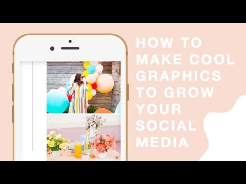
It’s also awesome for having standard graphics across the board if you have a team helping you. For instance, the featured photo in this post is copied and saved in my hub as a “master template” and anyone from Sugar & Cloth can log in and make a copy, upload photos and text into the same design, and then it’s ready for publishing again with new content. Easy peasy!
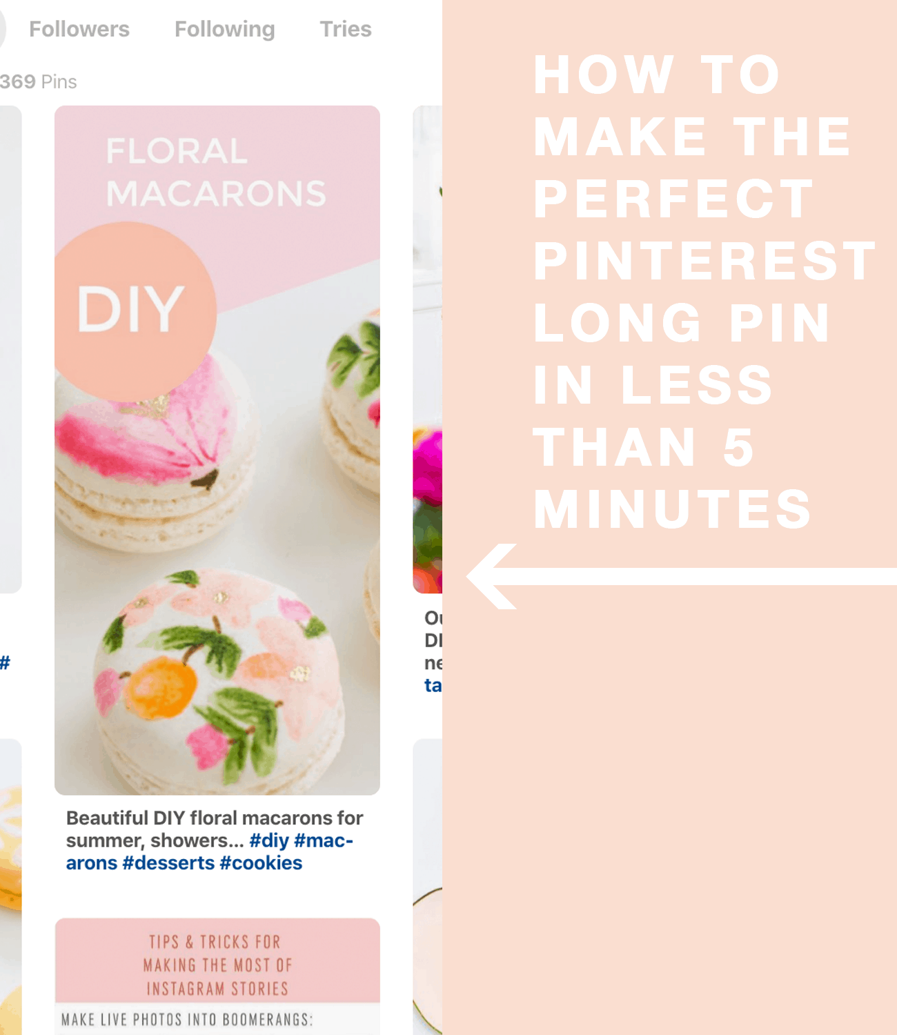
— Pinterest Long Pin: Use the blank templates or customize an existing template to create long pins that stand out quickly and easily.
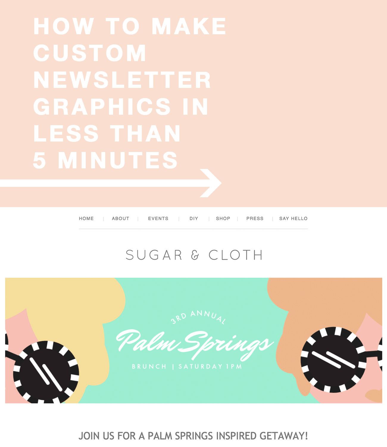
— Custom Newsletter Images: No one has time to round up allll of the content, links, proofreading, and making fancy schmancy images for their newsletter each week. Editing pre-made graphics with custom colors, images, and text is so much more realistic for us!
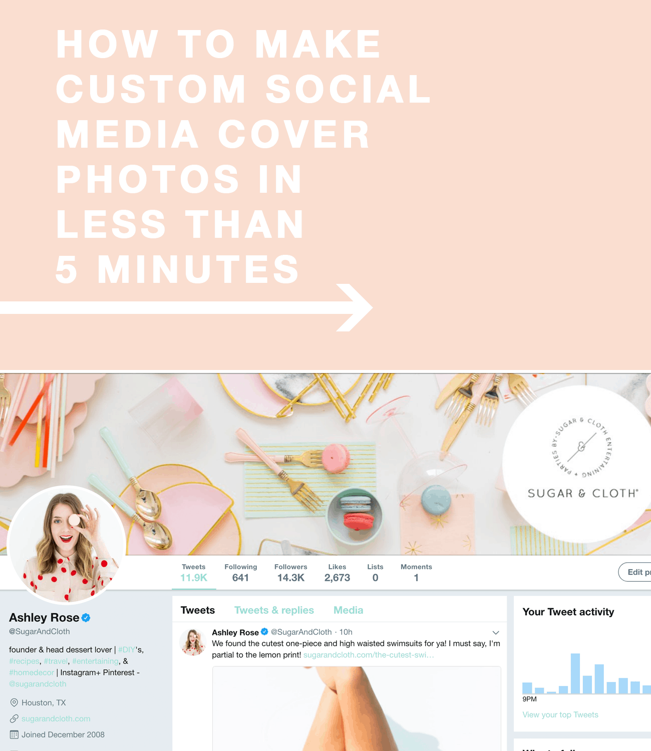
— Cover Photos: Raise your hand if you know someone who could use a serious cover photo makeover on their social accounts! Not going to lie, mine could use some updating as well. Even using a blank template that’s already made to size for each social channel speeds up the process tremendously.
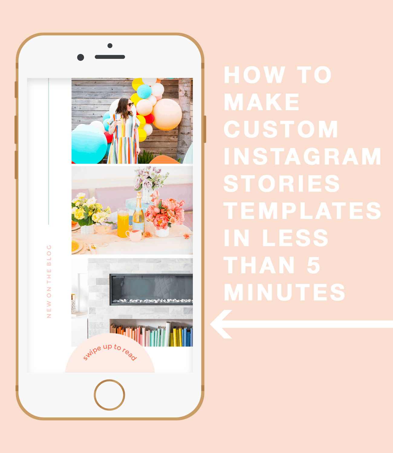
— Instagram Stories: Ohhhh how I love a good Instagram Stories cheat, and a “custom” swipe up design for featuring your latest and greatest blog posts, products, or shopping links is so convenient.
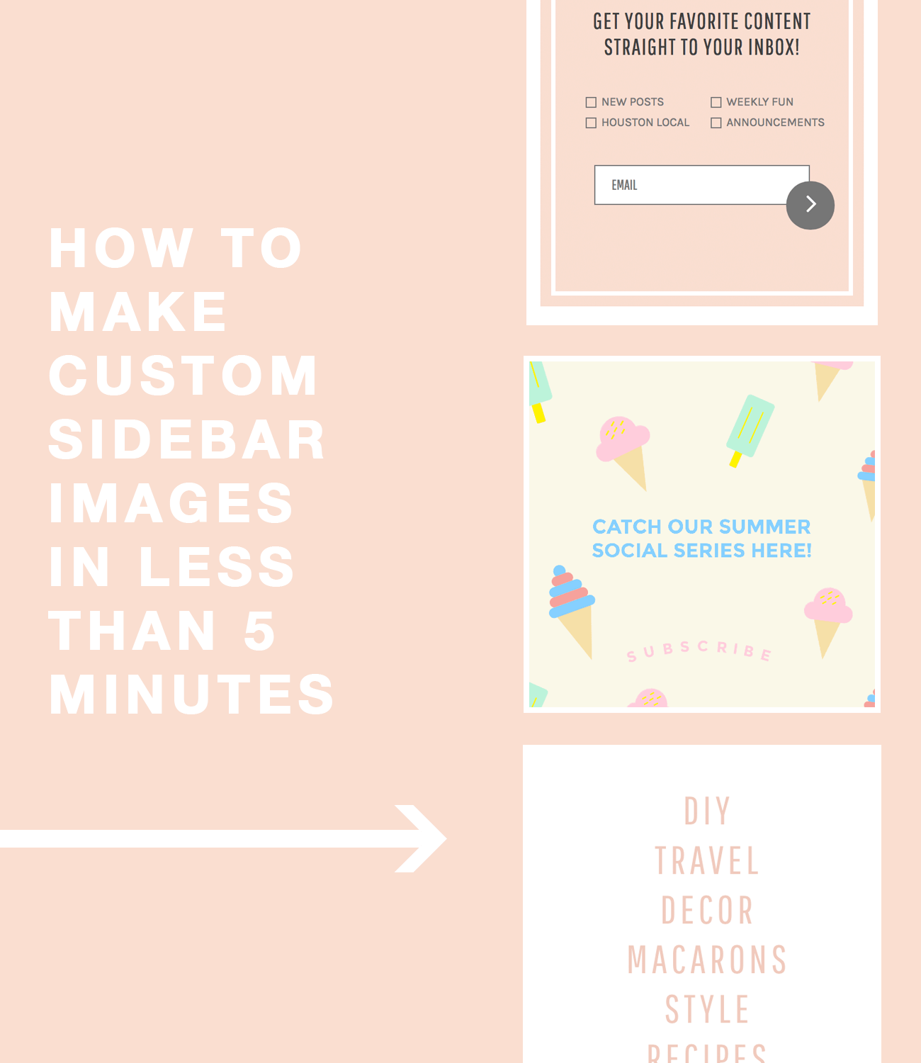
— Sidebar Graphics: This is one where customizing an already designed template is great for feeling like you’ve had professionally help with your site content rather than a jerry-rigged design job that you did on your own while half awake at midnight the night before.
Pretty sweet, right?! Since they’re just launching the new program, you can sign up with 48hours of this blog post going live to get 3 months for free. #worthit
AAAAAAND here’s a little clip from when we visited the PicMonkey HQ in Seattle in April —

I’ll be sharing more tips for using the software in the next few weeks too, so if you have any specific questions let me know!
Thank you to PicMonkey for partnering with us on this post! Sugar & Cloth has chosen to donate 5% of all sponsored campaigns to charity, which you can read more about right here.
Please note that we may earn a commission for some of the above affiliate links. However, products featured are independently selected and personally well-loved by us!
Thank you for sharing this information with me.
it was just music ;)
This is so exciting, what an amazing tool – I don’t know how I have never come across it before. Loved the video too, so cute and I can’t wait to get started. I think I will go for a sidebar image first. Thanks so much for sharing!
Holly from The Art of Being Holly xo
Hi Holly!! I know, it totally blew my mind when I first tried it. Let me know how you like it! :) Thanks for reading!
The music was so loud, I could not hear what you were saying in your video.