One Room Challenge Week 6- Our Living Room & Dining Room Design Reveal
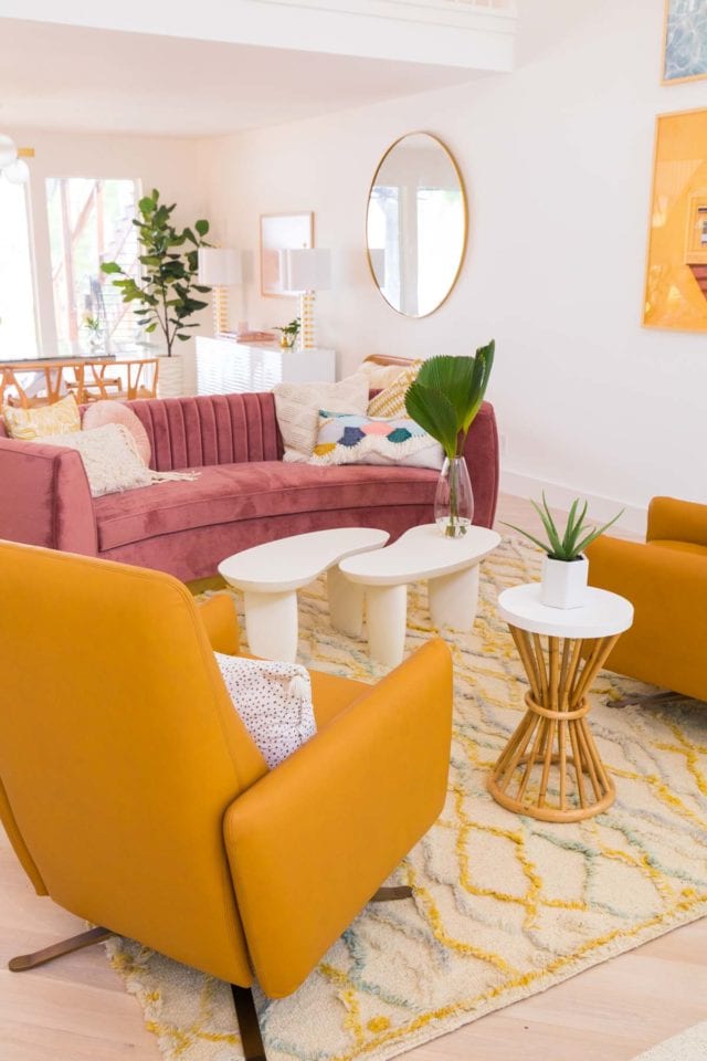
I truly cannot tell you how satisfying it is to see a finished living room and dining design after having closed on our renovation house seven months ago!
I definitely didn’t think it would take as long as it did. But we also weren’t expecting half the amount of hurdles that we came across along the way!
But really, does anyone?! I wanted to work on our living room and dining room design for the One Room Challenge since it’s the first space that makes an impression when you walk into the new house.
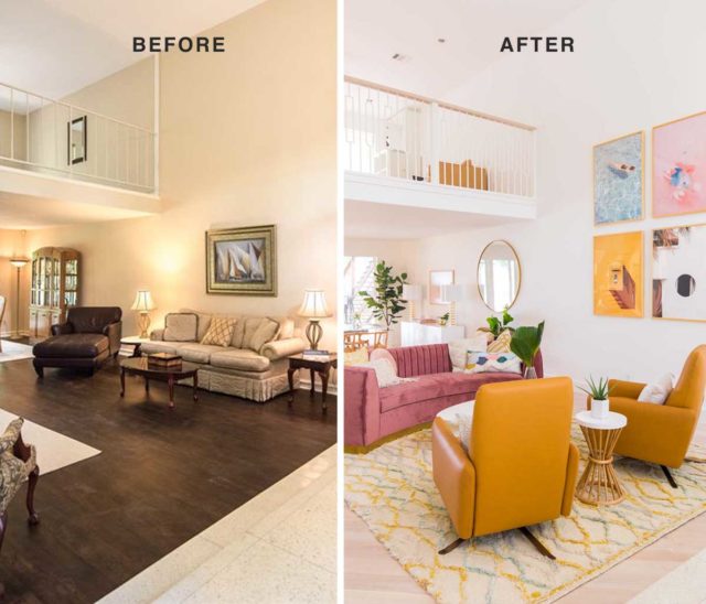
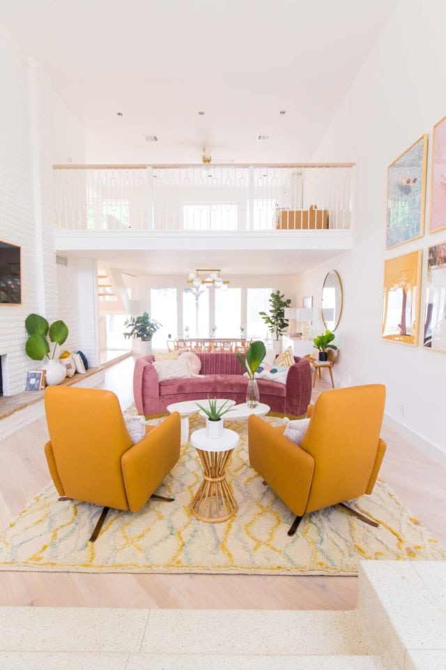
I think we can safely say that it is quite the statement with color, mid-century vibes, and a much brighter entrance now!
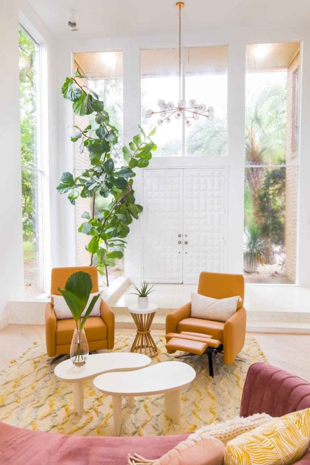
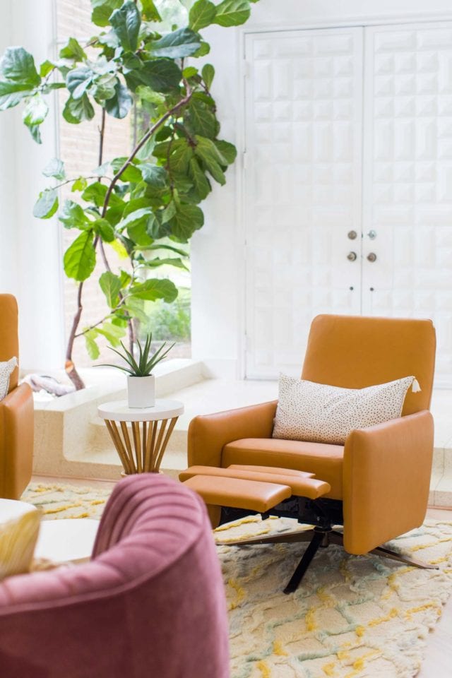
When we were house hunting, the listing photos of the entrance to the new house immediately caught my eye. It had really unique characteristics like the original terrazzo foyer with built-in planter.
The front doors are also original to the house and were custom made out of state and installed when the house was designed and built in the 70’s.
If you’ve been a reader for a while, then you already know that we LOVE our natural light, so all of the windows were a double win!
Granted, when we snapped these room photos yesterday it was pouring rain (Houston thunderstorms, yikes!) so it doesn’t quite do the evening light justice. It’s seriously so beautiful in this room in the evenings. Thankfully we have many a future Instagram photos coming of that. Haha!
Our Flooring
As for the design process, we knew right away that we wanted to replace the cheap, vinyl flooring with a lighter hardwood.
We ended up choosing Stuga Studio Oak Alpine to utilize throughout the house, but we added a little flair to this room by having our construction team, Genesis CP, install it at a 45-degree angle.
We just didn’t know about THAT thing we were going to find underneath the flooring during the demo phase.
Once we had the flooring debacle ironed out, the rest was as easy as repainting the entire room and deciding on furniture elements…

Our Furniture
As much as I wanted this space to be beautiful and fit the retro vibe, I also wanted to make sure we were selecting pieces that were functional. Especially having a Gwen running around!
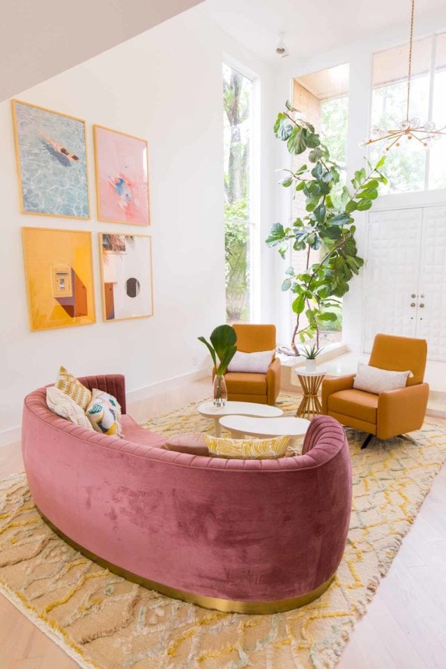
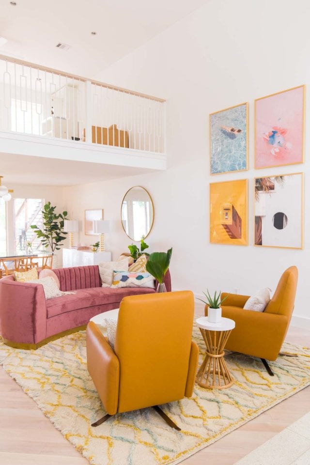
For instance, the Loloi rug designed by Justina Blakeney is perfectly soft and subtle but great for disguising sticky hand or footprints thanks to its texture.
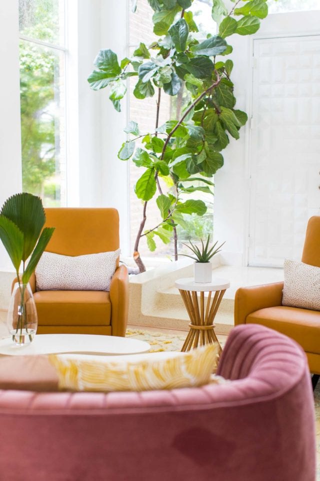
The American Leather Blake chairs in bison butterscotch are not only STUNNING, but they are such comfortable recliners. You would never even know they recline based on the design!
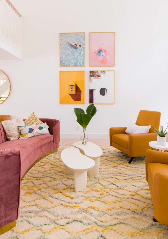
The coffee tables have a really fun mid-century shape but the rounded corners are great for keeping head bumps to a minimum with a toddler running around.
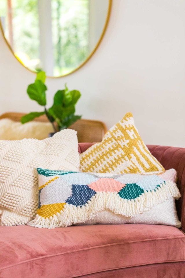
Admittedly, I was surprised by the deep color of the sofa from Overstock when it first arrived, but it’s really grown on me!
This was my original sofa choice, so I had to switch up some of my pillow selections in order to make the new color scheme flow better, but I love the way it turned out! It also has a deep seat which makes for comfortable lounging along with a forgiving color for sticky hands.
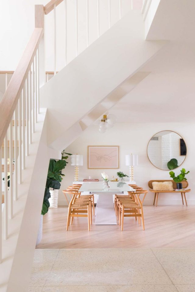
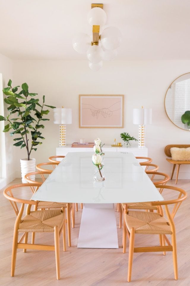
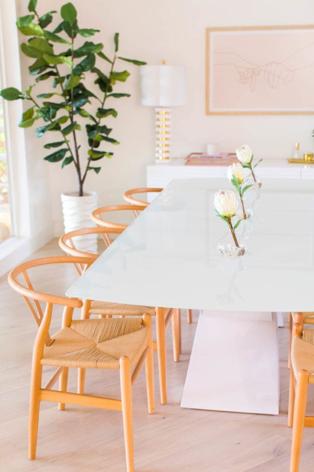
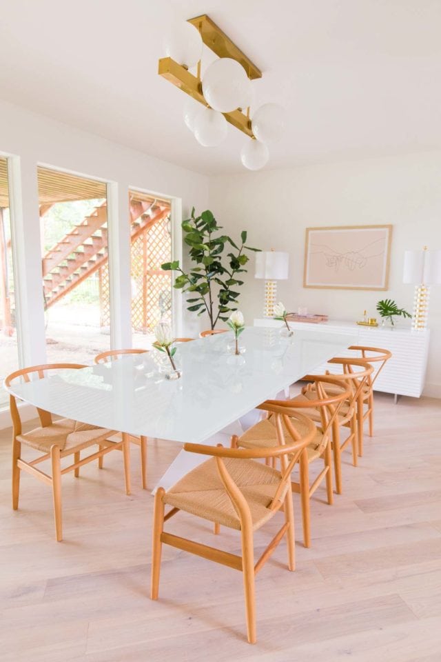
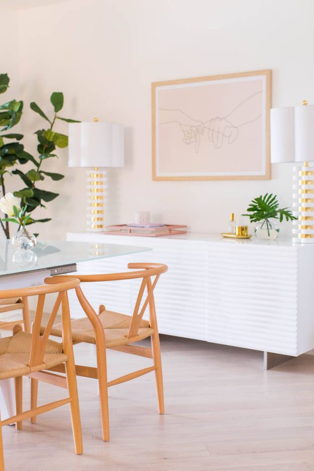
I also immediately fell in love with this extendable white dining table paired with the Tia Y chairs from Overstock as well. It easily sits 10 which is perfect for family gatherings and our future styled tablescapes!
Especially with our tabletop goods stored in the modern white buffet, and I’m so excited with how it looks alongside this Hudson Valley Lighting pendant light and matching Couture Lamps!
Our Artwork
I definitely did some debating when it came to choosing artwork for above the credenza and the main part of the living room. What do you think?! Too loud, too colorful, or just right?
The set of four prints in the living room are from Minted (I linked them all individually below!). As for the dining room, I decided on keeping it simple since the living room had so many pops.
I came across this print on Etsy and used photoshop to change the background color before having it printed and framed.
Our Accent Decor
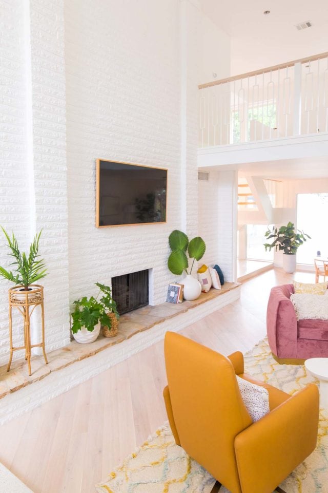
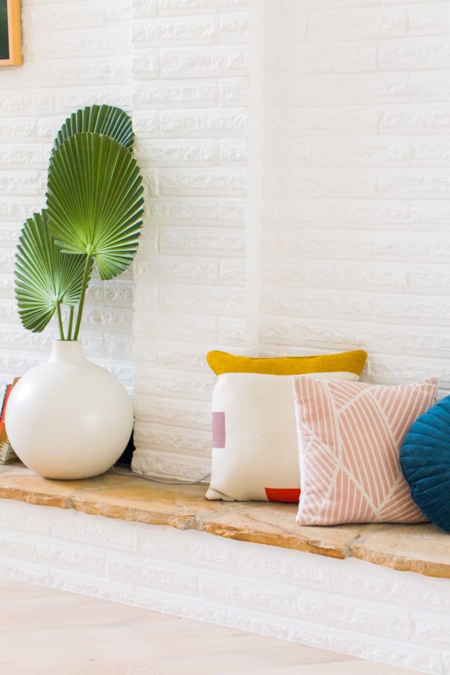
Once all of the large items were in place, it was all about selecting accents and textures to go along with it. I went heavy on the plants in this room since the large fiddle fig that came with the house really set the tone for that.
NDI has some BEAUTIFUL pieces like the protea on our dining room table, the tropical leaves on the coffee table, and the other faux fiddle figs in the dining room.
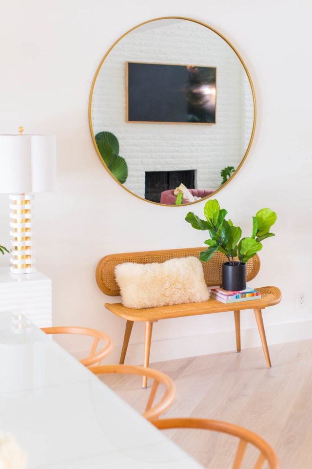
When was did all of the furniture unboxings I realized that we had a hefty sized gap in between the dining and living spaces, so I stumbled on this rattan bench last minute to make a seating area to tie the two together.
I think it came together really well considering it was so last minute!
This room feels so cozy, welcoming, and full of personality now. We’re actually moving into the new house this week, and I can’t wait to start using this space!
One Room Challenge Living Room + Dining Room Reveal Room Sources
- Modway Mauve pink sofa
- Tropical faux plant from NDI
- American Leather Blake recliners in Bison Butterscotch
- Justina Blakeney for Loloi Symbology Rug
- Jelly bean modern white coffee table from CB2
- Minted Soft Coral artwork, Minted Going For A Swim artwork, Minted Havana artwork, Minted La Poste artwork
- Rattan bench from World Market
- Large round gold mirror West Elm (above bench)
- Simple Living Tia Y Dining Chairs in natural
- MOON high gloss white buffet
- Quatrefoil Lamps in white and gold (on buffet)
- B Modern White Dining Table
- Hinsdale gold chandelier by Hudson Valley Lighting
- Fan palm in a glass vase by NDI
- Faux fiddle fig by NDI
- Glass protea set by NDI
- Pinky Finger artwork from Etsy (but I edited the colors to make it custom before printing and framing)
- Round oversized vase in white
- Rattan side table from Target
- Flooring – Stuga Studio Oak Alpine
- Wall paint – HGTV Sherwin Williams High Reflective White
- Construction – Genesis CP
And now that we’re on the final reveal week, definitely be sure to check out all of the other participants along with their before and after designs!
At Home With Ashley | Casey Keasler | Dorsey Designs | The Farmhouse Project | Home Made by Carmona | House of Funk |House of Jade Interiors | House Seven Design | House That Lars Built | Inspired by Charm | Jana Bek | Jessica Brigham | Kelly Golightly | Murphy Deesign | The Pink Pagoda | Sarah Gunn | Sherry Hart Designs | Sugar & Cloth | Veronica Solomon | Vintage Revivals | Media Partner BH&G | TM by ORC
Please note that we may earn a commission for some of the above affiliate links. However, products featured are independently selected and personally well-loved by us!
I really love what you did in the living room, Good job!
By the way, If anybody needs AutoCare services check out my site
http://www.autorepairgarland.com
Super late to this conversation but I love everything about this space !!! please tell me you haven’t switched to the all neutral living spaces that’s all over 2021
Thank you, Simone! Nope, we are all about color here! We did switch out the couch and the artwork but still had lots of color!
Thank you for the effort you have put into making your site interesting and informative. I will visit the site again to gather some more valuable information. You really did a good job.
mapquest directions
The dining room is beautifully decorated and very luxurious. I really like this cozy decor. online jigsaw puzzles
A bit late… but this living room is gorgeous….Love the airy feeling to it and the colour theme….
sooo cute
Never too late! Thank you so much, Dakota!
3 light meals you share are delicious and have low calorie content. You can draft food without worrying about fat. I really like these dishes.
Love your new vibe. I’m wondering if you laid new floors or whether you sanded your floors down and restained the wood. I have engineered wood floors and trying to figure out if I can lighten them like you did.
Hi Susan! We actually did a detailed blog on the flooring if you search One Room Challenge! In the post, we talked about having to raise the foundation. Yikes! We thought we could use the original and then had to lay completely new floors.
Omg I can’t believe you had to raise the foundation of your house! Oh the lovely discoveries that come during renovation! The finished space is absolutely gorgeous. I love seeing your One Room transformations!
The thing I love about art and pillows is that they’re temporary. You can always change them out if you want to go in a different direction.
Thanks for the kind words, Ashley! Raising the foundation definitely was the least favorite thing about this renovation so far. And we totally agree about art and pillow being easily changeable! XOXO
Another gorgeous room transformation! I don’t know how you pulled this off with all of your major setbacks, but you delivered a stunning living/dining room. I hope you are able to put your feet up and enjoy your beautiful new home. Well done!
Thank you, Linda! We are so honored to be a part of the One Room Challenge again! We don’t know how we pulled it off either but we are loving all the pieces! XOXO
Thanks for your helpful article
Glad we could help!
Love the colours in this space! You’re right, the dark pink sofa is really good (we have a chair colour that’s similar, and I’m getting lots of new inspiration!) Great job :)
Thank you! We originally thought it would be a lighter pink but we’re now thinking that darker pink is a lot more kid-friendly!
Stunning! Thanks for including us Ashley : )
We’ve always had wonderful luck with your rugs so we had to have more in the new home! Thanks for making such beautiful pieces!
Absolutely love the living room component of this! That couch is perfection, and the large scale art is so much fun.
Thank you, Ariel! We did a lot of large scale art with the new house this time! XOXO
What an absolutely stunning transformation!!! I love the use of color and the retro vibe it gives.
We really wanted to keep the retro vibe from the house! Thanks, Jocelyn!
Your design looks amazing! I love the fun color palette you chose! Awesome job! :)
We always put color into everything! Hopefully, not too much? Thank you for your kind words!
Holy smokes….this is amazing….I love all of the soft color mixed with white. Perfect combination. I can see the thought and planning that went into this space! You must be thrilled!
Sooo much thought and planning that we couldn’t wait to just execute it! Thanks, Sherry!
I am amazed at your unique style, vision and attention to detail. Just Gorgeous.
Thanks, Grace !XOXO
I am obsessed with your couch! Wow!
Thanks, Anna! We are loving the couch too!
Just dying over those fiddle leaf figs… So gorgeous!
I love how light and airy your home looks! The pops of color with the furniture is lovely, as well!
Thanks, Sara! XOXO
Such an inviting space!
Thanks, Suzy! We were hoping for the inviting vibe once you walk in!
Love the warm colors of the furniture!
Thanks, Sommer! XOXO
This space is simply breathtaking! We are honored to have been part of this project – the result is nothing short of absolutely stunning.
Thank you! We feel so lucky to have your Blake chairs in our new space! XOXO
I am moving in. The colors in the living area are to die for. Those prints on the wall are perfection. The light above the table!!
So, so good, and congrats on getting this room DONE.
Thanks, Kayla! We love every spot in the house too!
What an incredible space to work with! You did an amazing job. This is such a beautiful, bright, and cheery space! Congrats on nailing it :)
Thank you for the kind words! We were going exactly for bright and cheery!
Absolutely dreamy! I love the pinky print. What service do you use to print/frame and what size did you land on? Thank you! ✨✨✨
Hi Lucie! We used Frame It Easy in size 40×30. Hope this helps!
Wow!!! It looks amazing!!!!! You did such an amazing job! Anyone would be happy to walk into a space like that! I think I found the one thing you didn’t link and probably because it will be in a future post instead but I have to know! Where is the railing from???
Hi Nicole! We completely took out the old stairs and our contractor built a new one. We thought we could save the railing also but re-designed it ourselves!
Amazing like always! I love every detail💕
Thanks, Lusia! XOXO
If you were going for the 1980’s you nailed it!
Totally wanted an old yet new vibe! Thanks, Georgia!
You crushed it! It’s so warm, inviting, colorful, airy and happy.
You have such a great eye for color and this feels next level.
Also shout-out to the hubs for getting these photos in the rain (it looks all sunny up in there!).
Thanks, Kelly! Yes, we were really worried that the photos wouldn’t translate to what the space actually looks like when it’s bright and sunny outside!
I love everything about it! Cozy and modern 💛 Great job!
Exactly the feel we were going for! Thanks, Karla!
WOWOWOWOWOW this room is just AMAZING!
Thanks, Kristina! It has been the most challenging even though we thought it would be the easiest!
I am forever in love with your ideas and execution. It’s safe to say that you’ve successfully created a freaking impressionable space. It’s been a long time coming, Ashley, but soooo worth it.
Totally a long time coming!!! <3 <3
Images looks so lovely and charming. I love your living room and dining room ideas. Thank you for sharing such helpful tips.
Thanks, Sarah! XOXO
I love the furniture pieces in the living room SO much, the layout and the art you chose are so right! It I’m being honest, I feel like the rug doesn’t quite hit the mark. It feels too busy or perhaps it’s the colors? – I’m not sure, but that’s the one part of the room that feels off. The dining room is 100% perfect! Overall, I’d love to live in that space, rug and all! Well done!
Thanks, Michelle! We thought about a solid color rug but everything would have a color block look so we went with a subtle print (cause everything we have is seriously all patterns)!
Girl!! So good!!!!! All the heart eyes for this! I can’t wait to see the rest of the spaces as you finish them!
We can’t wait to show the rest of the space too! Hopefully, we don’t run into anymore delays! XOXO
Beautiful, practical, and suits the period of the house very well. Well done. Is that a Frame TV? Do you like it? I have been going back and forth about whether it is worth the extra cost for the pretty trim.
Hi Heather! Yes, it is a frame TV. We’ve just been in the house for a few weeks and have been barely home so we can’t exactly tell you how different it is yet. Aesthetically though, we love it! It makes the TV standout less. We didn’t want that to be a focal point or take away from the artwork… especially since it’s black while everything is so bright and colorful.
OBSESSED! You did such an incredible job! Colorful without being loud. I am in love.
Thanks, Anastasia! We really do love color! And we’re glad to know it’s not too loud.
What color white was used for the walls?
Hi Christina! The paint info is in the post with a link to the exact product! We used the HGTV Sherwin Williams High Reflective White wall paint.
Amazing, Ashley!!! So beautiful! cannot wait for the whole reveal. :)
Thanks, Izhar! We’re pretty excited for it to all be done!