Sugar & Cloth Casa: Our New Floor Plans for the First Floor!
In case you were wondering if it was possible for house floor plans to be 98% storage cubbies and the rest to be 2% of living space, the answer is yes! We literally bought that house, haha!
I know I’ve been a little quiet on the house renovation front unless you’re following on IG stories because most of what Genesis has been working on can’t really be photographed. For instance, we have to repipe the entire house with new plumbing, fix all of the A/C, repair all of the electrical, fix a sinking foundation problem, and more.
I’ll fill you in on details of what I should’ve done differently with those later, but for now, I figured some new floor plan visuals would be much more exciting since it’s already been a pretty heavy week around here after my year in review!
Before we get started with the new and old plans for the first floor, let me just tell you that our construction team has saint-like patience with me when it comes to constant changes. The problem is that I didn’t realize certain pieces of the layout were an issue until I started semi-designing them…
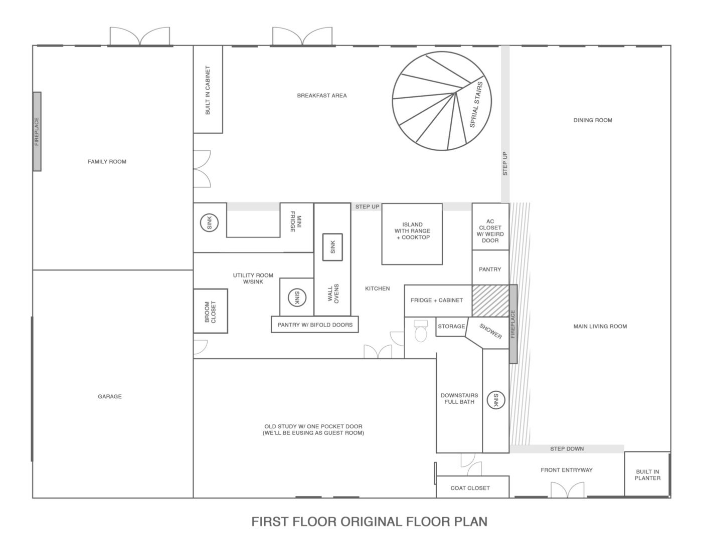
THE ORIGINAL FLOOR PLANS OF OUR NEW HOUSE

A great example is our kitchen (see the original photo of it here). You’ll notice it isn’t too much different than the original floorplan (minus the ridiculously sectioned off and over the top wet bar). At first, I thought that rearranging some appliances was all that was needed until I realized that it was going to leave us with a total of TWO upper cabinets for cups.
Don’t get me wrong, I love the cute open shelving that’s popular right now but I’m not planning to replace my mismatched cup collection just because of that. I also am weird about eating utensils being on open shelving where they could get dust or pet hair on them, is that just me?
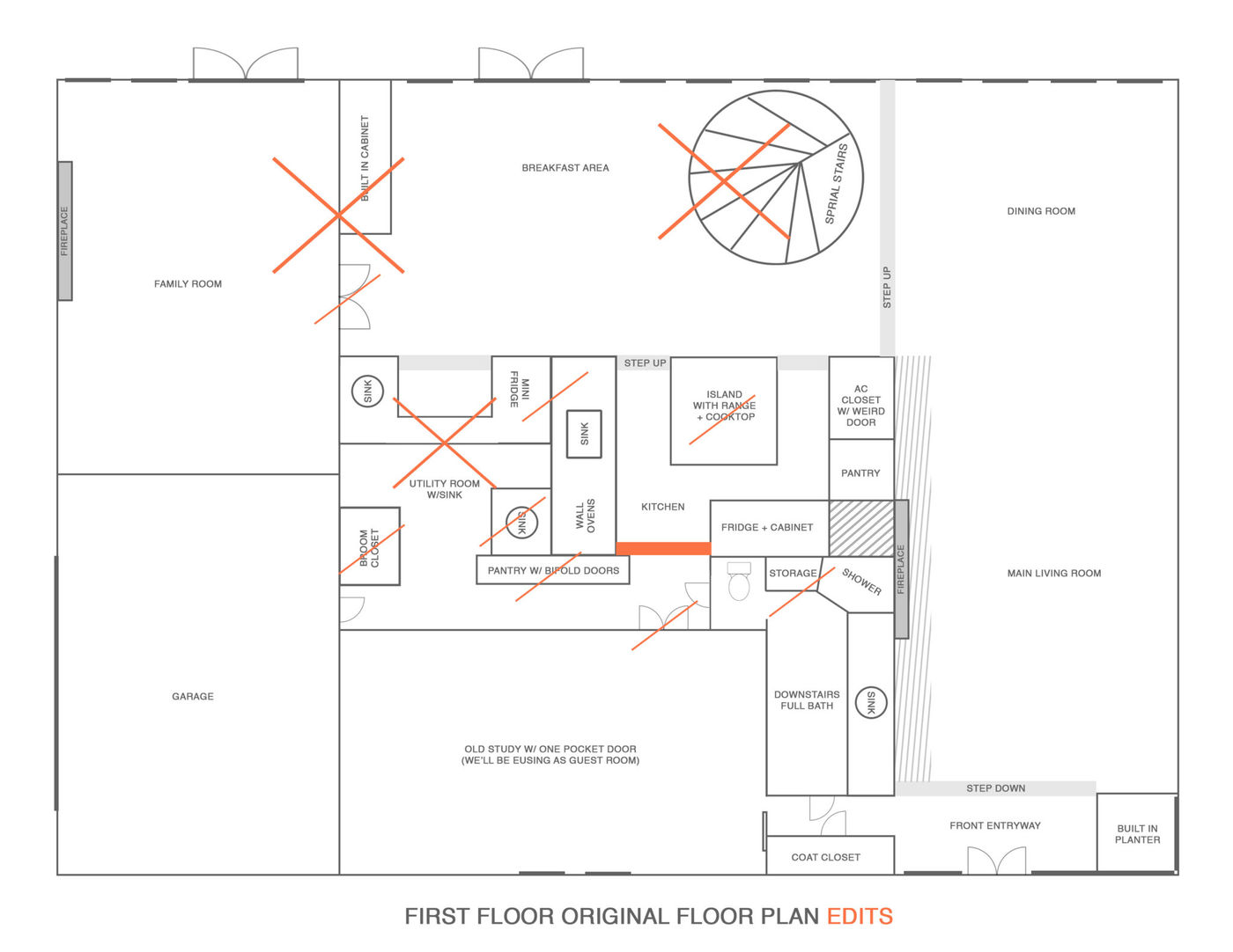
Anyways, we ended up closing off a doorway from the kitchen to the downstairs bathroom to be able to have more upper kitchen cabinets. Note the red bar in the below design —
THE EDITS TO THE FLOOR PLANS

I also tried to notate all of the other major demo elements as well:
- Taking out the family room wall in between the breakfast room (see the original wall here)
- Replacing the original 1974 spiral staircase with a kid-safe version (see the original stairs here)
- Removing the wall between the old utility room closet (the laundry room was actually moved upstairs near the bedrooms before we moved in, yay!) and the wet bar cubby. (see the wall we’re taking out from the wet bar in the far right corner here)
- Relocating the appliances in the kitchen for an easier workflow (see the original kitchen photos here)
- Scaling back the size of the wet bar and opening it up to the kitchen (see weird cut off from the kitchen here)
- Taking out the second small pantry and replacing it with built-in mudroom storage for a place to stash diaper bags and things when coming in from the garage. (this is the utility room behind the wet bar wall)
- Creating built-in storage in the butler’s pantry instead of having an unused second utility room (the best photo I have of the bi-fold pantry doors from the guestroom to the kitchen)
- We also aren’t starting on the demo for the downstairs bathroom yet because we only have the budget to do things little by little, but we’ll be reconfiguring the bathroom/showroom a tiny bit, so I wanted to go ahead and include it for the visual purposes! (the original downstairs bathroom here)
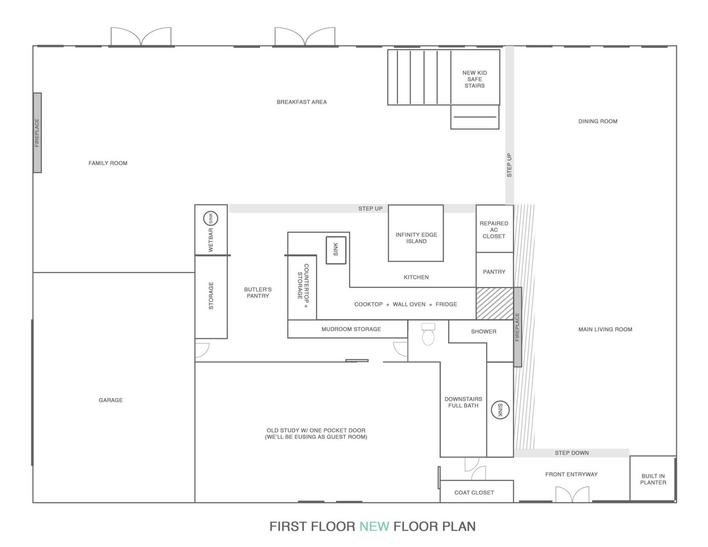
THE FINAL NEW FLOOR PLANS

Now there’s a much more normal flow in the kitchen and hallway from the garage. I also HATE having bathrooms that are right off the kitchen because you can hear (and smell) everything, yikes! So not only did we get more upper cabinets but we also can’t hear you tinkle, which is a win/win.
And in case you missed it, you can see all of the original listing photos from our new house announcement post right here! I’ll be sharing the floor plan changes to the second floor next plus the crazy before and after of our new Velux Skylights soon, too!
Please note that we may earn a commission for some of the above affiliate links. However, products featured are independently selected and personally well-loved by us!
I love the idea of having a butlers pantry. Mine is located in the kitchen since I love to cook and bake so I have a lot of materials needed and I really want my things to be organized. I found my great inspiration here by the way https://www.caesarstoneus.com/about-us/information-inspiration/design-to-inspire/7-tips-to-design-the-perfect-butler-s-pantry/
That’s too funny about your concerns about the bathroom near the kitchen. (I totally agree.) I took a home tour of a mansion years ago and they had a downstairs bathroom near the dining room, and the homeowner had had it soundproofed for that very reason!
We noticed a lot of older homes do that! One of our friend’s parent’s house has a bathroom door that opens up to the dinning room. They actually just closed it out this year and switched the layout!
Your floor plans are looking good so far. Looking forward to see how the whole renovation will turn out. Thank you for sharing Ashley!
Thank you! We just want the renovations to be over (probably also said by everyone who has done one)!
Glad you took out that spiral staircase — not the best for kids. I am with you about the open shelving — no hairs and dust etc. What happened to have to rewire and replumb etc.
Thanks, Ginny! We know open shelving has been such a trend but we also hate dusting. :)