Smith House Family Room Makeover
Smith House Family Room Makeover — We went from drab to fab with this family room makeover featuring Article pieces and some of my favorite decor hacks…
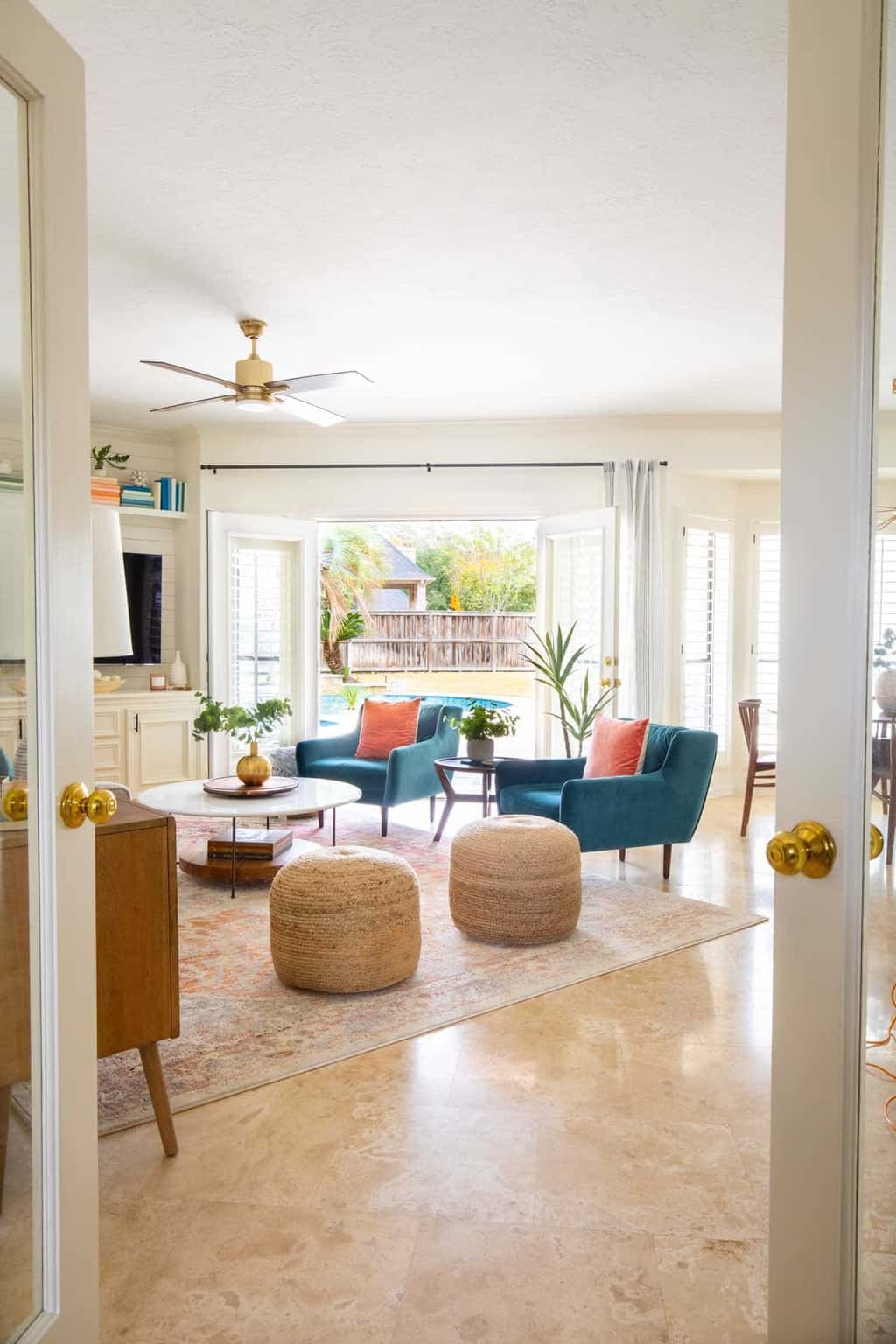
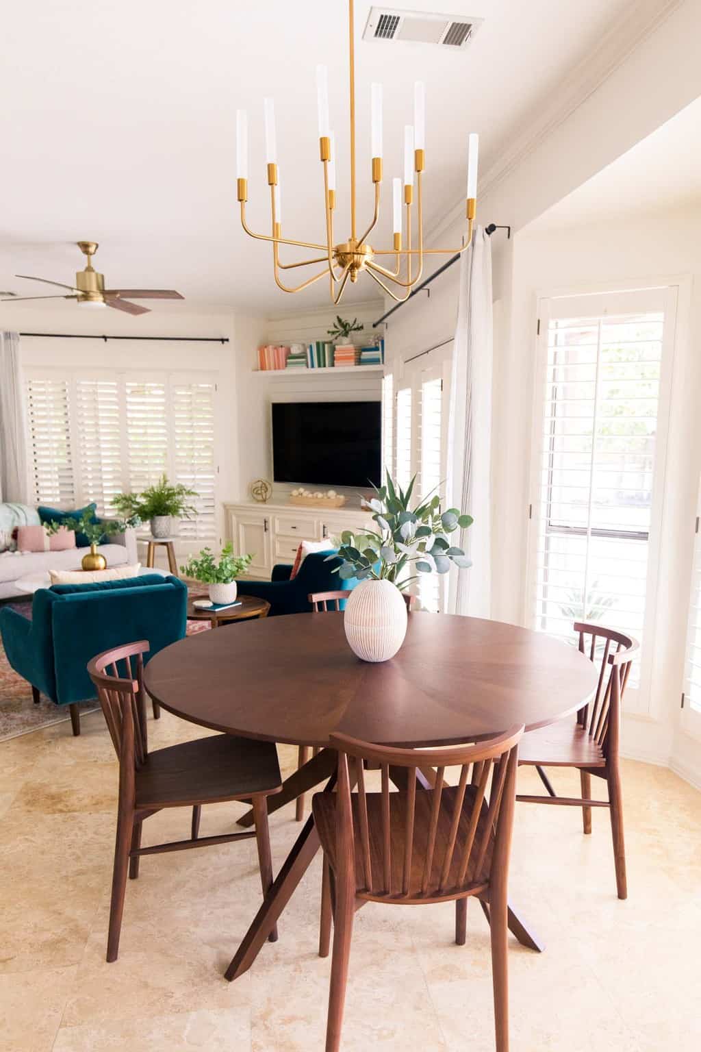
Man, I love a good before and after! We’ve been slowly helping design new spaces for my mother in law, and it’s been a super satisfying process to see the before and afters side by side.
We originally partnered with Article on for her transitional living room makeover last year, and this year we’re doing a reveal on the new family room!
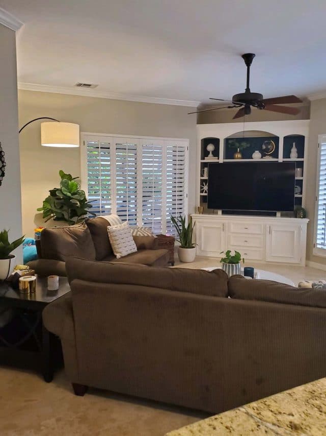
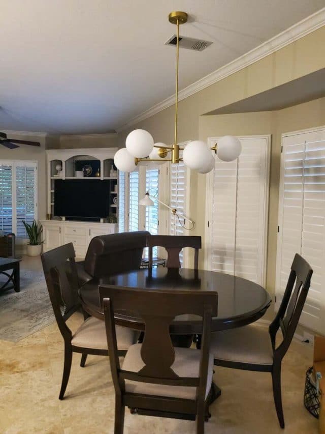
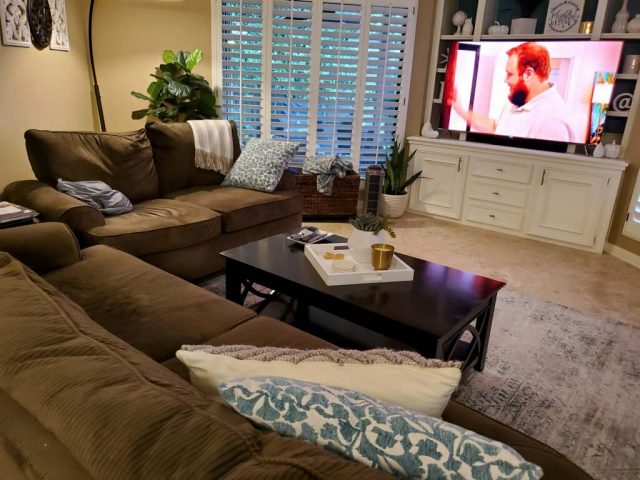
Here’s a look at the space before we started on it…
The Before Photos
Our Home Makeover Goals
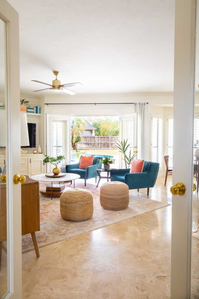
Aside from modernizing the furniture, my biggest goal was to brighten this room and rework the layout to feel more open.
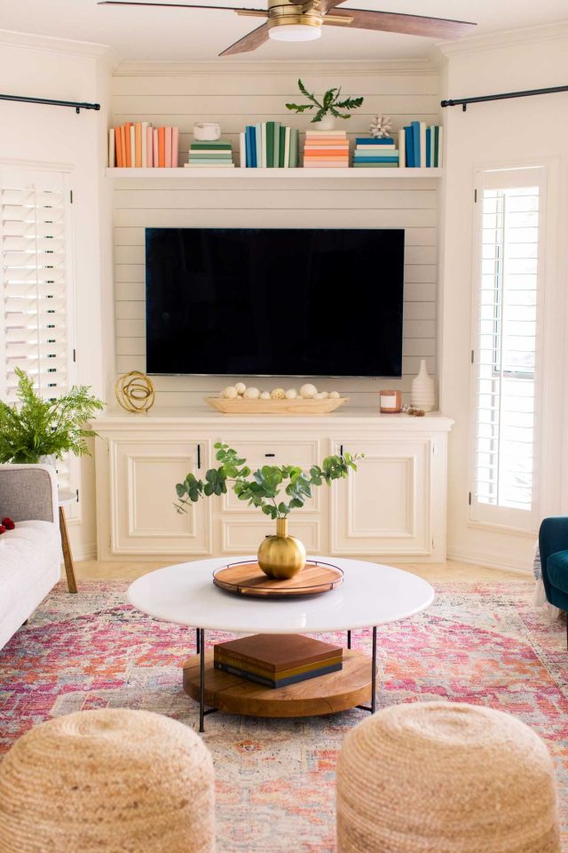
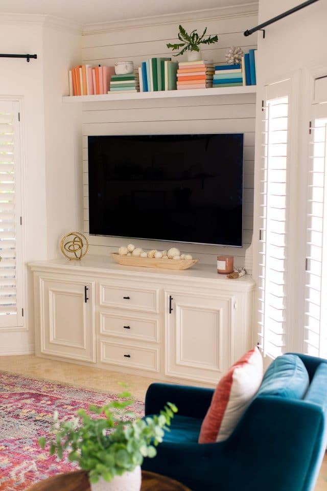
I also wanted to totally design the TV area since that’s a big focal point in this space.
To do that, the tan walls got repainted white, the shelves behind the TV were removed, and we started with a clean slate on the furniture…
Furniture Updates
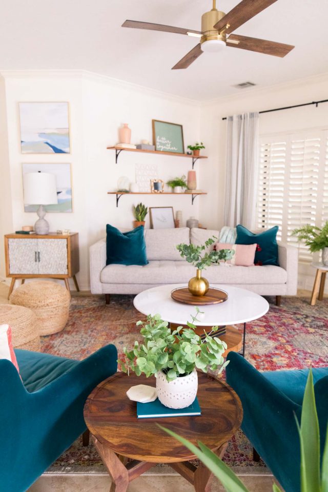
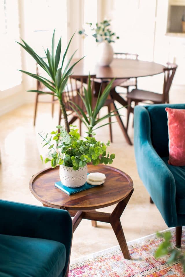
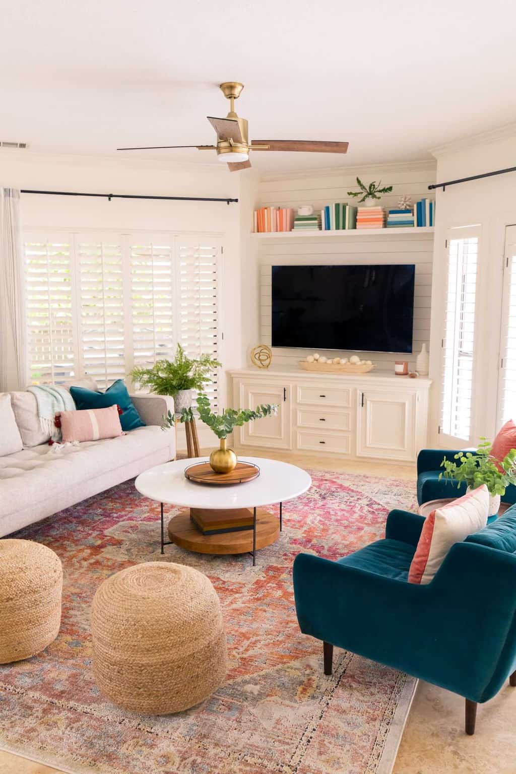
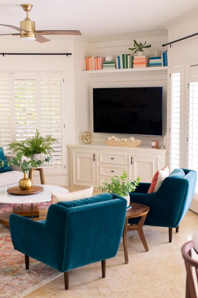
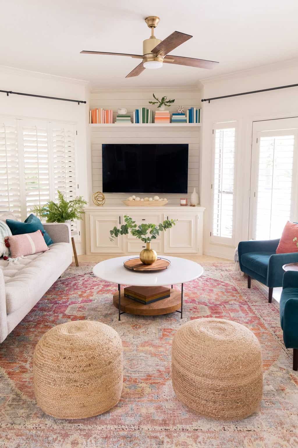
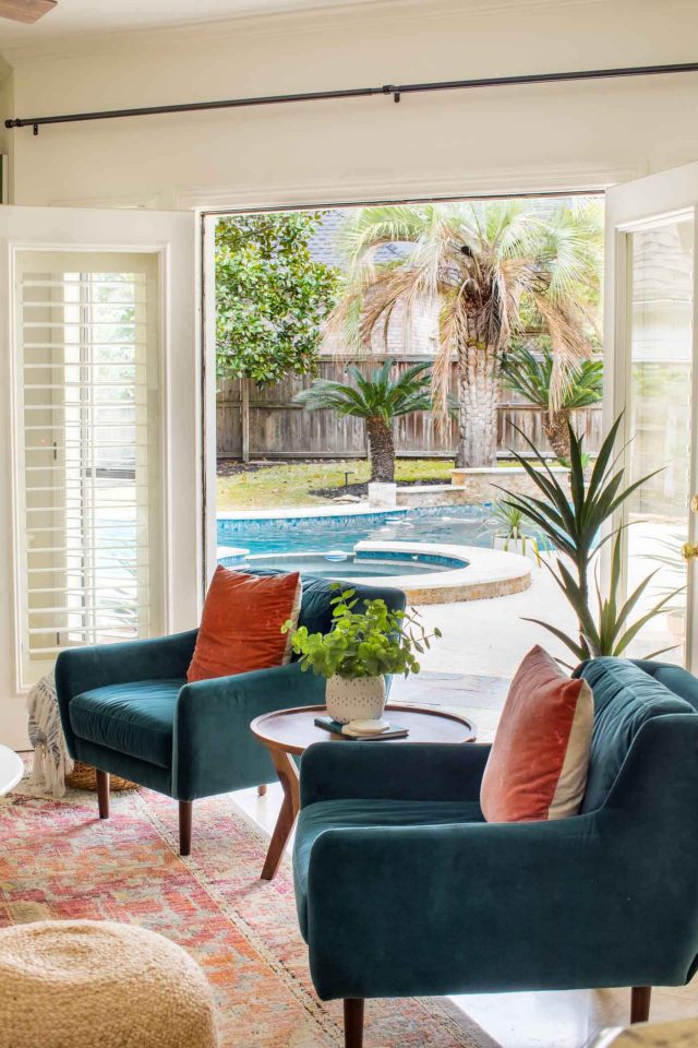
Rather than having heavy, dark sofas blocking the flow of the room, we decided on the Sven sofa from Article in birch white, and paired it with two Matrix Pacific Blue chairs on the opposite side.
That opened up the space a ton, allowing it to flow both from the double french door entrance and from the kitchen entrance.
We also sized up the rug and tied in the brighter color scheme with a Loloi Javari Sunset rug, and updated the lighting with Craftmade pieces.
Rather than having the shelfing behind the TV, we replaced it with a shiplap accent wall and a single floating white shelf, and an adjustable TV mount.
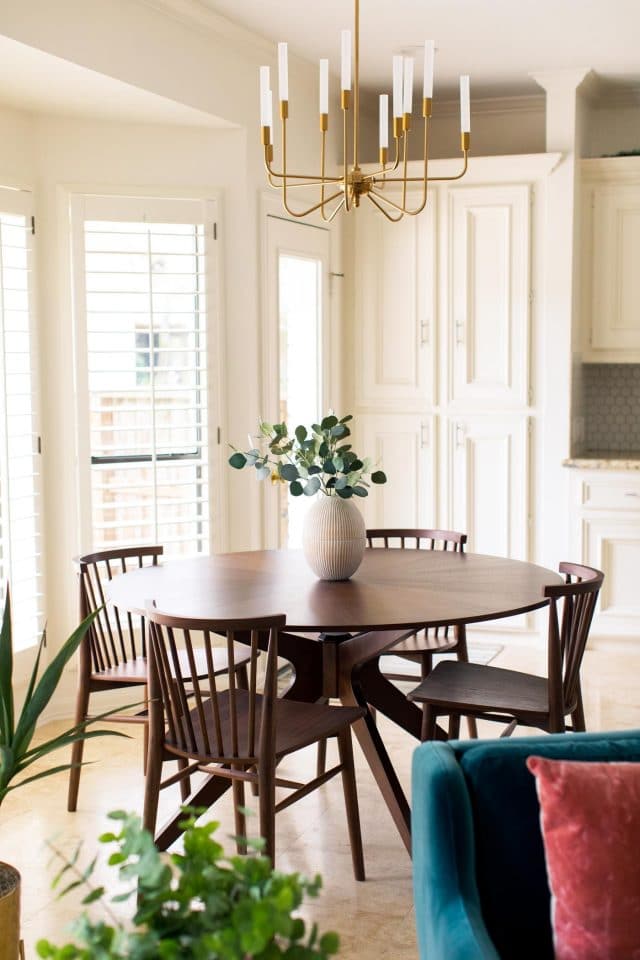
The family room is in one large space with the kitchen and breakfast area, so we also updated the kitchen fixture with a Craftmade chandelier and the Conan Dining table from Article.
If you haven’t shopped Article pieces online, then you need to hop to it! They offer free shipping over $999, which is a steal for white glove delivery at that price point. Especially for the high-quality furniture that’s already an amazing deal.
Jared insists he wished we had gotten an Article breakfast table instead of the one we bought here in Houston, haha. Our love for them runs deep!
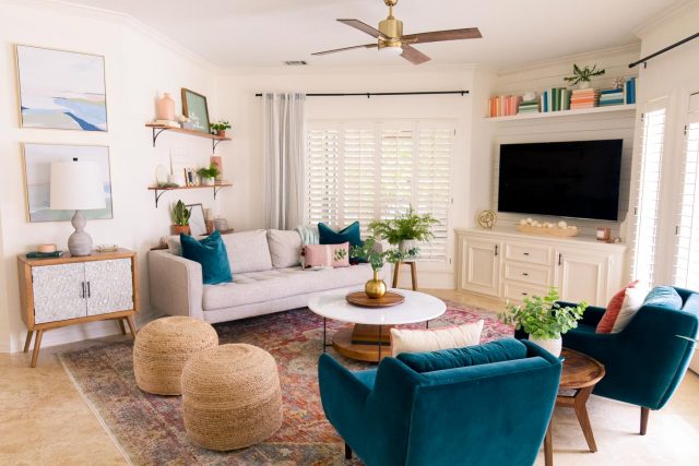
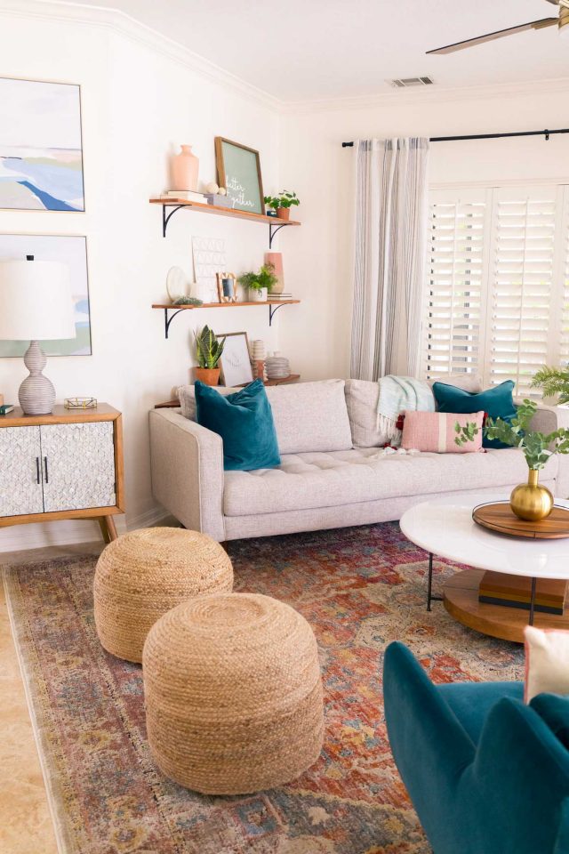
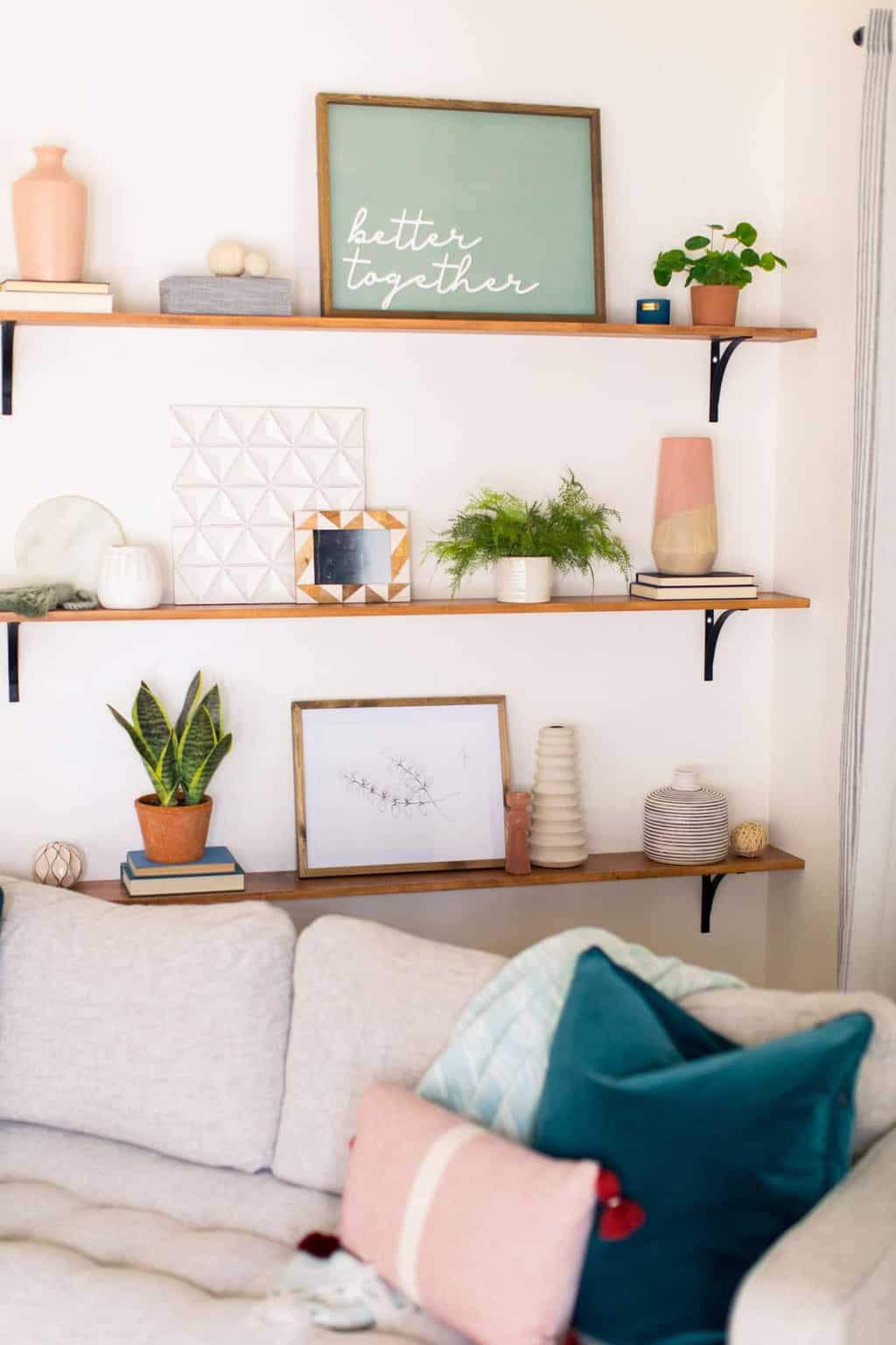
We also kept the new Sven sofa at an angle to work with the existing layout of this awkward corner, and made DIY shelving with stained wood and matte black brackets to add interest to the corner without it feeling cluttered.
Complete Room Sources
- Matrix Pacific Blue Chairs from Article
- Teana Fan in Satin Brass from Craftmade
- Valdi Satin Brass Chandelier from Craftmade
- JV-08 Javari Collection Distressed Modern Area Rug in Berry/Sunrise from Loloi
- Sven Birch Ivory Sofa from Article
- Woven Ottomans
- Small side table between chairs from Home Goods
- Faux Yucca plant
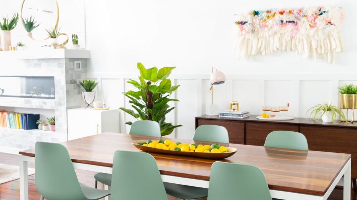
- Conan Round Dining Table from Article
- Rus Dining Chair in Walnut from Article
- Pacific Blue Pillow Set from Article
- DIY Colorblock Books
- Olivia Coffee Table from High Fashion
- Mother of Pearl Side Cabinet from At Home
- Small decor accessories from At Home
- Wall color is Behr Simply White
- Curtain rods from Umbra
I hope ya’ll love this space as much as I do, and as always, feel free to leave me questions in the comments!
You can see more of our house renovation posts here —
- Our guest bathroom remodel
- Master bathroom reveal
- Modern kitchen before and after
- Mid-century living room and dining room before and after
- Our lakeside modern living room makeover
More Home Makeovers
Please note that we may earn a commission for some of the above affiliate links. However, products featured are independently selected and personally well-loved by us!
This kind of makeover is so fantastic! looks fresh, nice, and clean.
Thank you!
Love what you did in the living area! what is that? is that like? Drywall Texturing
Great shot! It’s such a great idea and interior decoration, love it as it was so minimalist. By doing this decoration we also get to reminisce such memory on every photo. LOVE IT 💋
Sending love,
Homeadvisor
Thank you!
Thanks for the blog loaded with so much information. Stopping by your blog helped me to get what I was looking for.
You’re welcome! So glad you found us!
Love the pop of color the chairs add to the space! Absolutely gorgeous!
Thank you, Jenn!
Just gorgeous! I really love what you did with the lighting in the room!
Thank you, Ashley! XOXO
This is just gorgeous! Really love the colors you have going on in this room! Love those chairs too! Super cute!
Thanks, Suzy! Totally agree! The new chairs make such a huge difference in opening up the space compared to the old ones!
Hi could you please share more details of the paint colour that you used for the walls. The paint name & colour. Thanks
Hi Ash! Of course. The paint color is from Behr and the color is Simply White. We’ll add that info too in the blog post so other’s know! XOXO
I looooove our new room! So much brighter and modern. Just makes me happy when I walk in the room! Thanks sooo much! Turned out prrfect!😍❤😘
So happy we could do this for you! XOXO
Your makeover is so amazing, I just love everything you have done. I love the new style and decoration. Thanks and I’m looking forward for your more makeover. By any chance do you hear about http://homeremodelingnewportri.com/?