Lakeside New Kitchen Design Plan & Before Photos
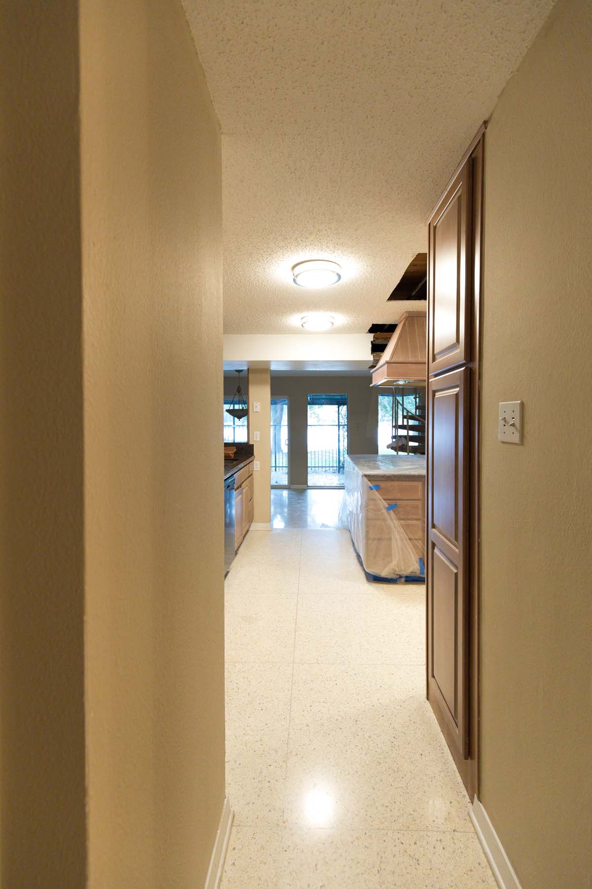
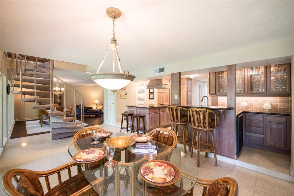
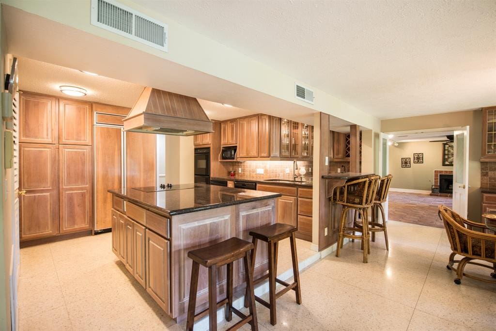
Hopefully no one is suffering from vision impairment from that feature before photo. The original kitchen in our renovation house was just…A LOT (you can see all of the before photos here). Our new kitchen design plan will be much more minimal in comparison, to say the least!
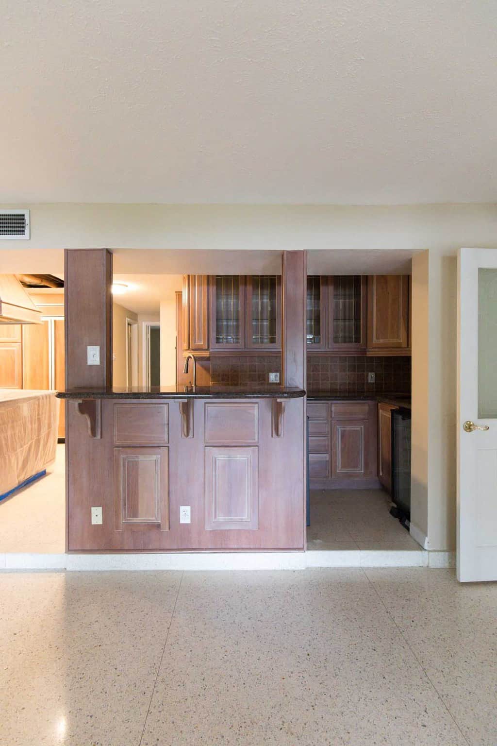
The one thing I hated about the before kitchen was the weird drop down for the ductwork. It made the space feel so small and sectioned off. I also didn’t love the fact that you had to step up into the kitchen, but we did really love the original terrazzo flooring and wanted to try to keep it if it all possible.
Our kitchen renovation priority list looked like this:
- Get rid of the ceiling drop down at any cost
- Rework the flow so that the wet bar wasn’t a cubby hole
- Brighten up the space as much as possible
- Come up with a solution for small appliances so they didn’t overtake the countertops
- Determined to use the white and gold GE cafe appliances…because gold, lol
If you’ve ever renovated then you know first hand that your wish list doesn’t always add up to your budget. We worked with Genesis CP to figure out what was doable. Getting rid of the drop down came with a hefty structural beam price tag, but it’s worth it in my book!
Once they started to demo the existing cabinets we quickly realized that it was going to be tricky to save the terrazzo since it was in really poor condition (if it existed at all!) underneath some of the cabinets and wall divisions. After A LOT of debate, the most budget-friendly option for flooring was to lay the Stuga Studio wood we were using throughout the rest of the house on top of the newly patched, crumbling terrazzo.
The reason we wanted to save our budget with the flooring was so that we could spend more to rework the overall layout. You can get a better idea of the floor plan changes to the kitchen from my floorplans post right here.
We ended up closing off the walkway to the left (see in the before photo below) and making a new entrance into what used to be the old laundry room from the wet bar…
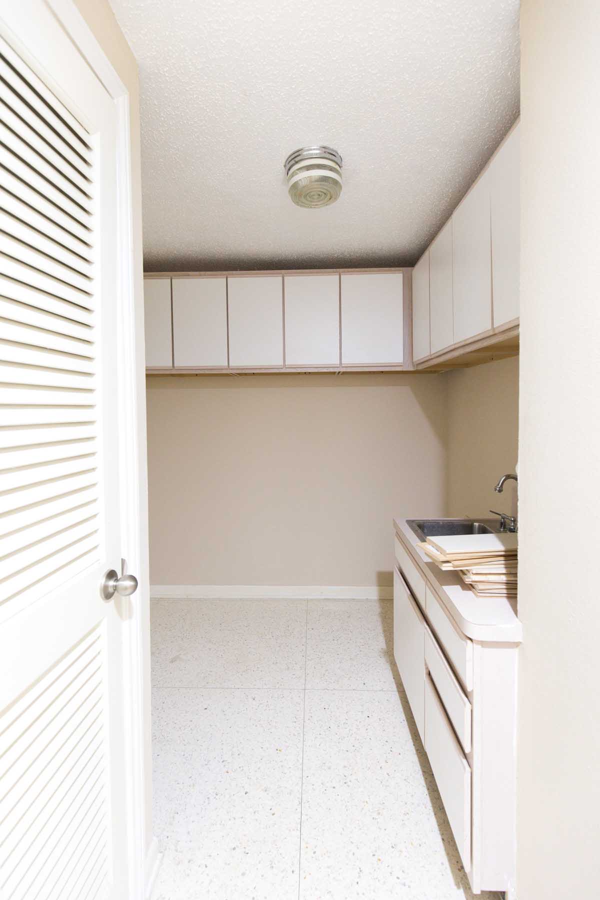
The old laundry room (above) is now the walkthrough pantry from the garage entrance with a spot for keys, mail, etc. It made the space much more versatile for us and a better flow getting into the house from the garage as well.
As far as cabinetry, we’ve always wanted to try out the Semihandmade cabinet fronts. They make sleek, high-end cabinet doors that fit Ikea cabinets. Though the Semihandmade fronts are very user-friendly, plus they offer white glove delivery and consultations for choosing your pieces, the Ikea kitchen planner isn’t quite as easy.
From our experience, you should 100% use all of the Ikea kitchen designer and planner services rather than doing it yourself. We made that mistake once, and it won’t happen again haha!
Basically, don’t plan to virtually build, measure for, and install the base of your kitchen yourself unless you’re VERY DIY savvy and/or have a strong marital relationship. Haha! Pretty sure Jared and I almost killed each other several times.
Overall I’m so happy with upscale it looks (reveal coming soon!) using the Chris Loves Julia x Semihandmade shaker style cabinet fronts, but it’s worth it to handoff the installation specifics when it comes to the Ikea details.
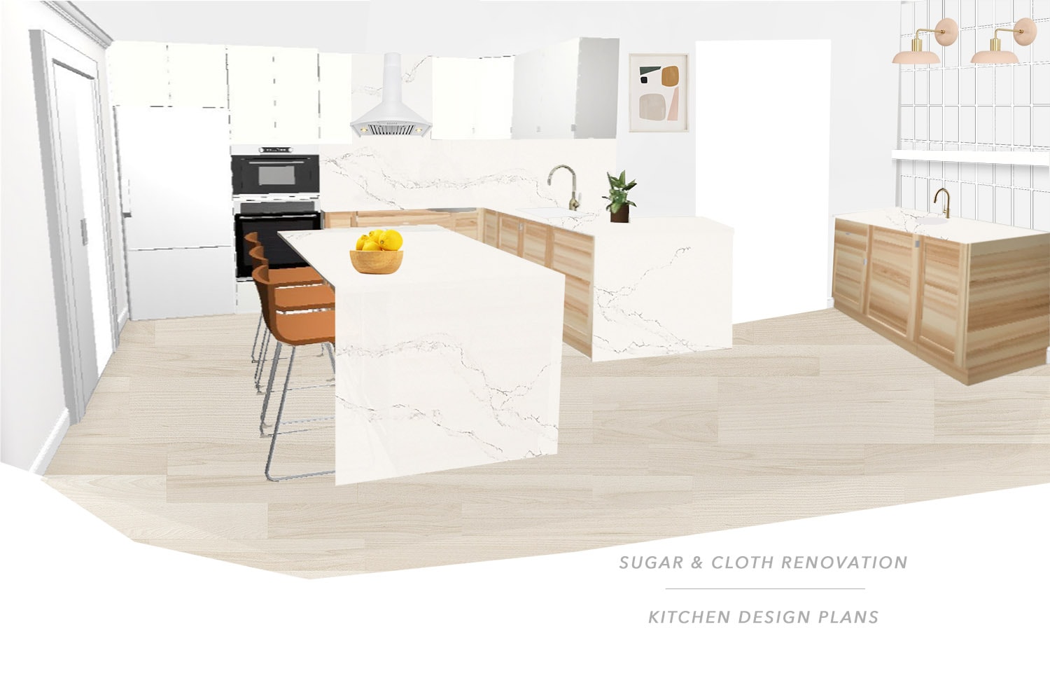
Sugar & Cloth Casa | Our Kitchen Design Plan
For countertops, we were originally loving Caesarstone Frozen Terra to mimic the terrazzo floors that we had to cover up, but once we saw the samples in real life it looked a lot darker in the space. There aren’t any windows in the kitchen, so we ended up choosing Calcutta Nuvo for a brighter feel.
Originally we only planned to have an infinity edge on the island, but thanks to having to create a weird adjoining wall for plumbing near the kitchen sink, we opted for doing a second infinity edge countertop there instead of a custom cabinet piece.
We still kept part of the wet bar feel with a floating shelf accent wall on the right of the kitchen, and I’m super excited about styling this space!
You can get an idea of all of the pieces we used for the kitchen in the links below, and I’ll be sharing the final kitchen reveal here in the next two weeks! Yay!
- Caesarstone Calcutta Nuvo countertops and matching backsplash
- Undermount sink in white from Signature Hardware
- Undermount bar sink in white from Signature Hardware
- Cedar and Moss wall sconces for over the wet bar
- GE Cafe Refridgerator from Ferguson
- GE Cafe double wall oven from Ferguson
- GE Cafe electric cooktop from Ferguson
- GE Cafe dishwasher from Ferguson
- Chris Loves Julia for Semihandmade shaker cabinet fronts for lower cabinets
- Supermatte white slab cabinet fronts by Semihandmade for upper cabinets
- Delta Touch2o Trinsic Sink Faucet
- Delta Touch2o soap dispenser
- Stuga Studio flooring in Oak Alpine
- AKDY White rangehood
- Sumner Street Finger Pulls
- Panel ready warming drawer from Ferguson
- GE Cafe microwave for the appliance closet
- Abstract art
- Lemon Print
Please note that we may earn a commission for some of the above affiliate links. However, products featured are independently selected and personally well-loved by us!
I appreciate this piece of useful information. We are Bathroom Remodeling Reno in Nevada at the USA we are providing the same services in Reno Nevada For more information visit our site: Bathroom Remodeling Reno NV
After reading your friend’s post, I have more great ideas. Thanks. atari breakout
Great ideas. I couldn’t believe that it is the same kitchen. Beige and brown is the perfect combination. What I did when I was renovating my kitchen – I used Caesarstone light-brown countertops with dark brown cabinets – classy and always in trend.
Wow!! It’s gorgeous!
Thank you, Tanya!
I need a new kitchen design!! I have had it the same way for around 13 years.
Yes, you deserve one! There’s all these cool new appliances now!
The plans look beautiful, can’t wait to see it all done!
Thanks, Emily! It’s getting close to being complete so we can’t wait either!
Can’t wait to see how it turns out! Love the countertop choice, such a pretty color.
Thanks, Julie! We went back and forth with the stones and love the final choice too!
Can’t wait to see how it turns out; looks like an interesting floor plan for sure!
Thanks, Sara! We would love to have all the design credit but we had to work around a lot of issues that came up! That vent definitely had to go no matter what though!