Our Wet Bar Makeover Before & After
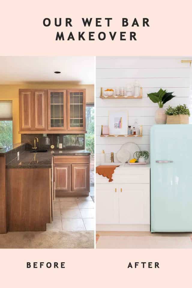
We transformed our upstairs wet bar into a stylish and functional space without breaking the bank! Discover budget-friendly tips for creating a modern farmhouse oasis.
If we’ve learned nothing else from all of our house renovations, it’s that milking the makeover costs to get as many extra perks as possible along the way is worth it!
So we partnered with Capital One and Walmart for our wet bar makeover. I am SOO excited with how it turned out! You already know that we’ve been shopping for a ton of home decor supplies lately. And the Capital One Walmart card gets you lots of rewards and shopping options. My personal favorite perk is that you get 5% back on Walmart.com Grocery Pickup and Deliveries (because we all know that I have an online and app shopping addiction).
That said, you know I’m not one turn down a good travel reward. You can redeem rewards for flights and hotels too. Not that I’m ever going to feel like leaving my house once it’s finished, but the perks are enticing!
Here’s the scoop on how we revamped our wet bar, the before-after photos, and room sources.
Our Wet Bar Makeover Details
You might be wondering why we focused on this space when we still have plenty of rooms to renovate.
We’ll be back to baby bottle life so soon. So it will be convenient having a small home bar with a refrigerator on the second floor near the bedrooms. Never underestimate the power of a sink with running water close by when you have a newborn and toddler running around.
The wet bar is right off of our upstairs balcony play room. And although a wet bar is technically designed for mixing and serving alcoholic drinks, it’s mainly going to be used for storing drinks for guests and keeping bottles and apple sauce pouches cold.
There are so many creative wet bar ideas. They’re typically situated within a shared space. So we wanted this spot to be cohesive with the playroom but also be its own distinct nook.
The Before
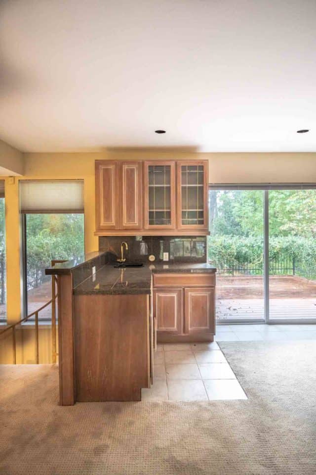
This is what the previous space looked like when we first bought the house. You can see all of the before photos and first video walkthrough.
Needless to say, we had A LOT of renovating to do. We had the floors replaced and the old wet bar ripped out at the very beginning of our renovations last November. So this corner has just been sitting empty since then.
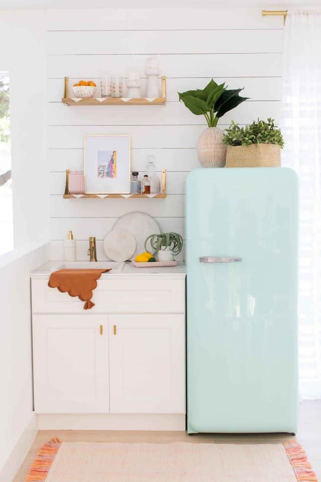
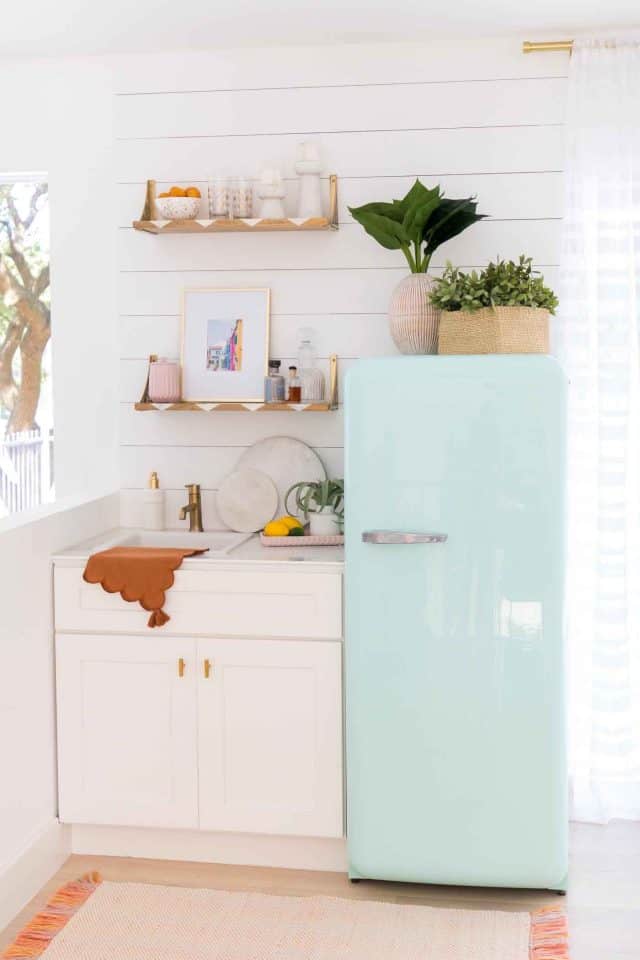
We installed this shaker base cabinet and white sink insert. The champagne bronze faucet matched our customized bronze hardware on the cabinet doors.
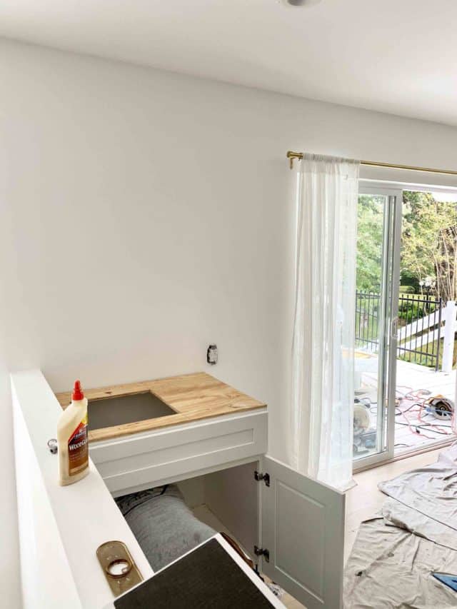
For the countertop, we used a leftover piece of porcelain from our master bathroom renovation, which definitely helped us save on expenses.
Wet Bar Accent Wall
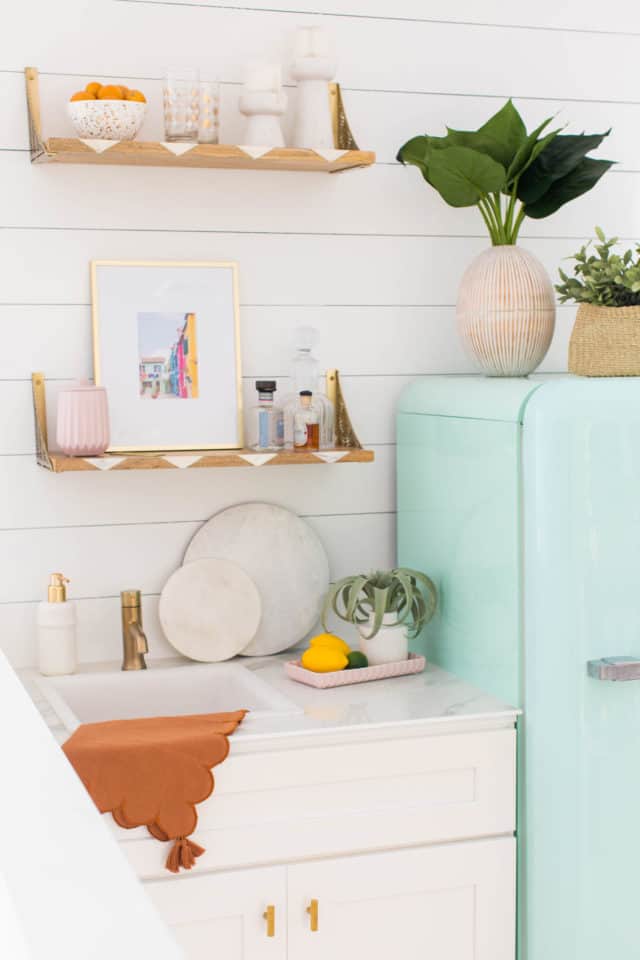
The wall behind the wet bar is just “shiplap” made from leftover wood we had from replacing the baseboards. So you could say this was definitely a budget-friendly scrap wood project! We wanted some rustic charm with the modern sink.
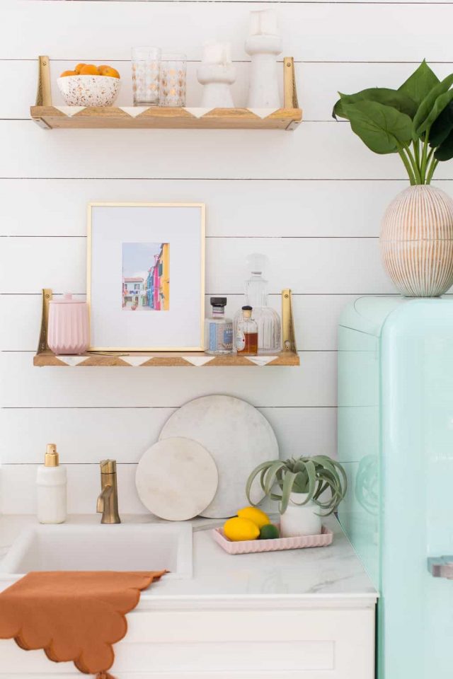
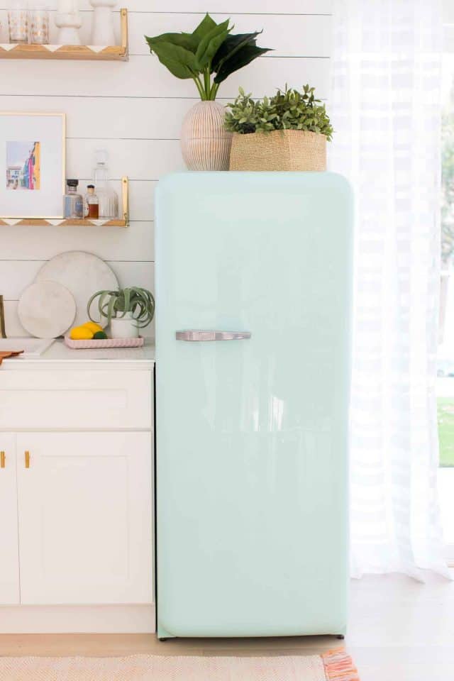
We opted for a full size fridge instead of a traditional wine fridge. Our retro mint green fridge is from our old studio kitchenette, and I’m still obsessed with it! This mint green fridge is a great affordable alternative.
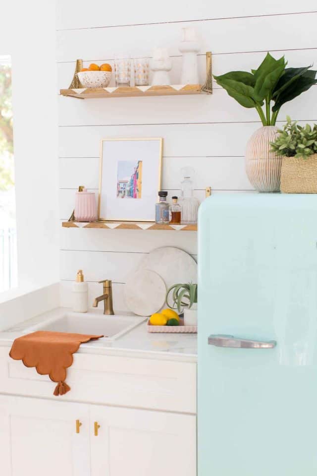
The upper cabinets were removed and replaced and repurposed with shelving from our old town house.
Decorating Our Space
Decor items from our old townhouse and new pieces were mixed in and styled together. I’m personally obsessed with these scalloped napkins from the Drew Barrymore collection!
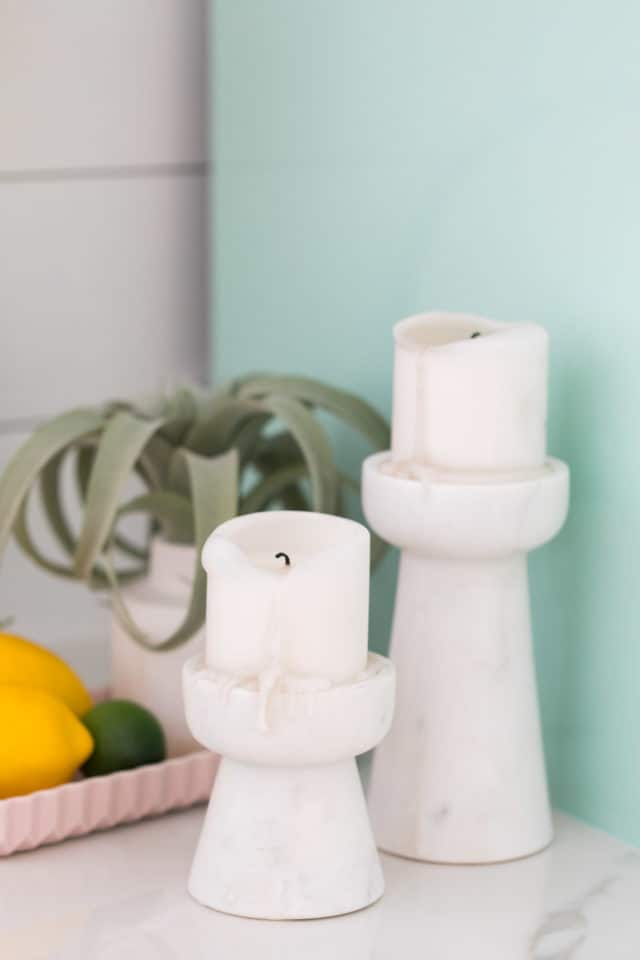
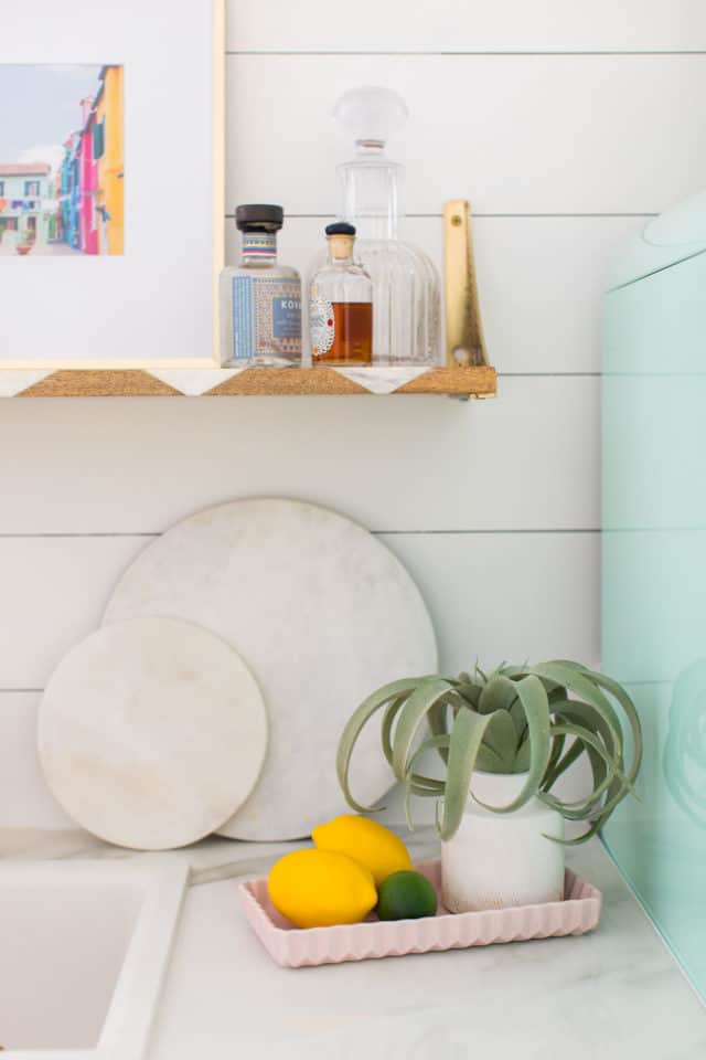
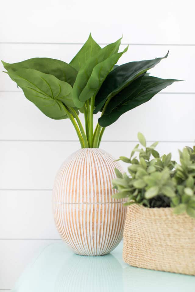
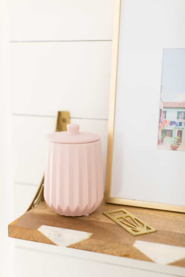
I combined them with a light wood vase to match our floors and this pink accessory set that I love.
Home Wet Bar Room Sources
Shaker base cabinet with this champagne bronze faucet and white sink insert
Countertop from a leftover piece of porcelain from our master bathroom renovation
Mint green fridge is from our old studio kitchenette
- Scalloped napkins
- Light wood vase
- Pink accessory set
More Sugar & Cloth Makeovers
Considering we still have two entirely untouched bathrooms to renovate and a slew of decorating to do, it’s safe to say aiming for cash back on this is a win. What do you think of how our wet bar turned out?! You can see more of our house renovation posts here —
- Our guest bathroom remodel
- Master bathroom reveal
- Modern kitchen before and after
- DIY accent wall and guest bedroom makeover
- Mid-century living room and dining room before and after
This post has been sponsored by Capital One & Walmart, but all opinions are my own and we’re happy to work with them since they’re a platform we use regularly! Sugar & Cloth has chosen to donate 5% of all sponsored campaigns to charity, which you can read more about right here.
How to Paint a Porch for an Easy Home Upgrade
Looking for a quick makeover to your exterior? We’re sharing…
Continue Reading How to Paint a Porch for an Easy Home Upgrade
We’re Moving!
That’s right, we’re moving! I know, I know. A ton…
Our Revamped, Open Concept Living Room & Dining Room Design
Explore a harmonious blend of style and functionality as we…
Continue Reading Our Revamped, Open Concept Living Room & Dining Room Design
Lakeside Modern Living Room Before & After
This bright white lakeside modern living room design is the…
Please note that we may earn a commission for some of the above affiliate links. However, products featured are independently selected and personally well-loved by us!
Where did you get the fridge and what is the brand?
Hi Mary! There is a link in the blog post about the fridge that was in our old studio: https://sugarandcloth.com/sugar-cloth-studio-kitchenette/. It’s a SMEG mint green fridge. We purchased is from West Elm but the exact model is sold out. SMEG does have a similar model here. This fridge from Home Depot is similar and cheaper also. Hope this helps!
love this so much! Where are the shelves from?
Hi Tessi! They’re from World Market!
This is a great thing, I think everyone feels this information is very valuable, thank you happy wheels
We hope so too!
What a huge difference. It looks so cute and useful. Who says a wet bar can’t hold applesauce anyway?
Thanks, Krissy! You know life is completely different when your wet bar holds applesauce instead of apple martinis, hah!
I am obsessed with this! It is so my style too! Gorgeous!
Thank you, Katie! XOXO
Oh my goodness, HOW BEAUTIFUL! I just love that fridge!
Thanks, Jennifer! We love the fridge too and had to take it along with us!
TURNED OUT SO CUTE!
Thank you, Jennifer!