Our Revamped, Open Concept Living Room & Dining Room Design
Explore a harmonious blend of style and functionality as we showcase the transformative power of an open floor plan with our living room and dining room design reveal!
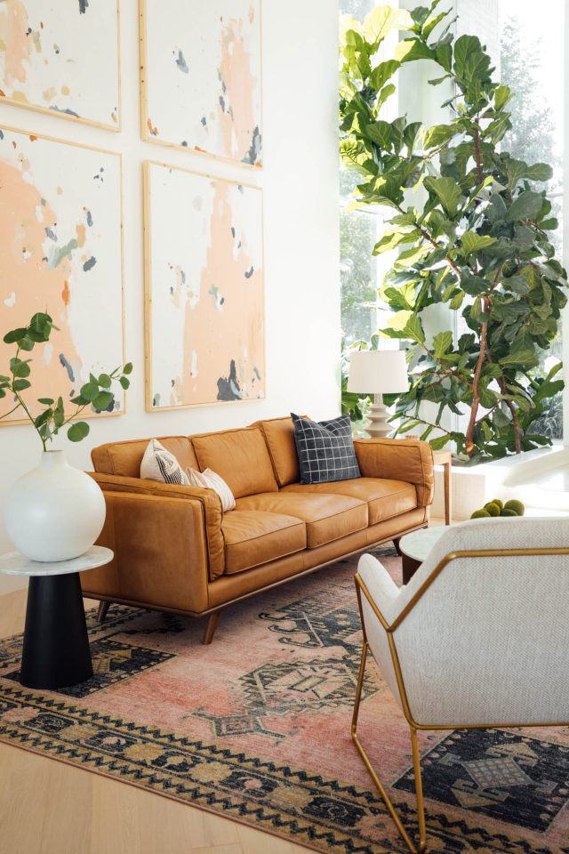
Sometimes the second time is the charm, my friends! As it turns out, you might like a specific design style… but that doesn’t always mean you want to live with it every day.
That’s actually what happened to us with our first living room design in our house. While I LOVE a colorful, mid-century aesthetic, I actually don’t love living with it all the time.
The more we’ve been home thanks to 2020, the more I’ve been contemplating this design switch. And boy, is it quite the 180!
Switching to a Neutral Color Scheme
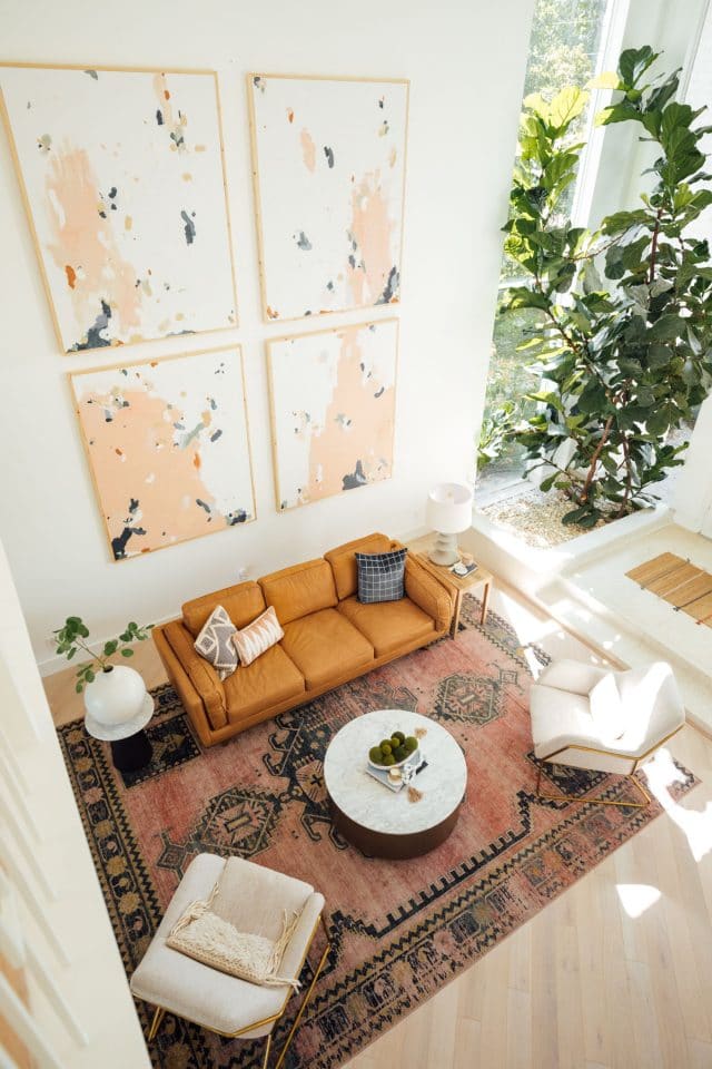
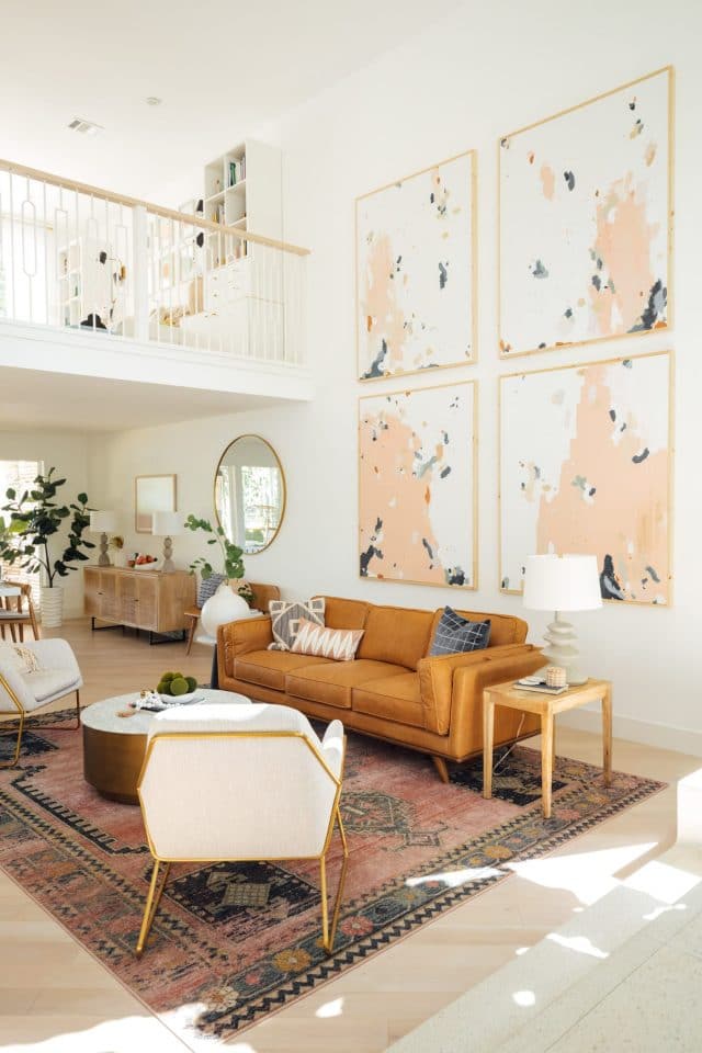
We’ve gone from this very colorful old living room to a more muted color scheme and classic design. This time around we were dead set on selecting pieces of furniture that were durable, well-made, and timeless.
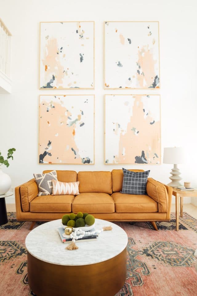
The Timber sofa from Article was our first choice and I’m SO happy with that decision. The color is beautiful, its extremely comfortable, and it holds up well with kids in the house.
It goes perfectly with a pair of Forma chairs that are white enough to be neutral but have a great woven texture to hide any spots that might happen.

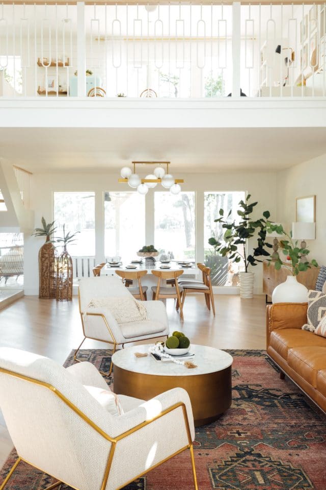
When we ordered everything from Article, (they offer free shipping over $999) we chose the Trosmo black side table to tie in some of the matte black elements in our other decor and the rug color combination.
They’ve since come out with a marble and gold version that I am SO in love with! So you should get it since I missed the boat, haha!
Our New Dining Room
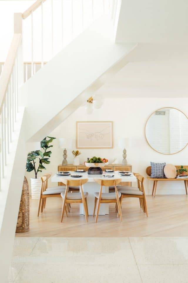
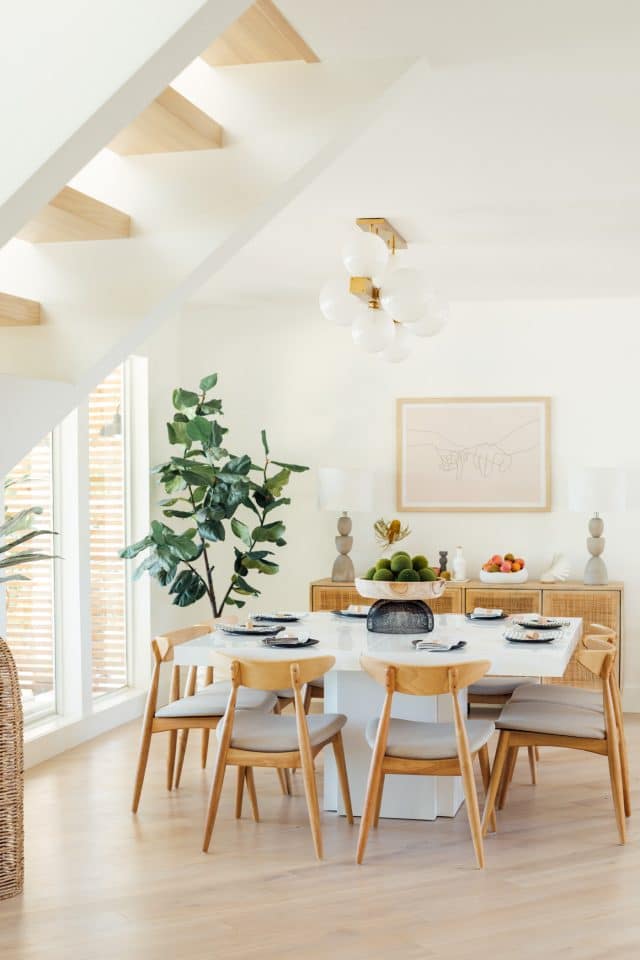
When it came to the dining room, we ended up replacing our previous dining table because it had a glass top which didn’t suit our house full of kids well. Even though I loved it and it was super easy to extend, too.
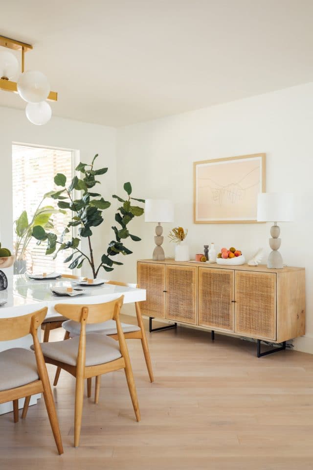
The new square dining table is also a better size for the space to leave more walking room around the Carmel sideboard from High Fashion Home.

If you following along on Instagram, then you know the debate over our dining chairs was very real.
I ended up going with a mid century, light oak chair that suits the style of our home but is still very welcoming and comfortable.
The other debate for this room was what to do with our artwork…

My Custom Artwork
Since we have extemely tall ceilings in the entrance, I had to create artwork that felt like it was on the same scale. I ended up buying 4 canvases on sale at Michaels and adding wood trim to the sides and painting the abstract art myself.
It was definitely a time investment. But I love the large statement and subtle color scheme. You can now find these pieces for sell at The Southern Kindness Gallery.
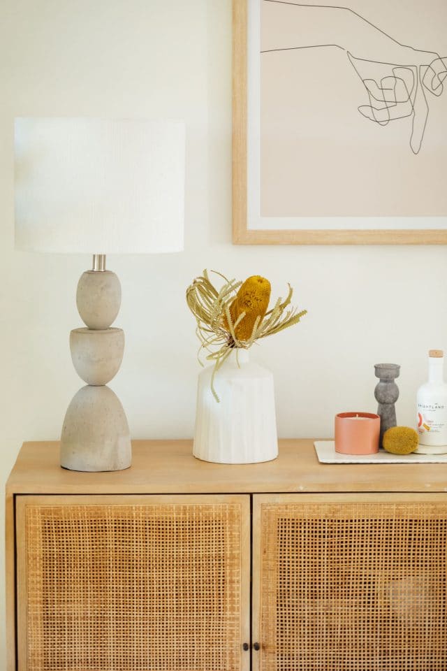
I also painted this pastel circle art below and paired it with a photo from from my first trip to New Orleans.
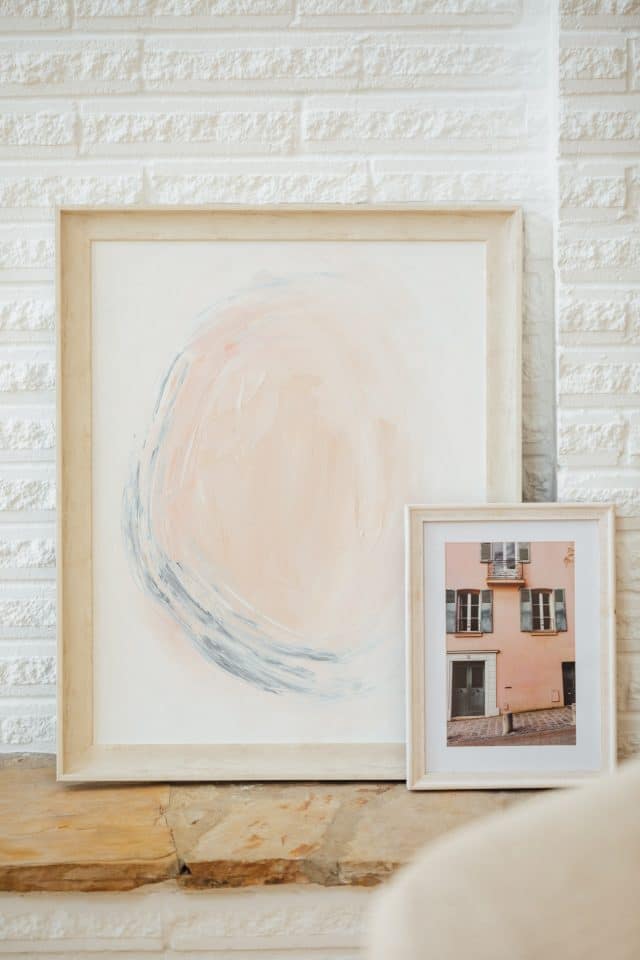
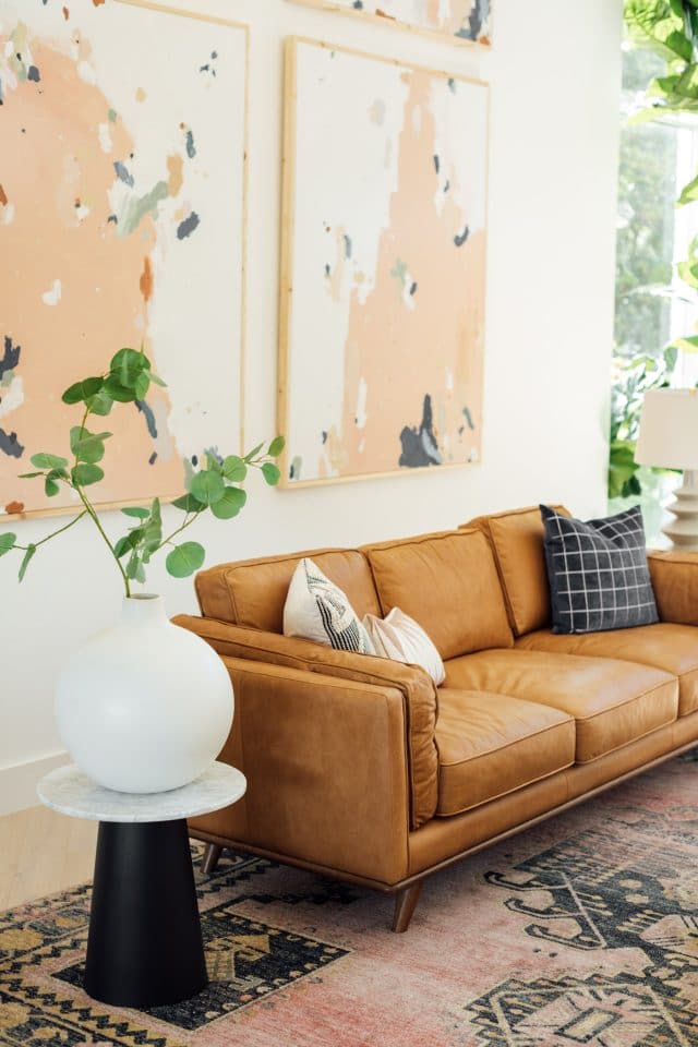
Everything else was as simple as combining textures from pillows, plants, and other knick knacks from around the house to make it feel like home.
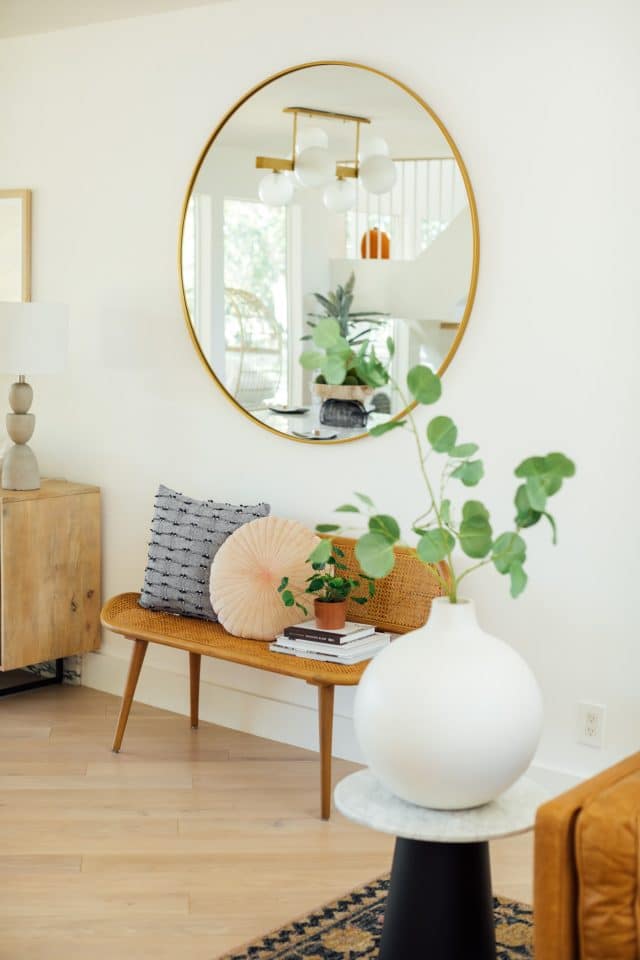


And in case you’re just catching up on some our our renovations, you can find more of our home tour below! —
- Our DIY modern wet bar makeover
- The kids playroom with easy faux built-in storage
- Lakeside modern living room
- Master bedroom design
- Little girl room ideas from Gwens toddler girls bedroom makeover
- DIY Ikea tv stand hack from our master bedroom

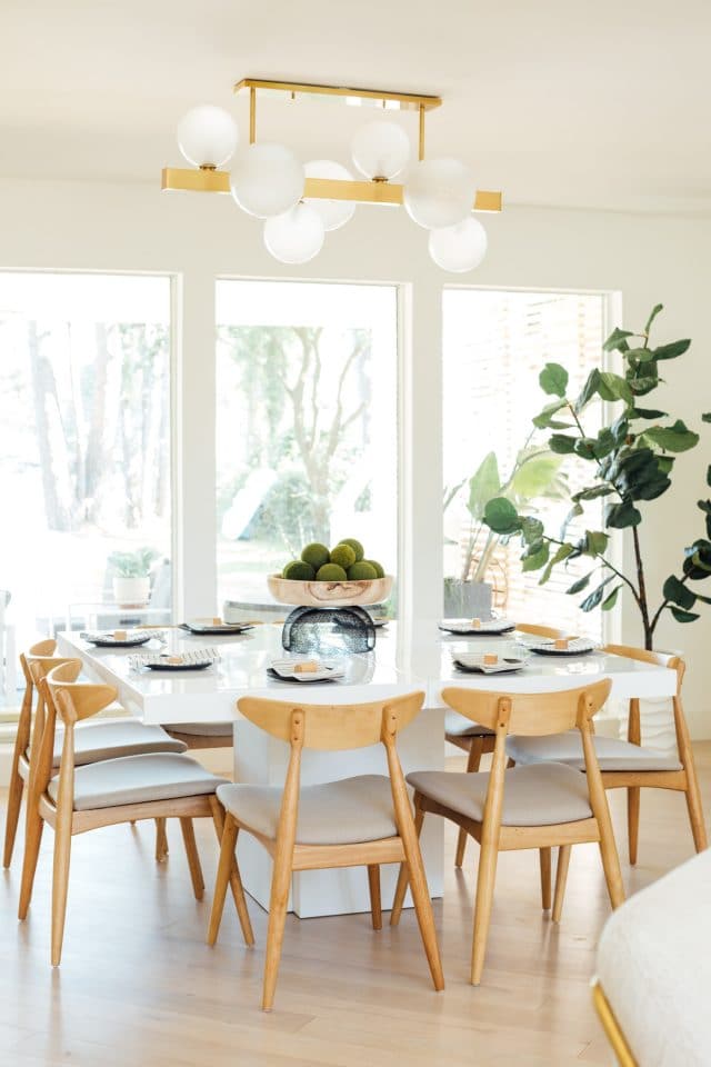
All Lakeside Living Room and Dining Room Sources
It’s definitely a big change from the first version. But it suits us so much better, and I’m really happy we went for it! Just to make it a little easier for you, I also put all of the room sources below for easy referencing too.
- Timber Charme Tan Sofa from Article
- Forma Chair in Milkyway Ivory from Article
- Tromso Side Table in Black and Gold from Article
- Carrington Mid Century Dining Chairs
- White square Jake Dining Table from All Modern
- Similar round marble coffee table — Ours is old from West Elm.
- Shaped Concrete Lamps from At Home
- Abstract 1, 2, 3 & 4 by Ashley Rose — I hand painted them myself and nail gunned 1″ x 2″ premium pine wood cuts to frame them. You can now find some of my large canvas Abstract pieces at Southern Kindness Gallery.
- Pinky Swear Finger Artwork from Etsy — I edited the colors myself to make it custom before printing and framing.
- 9″x12″ Jocelyn Rug in Rose by Loloi
- Grey Erin Lamp by Mitzi
- Mango Wood Side Table from At Home
- Carmel sideboard from High Fashion Home
- Large round gold mirror West Elm (above bench)
- Rattan bench from World Market
- Hinsdale Gold Chandelier by Hudson Valley Lighting
- Round Oversized Ceramic Vase in White from West Elm
- Large faux fiddle fig tree
- Stuga Studio Oak Alpine flooring in Elderflower
- HGTV Sherwin Williams High Reflective White wall paint
- Construction – Genesis CP
Please note that we may earn a commission for some of the above affiliate links. However, products featured are independently selected and personally well-loved by us!
Your revamped living/dining room looks great. Can you tell me about your rug? Would you recommend? I find it hard to buy rugs online to be able to see the quality.
Hi Sydney! We have a link to the Jocelyn Rug in Rose by Loloi Rugs in our blog posts if you want additional details about this specific rug. We highly recommend Loloi. They’re good quality rugs and have been durable enough with our two kids. Our previous living room when we lived in a townhome had a rug from Loloi and we do have their rugs in our bedrooms. Hope this helps!
I too have a giant white wall in living room, not as tall but still sit empty 3 years later… can you do a story/highlight/blog whatever is easiest on DIYing the art canvas and frame? It looks lovely!
Hi Emily! We’ve actually been getting so many requests for more details on the DIY Canvas Art that we may do a blog post! We did a quick how-to in our Instagram stories but still got lots of questions. Thank you for the feedback!
What a beautiful space! DREAM! 2 questions….what type of wood did you use on your canvass? What an incredible idea BTW to make it look finished. Also the pink swear print is awesome. How did you change the background color to fit your color scheme? Did you do it yourself or did you get the etsy artist to do it?
Hi Alison! We just drilled (or you can also nail gun) 1×2 wooden boards all around the canvas. We just used simple and affordable plywood. We’ve gotten so many inquiries about it that we think we are going to do a dedicated post just for the DIY canvas art. For the Pinky Swear print, we changed the background ourselves in Adobe PhotoShop. We’re sure if you message the artist, she may be able to customize it since it’s really easy to do. Hope this helps!
Beautiful space!
Thank you, Melissa!
Such a beautiful space!! I love the open concept!
Thanks, Katerina! XOXO
Love how neat and crisp this looks! The color choices and design aesthetic are wonderfully cohesive and so on point! Some great inspiration here for me!
So happy to hear! Thanks, Betsy!
I prefer this softer and more timeless room. The brightness is crazy!
Thank you, Melle! We love when we see bright colors in other homes (and still do). But you’re right. The softer tones are a bit more timeless. XOXO
Ashley and Jared – I am BEYOND obsessed! It’s so gorgeous! You managed to make it feel warm and welcoming while soft, modern and magical. It’s amazing!
Thank you, Julie! XOXO