Lakeside Guest Bathroom Remodel Reveal
Here’s the full before and after of our downstairs guest bathroom design in all of it’s modern glory!
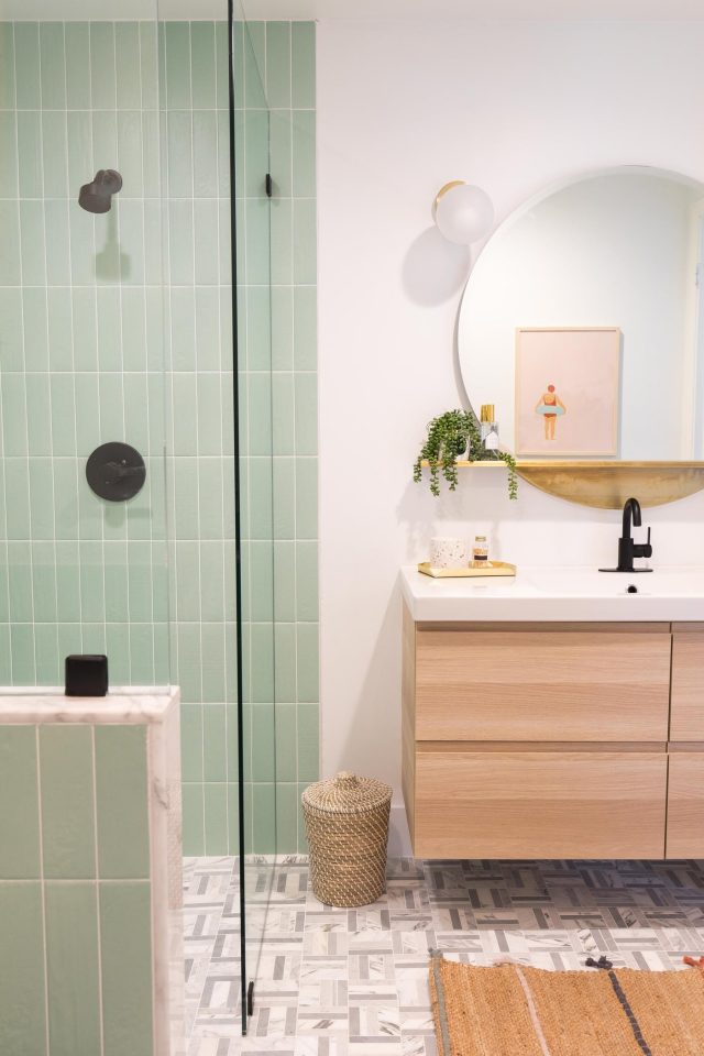
As promised, we’re back with our guest bathroom remodel reveal after sharing the design plan last month!
We honestly can’t tell you how much joy it brings me to see the before and after photos of our house as we finish each room.
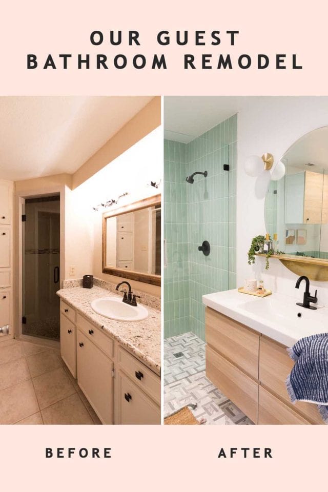
This small bathroom was having a major identity crisis when we first bought the house. Our new home has mid-century modern bones. But a lot of the “updates” from the previous owner were very moody and traditional.
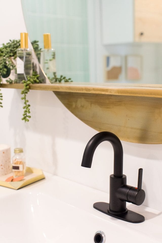
The only thing that is remotely the same from the before and after version is the matte black hardware inspiration. We knew that we wanted to do matte black hardware instead of the gold that we used in our master bathroom upstairs.
We decided on the Peerless Faucet Precept Collection in Matte Back for both the sink and shower. And I love how it turned out!
It matches the matte black accents from the adjacent downstairs guest bedroom really nicely and gives the bathroom a sleek, contemporary feel.
Guest Bathroom Remodel Ideas
Our biggest priority was to make this small bath feel bigger by gutting the entire space and starting over on the floor plan. Since it’s the only first-floor bathroom, it was meant to serve as both the downstairs powder room and guest bathroom.
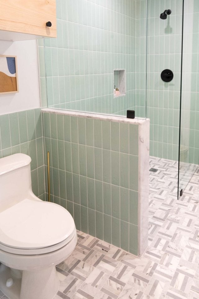
It had a small room for the toilet that was separate from the shower and vanity which we got rid of and made it into one large space.
We’re really glad we ended up gutting the original bathroom because there was plenty of mold and mildew smells happening with the old cabinetry and vanity.
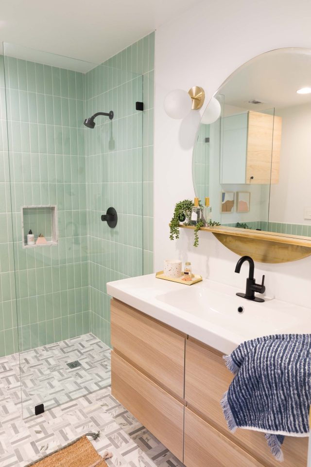
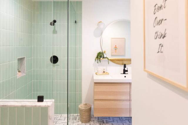
Rather than replacing the old cabinets with a pedestal sink or another large built-in, we opted for an inexpensive IKEA floating vanity.
It offers a ton of drawer storage while also making the bathroom design feel bigger thanks to it being off the ground.
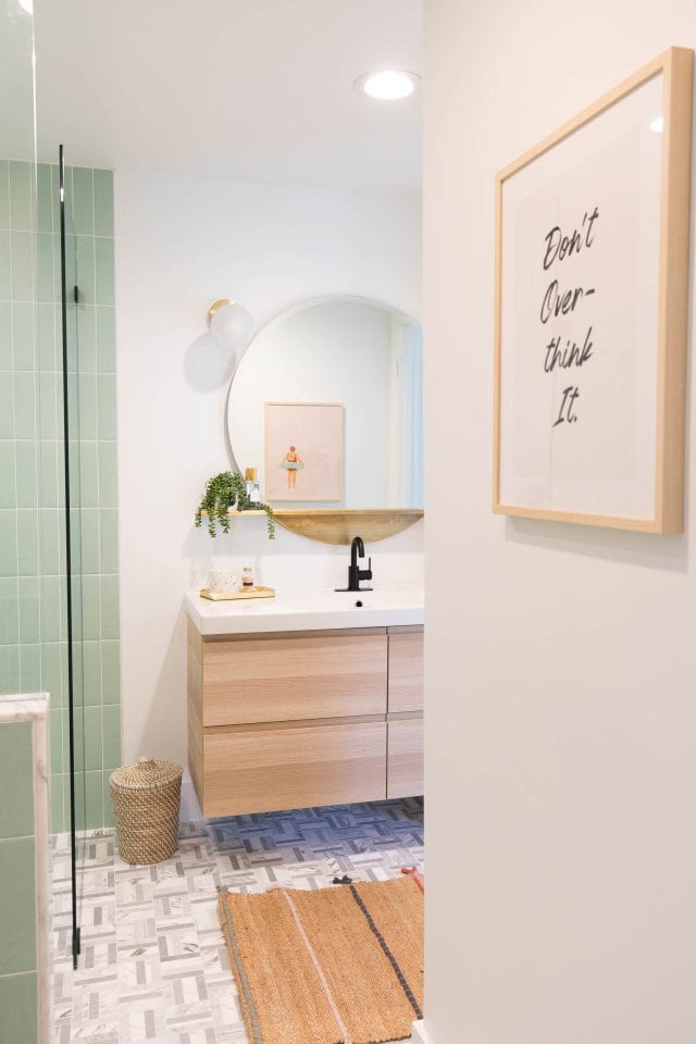
The Walk In Shower
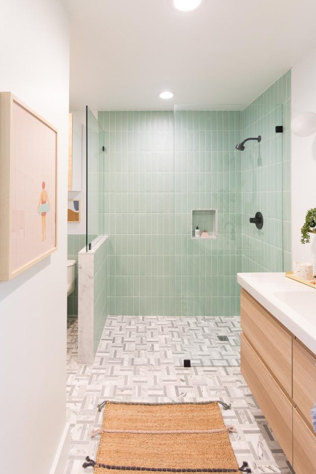
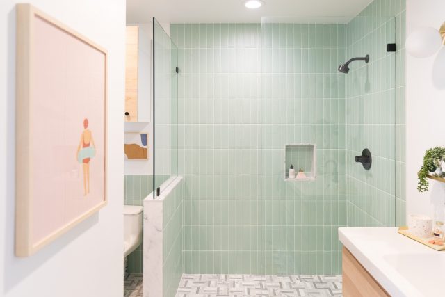
One of our other wishlist items was to have the tile floor be a seamless transition into the walk-in shower. At first, we weren’t sure if we were going to have a shower door on the glass shower or not.
We’re SO happy that we decided to keep the shower design very minimal, letting the focus stay on the Peerless Precept Shower Only Trim Kit in Matte Black and the statement tile from The Tile Shop!
Goodbye ugly shower curtains and weird corner shower!
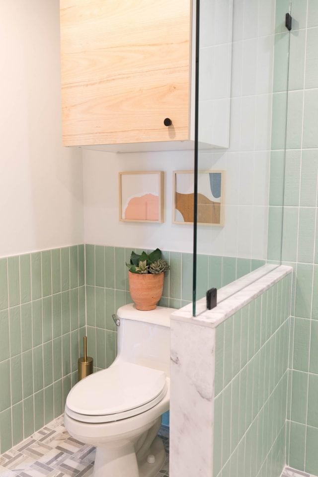
Our Guest Bathroom Tile Choices
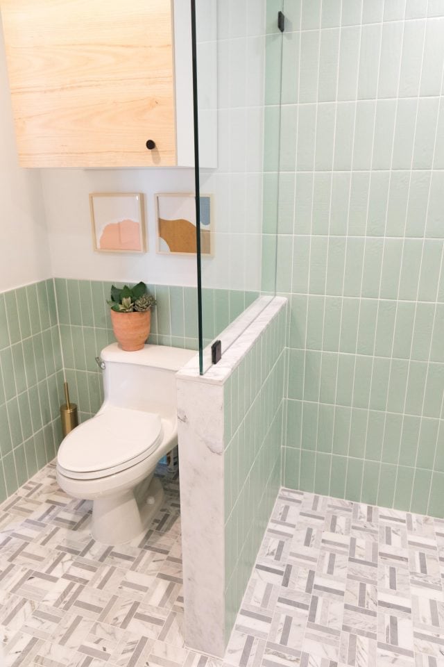
We weren’t sure of the dark grey in the marble mosaic floor tile at first. But it turned out to be the perfect blend of modern and classic.
The Aquamarine subway tile on the walls adds just the right amount of color too. It plays really well off of the color scheme in the downstairs guest bedroom.
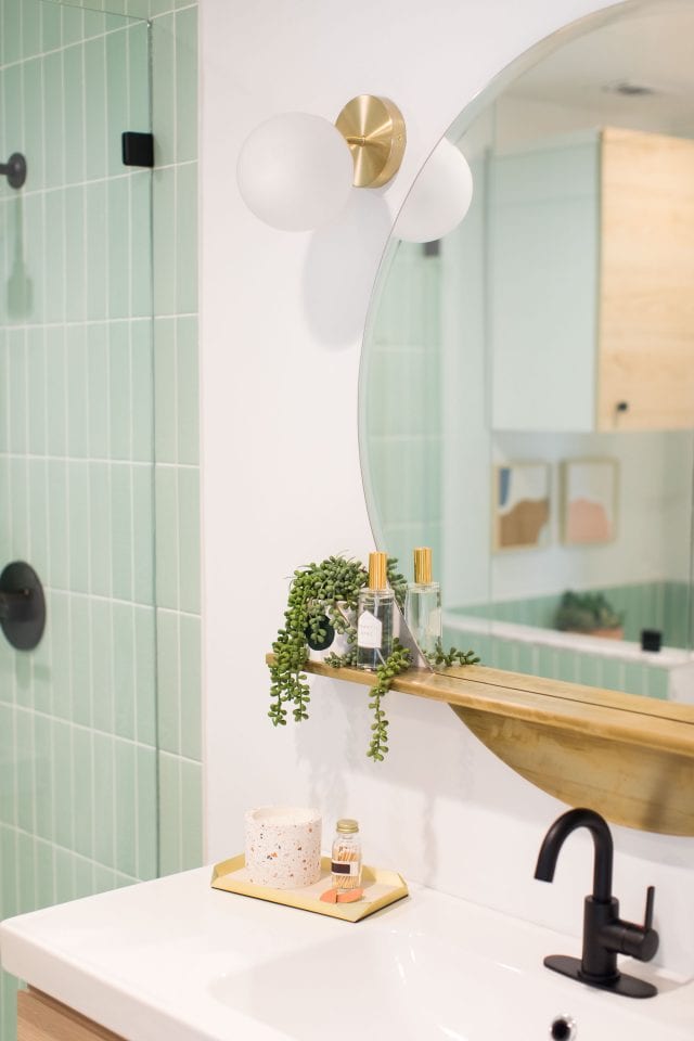
Gold Accents
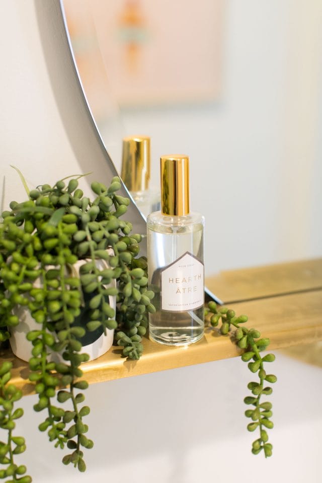
We couldn’t totally abandon our love of gold. So we bought this round gold mirror with wall shelf to pair with the Peerless Faucet Precept Single Handle Centerset Faucet in Matte Black.
We also used a few gold accents for the vanity styling and stuck with light wood picture frames for the wall art to tie in the light oak vanity.
We’re no professional bath remodelers. But we’d say this guest bathroom remodel turned out pretty darn well! What do you think?!
In case you’re looking for more renovation inspiration, you can see more of our before and after posts along with design ideas below.
We still have two additional ensuite bathrooms for the kid’s bedrooms upstairs that haven’t even been touched yet. We’re hoping to have the budget (and energy!) to get to those by the end of this year. In the meantime, be sure to keep an eye out for our master bath reveal next!
Guest Bathroom Room Sources
- Color Market matte Aquamarine subway tiles from The Tile Shop
- Bennett Marble mosaic floor tile from The Tile Shop
- Honed marble floor and wall trim for lining the shower wall from The Tile Shop
- White powder-coated edging for the subway tile walls from The Tile Shop
- All grout, mastic, and tile sealers from The Tile Shop
- Peerless Faucet Precept® Single Handle Centerset Bathroom Faucet in Matte Black
- Peerless Faucet Precept® Shower Only Trim Kit in Matte Black
- Ikea floating vanity, Godmorgan sink cabinet with light oak drawer fronts
- Round gold mirror with wall shelf from CB2
- Single bulb round gold wall sconce CB2
- Light wood picture frames
- Swimmer print artwork, digital download from Etsy
- “Don’t over think it” quote artwork, digital download from Etsy
- Quinn woven rug in rust by Urban Outfitters
- IKEA over the toilet storage cabinet with light oak wood door front
Our Other Home Makeovers
And in case you’re on the before and after photo train, you can see more of our room reveals and design plans for the new house below!
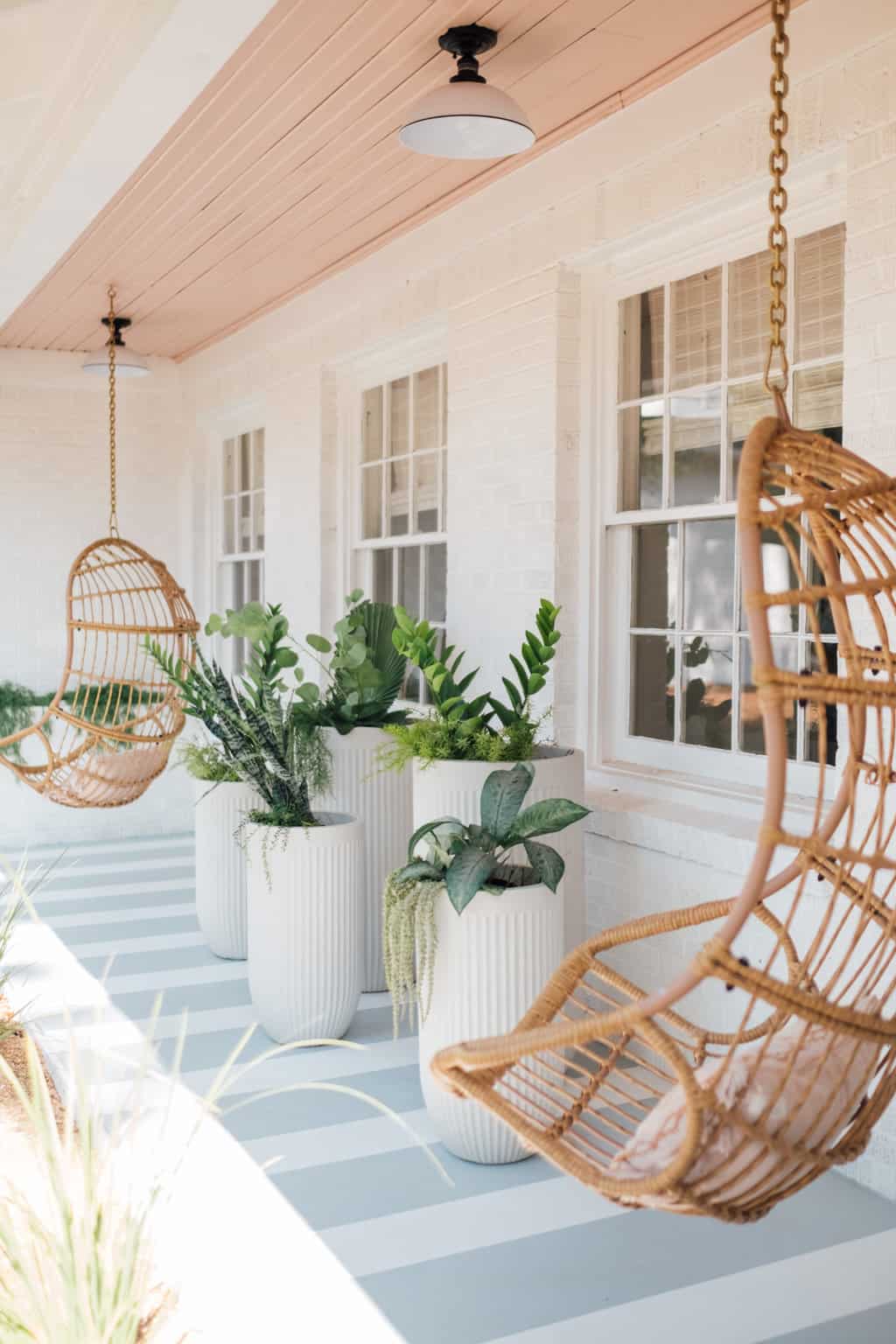
How to Paint a Porch for an Easy Home Upgrade
Looking for a quick makeover to your exterior? We’re sharing…
Continue Reading How to Paint a Porch for an Easy Home Upgrade
We’re Moving!
That’s right, we’re moving! I know, I know. A ton…
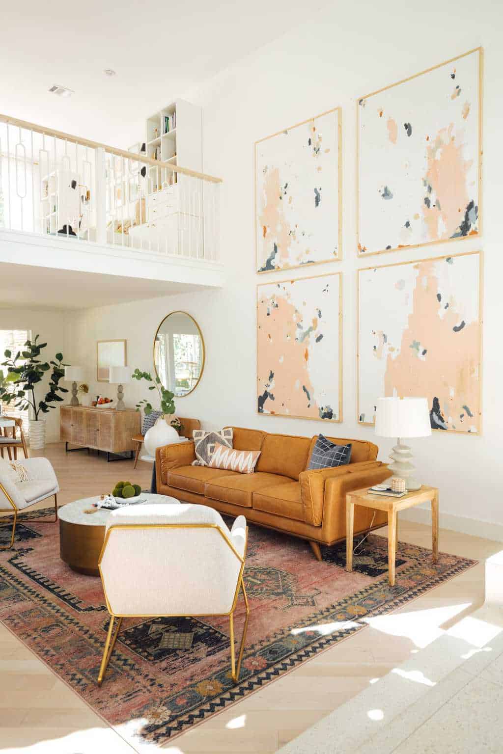
Our Revamped, Open Concept Living Room & Dining Room Design
Explore a harmonious blend of style and functionality as we…
Continue Reading Our Revamped, Open Concept Living Room & Dining Room Design
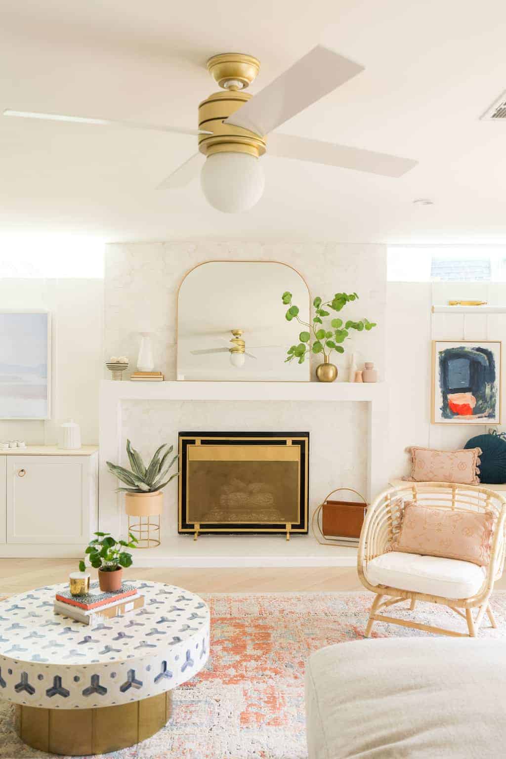
Lakeside Modern Living Room Before & After
This bright white lakeside modern living room design is the…
Please note that we may earn a commission for some of the above affiliate links. However, products featured are independently selected and personally well-loved by us!
