Lakeside Master Bathroom Design Ideas & Before Photos
After MUCH anticipation, I’m excited to finally share our master bathroom design ideas and before photos with you! Granted, we’re pretty much finished with this bathroom remodel by the time I’m sharing all of this with you but it’s a good testament to how many hurdles we’ve come across along the way.
When we bought our new house, the previous owner had the bathrooms listed as “remodeled” already. You can see in the photos below that they weren’t bad by any means, but definitely not our usual style like our previous master bathroom.
There were also TONS of hidden issues happening throughout the entire house, including the master bathroom. All of the galvanized plumbing and outdated electrical needed to be replaced, which cost a small fortune.
Thankfully our contracting team at Genesis CP hasn’t disowned us yet, ha!…

Our Bathroom Remodel | Master Bathroom Design Ideas
You can also see in this before photo that there were old, red heat lamps in the ceiling and a makeshift door from the bathroom going into a guest room upstairs. There was definitely no reason for a pocket door to go from the master bath to a guest room, if you ask me!
When the owner “updated” the bathroom, they never changed out the previous spa tub that didn’t work and half of the new floor tiles were already loose.
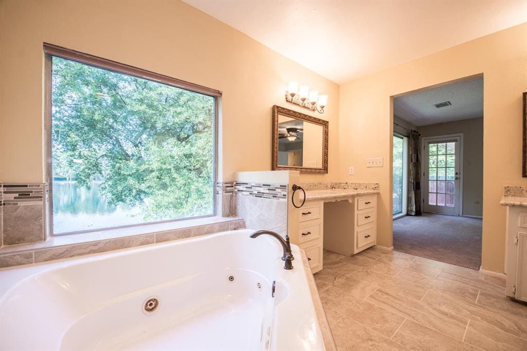
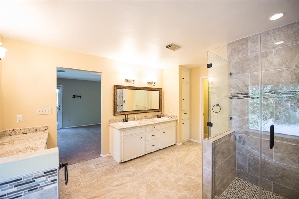
It also had the original 1970’s cabinetry and the inside of the cabinets definitely smelled that way!
At the end of the day, we decided to keep a good portion of the layout the same so that our money was spent on the interior design rather than rerouting to many key elements of plumbing or electrical.
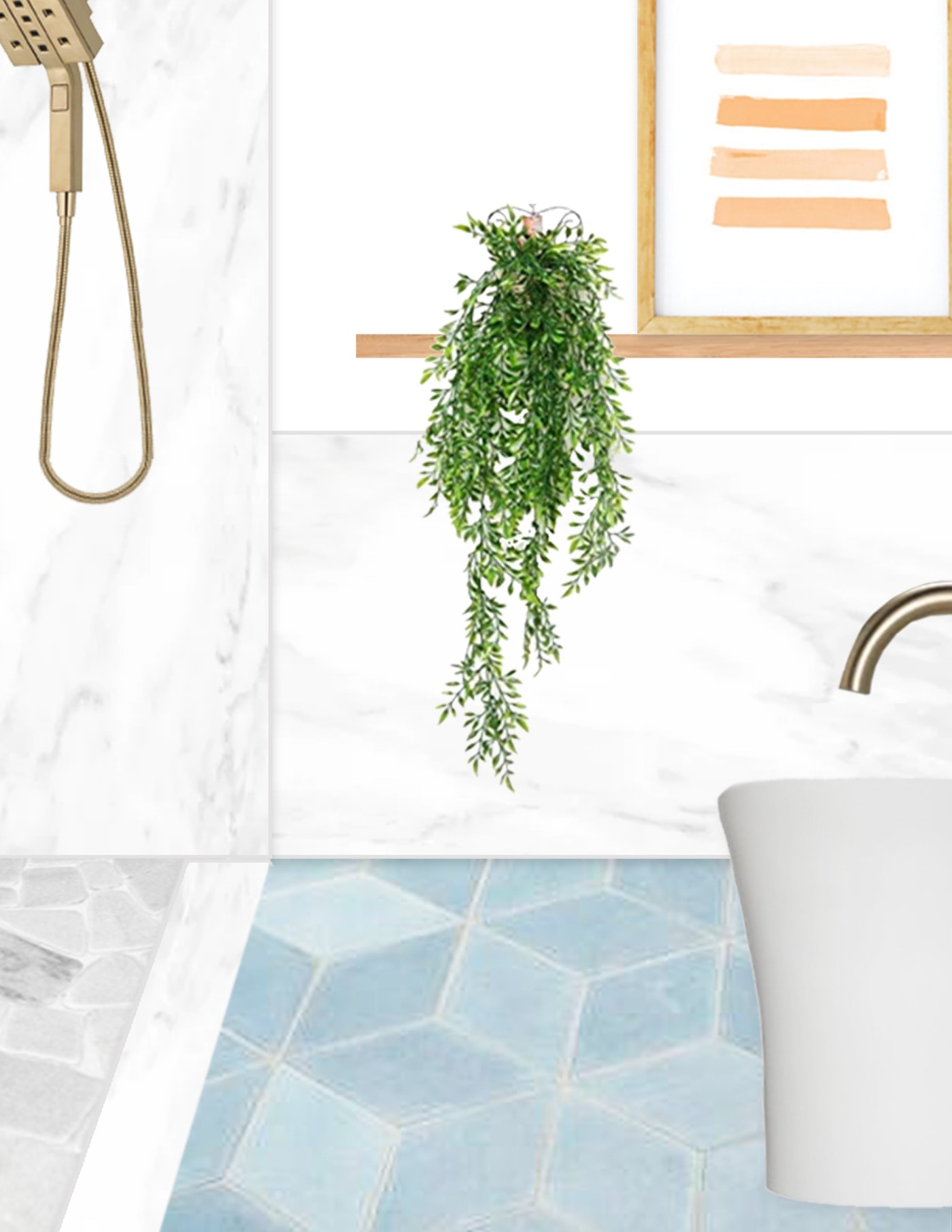
One of my top wishlist items was a statement floor, and I LOVED the Fireclay options. You can really mix and match to create a custom mosaic tile floor or accent walls. We combined their hexite tiles in three different colors — crater lake, caribbean blue, and morning thaw.
Another priority for us aside from the general design ideas was to add more natural light. You can see from the doorway above that looks into the master bedroom that it was a pretty dreary space when the lights weren’t turned on.
We opted for a set of statement skylights in the master bedroom so we kept the bathroom more minimal by adding two VELUX sun tunnel skylights instead.
The sun tunnels allow natural light during the day but mimic the look of a recessed ceiling light. They come with a light kit built in to use them as a traditional light fixture at night. PLUS, they have a built-in night light option which is perfect for late-night bathroom trips!
Aside from closing off the strange door going to the guest bedroom, the rest of the bathroom floorplan stayed pretty much the same except for the design choices.
We kept the walk-in shower in the same location but took down the strange pony wall and did floor to ceiling porcelain tile slabs for the shower walls. The shower door also got moved and we made the shower itself a bit bigger so it’s definitely not a small bathroom.
In true Ashley fashion, we stuck with the champagne bronze look throughout the bathroom with the Delta Faucet champagne bronze collection. Overall we chose — Delta Trinsic single hole faucets for the double vanity, Delta Trinsic floor mount tub filler, and the Delta two-in-one showerhead and handheld system.
There were certain things in the bathroom that I felt like I couldn’t really select just from online shopping. I mean, who can decide on a toilet or a bathtub from a digital photo and a link?!
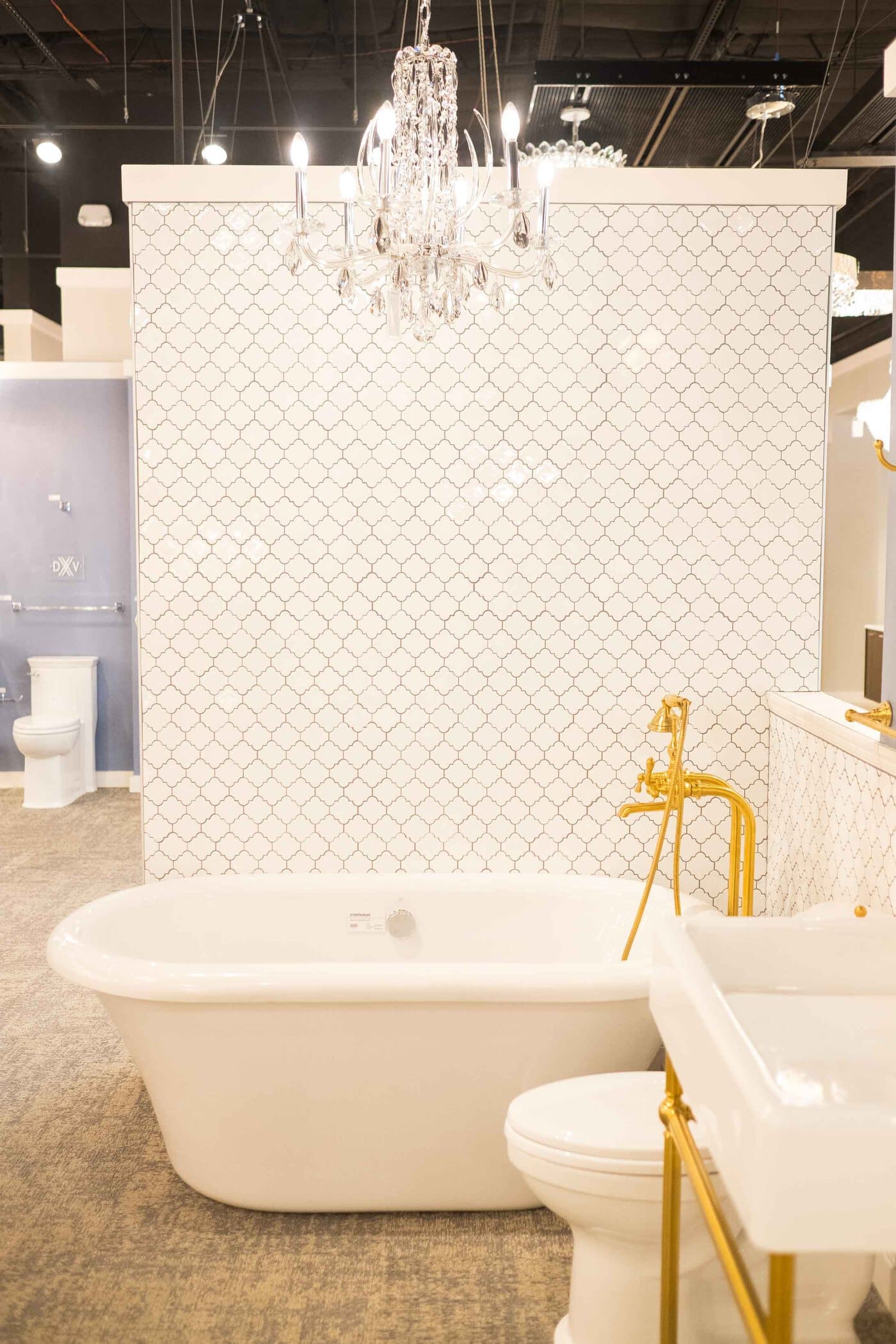
We visited the Ferguson Showrooms in Houston to be able to walk through and get a sense of style, price point, and overall size of certain items we wanted.
I’ve always loved the freestanding tubs and we decided on a modern version with this Edinburgh tub with jet system. I debated on whether to install a pendant light over the tub but decided to keep it more minimal.
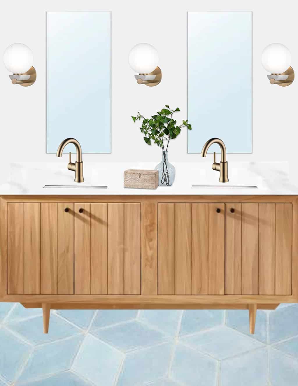
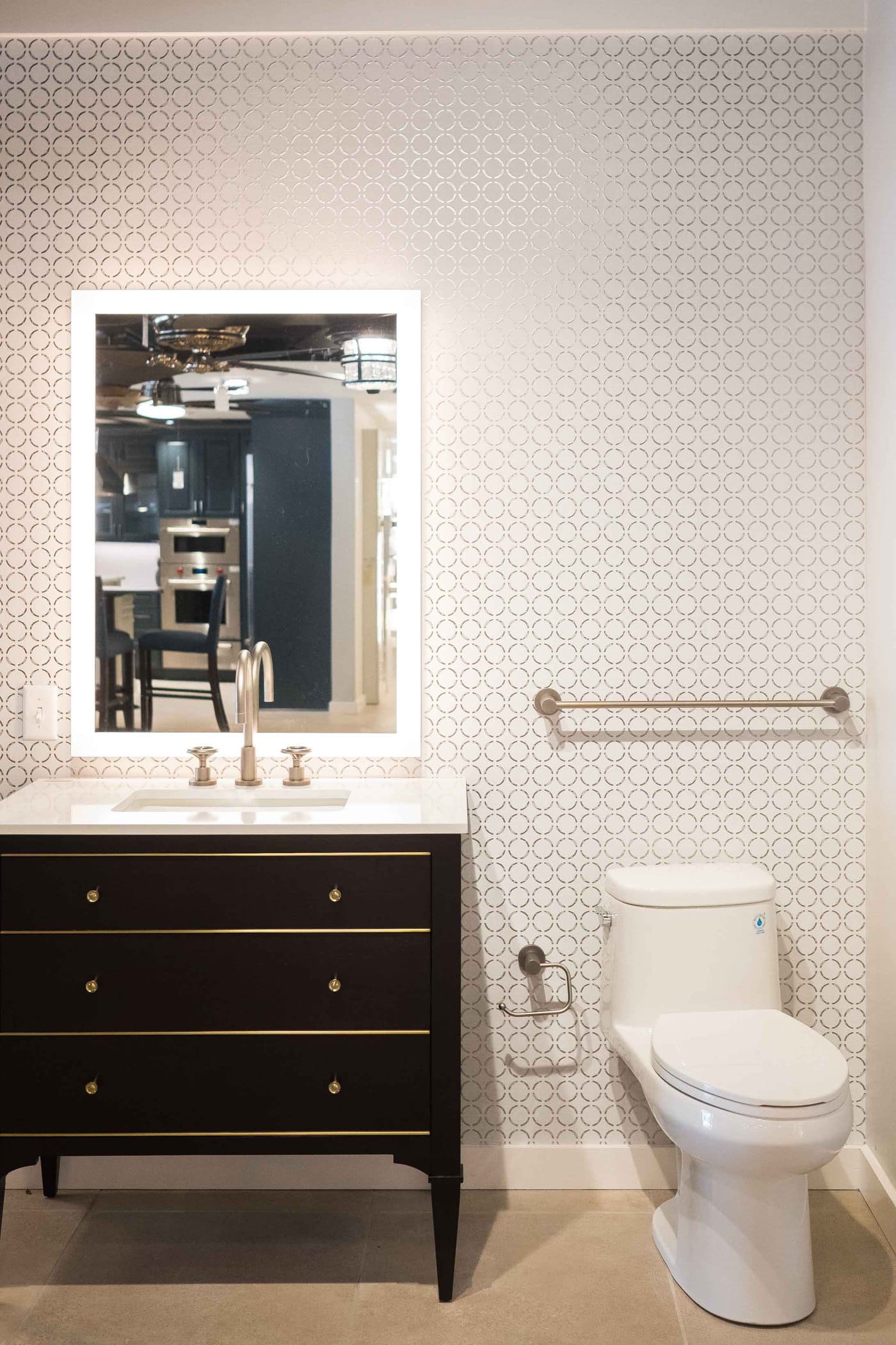
When we were at Ferguson, I fell in love with the led vanity mirror concept and decide to go with a round version for overtop of my future makeup counter.
For our actual sink vanity, we chose this teak wood double vanity with the marble countertop option. I am in LOVE with it! It doesn’t come with drawers so we opted for medicine cabinet mirrors to store our smaller, everyday items.
In between the medicine cabinets we have Hudson Valley Lighting boone wall sconces, which are the perfect tie in with our bronze water fixtures.
Since the flooring, bronze accents, and marble touches are all heavy statements, I’ve decided to keep white walls and make the space warmer with smaller accent decor.
Just so we’re not a part of the decor when we’re showering in front of the picture window, I snagged wooden top-down, bottom-up shades from Blinds.com to tie in the teak in the vanity while we add privacy.
It’s definitely a modern bathroom but still has cozy elements. I’m excited to share the final room reveal with you all shortly, so stay tuned!
You can also shop the room sources below and peek at the other room renovations we’ve shared recently!
Master Bathroom Design Ideas | Room Sources
WE USED GENESIS CP AS OUR CONSTRUCTION TEAM HERE IN HOUSTON
EDINBURGH ACRYLIC FREESTANDING TUB W/ JET SYSTEM FROM SIGNATURE HARDWARE
72″ OSA TEAK DOUBLE VANITY FOR RECTANGULAR UNDERMOUNT SINK – NATURAL TEAK WITH MARBLE TOP AND WHITE SINKS FROM SIGNATURE HARDWARE
MIRABELLE TWO PIECE TOILET W/ SLOW CLOSE LID IN WHITE FROM SIGNATURE HARDWARE
DELTA FAUCET In2ition SHOWER H20KINETIC DUAL HANDHELD SHOWERHEAD WITH HOSE IN CHAMPAGNE BRONZE
SHOWER WALL TILES ARE LARGE PORCELAIN, MARBLE LOOK SLABS FROM VIVALDI SHOWROOMS IN HOUSTON, TX
DELTA GRID SINK FAUCET STRAINER IN CHAMPAGNE BRONZE
DELTA TRINSIC SINGLE HOLE SINK FAUCETS IN CHAMPAGNE BRONZE
DELTA FAUCET TRINSIC FLOOR MOUNT TUB FILLER IN CHAMPAGNE BRONZE
FIRECLAY TILE CUSTOM PATTERN MADE FROM HEXITE CLAY TILES IN COLORS CRATER LAKE, MORNING THAW, AND CARIBBEAN BLUE
VELUX SUN TUNNEL SKYLIGHTS, WHICH YOU CAN FIND IN YOUR AREA RIGHT HERE
TOP DOWN, BOTTOM UP WOODEN SHADES FROM BLINDS.COM
MARBLE COBBLE TILE SHOWER FLOORS FROM THE TILE SHOP
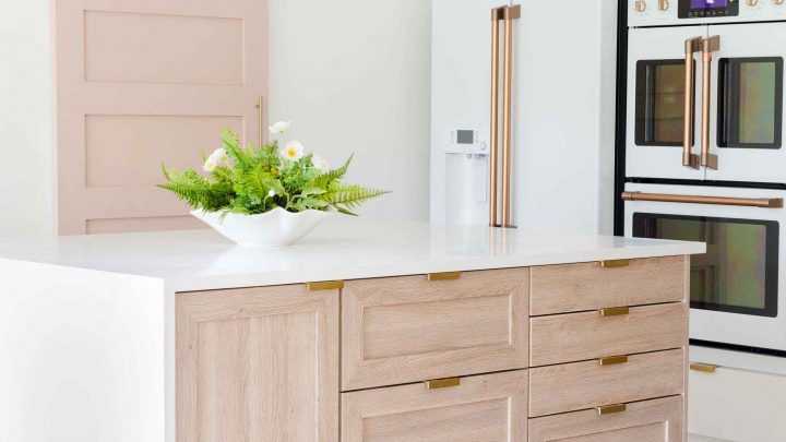
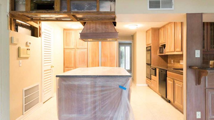
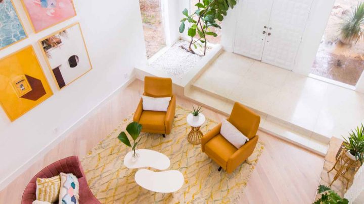
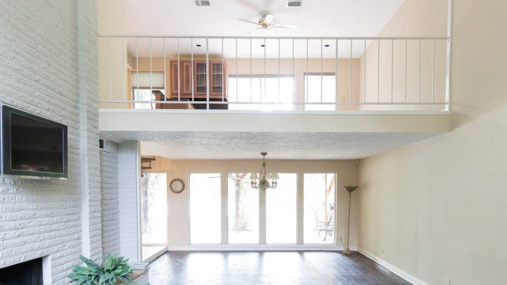
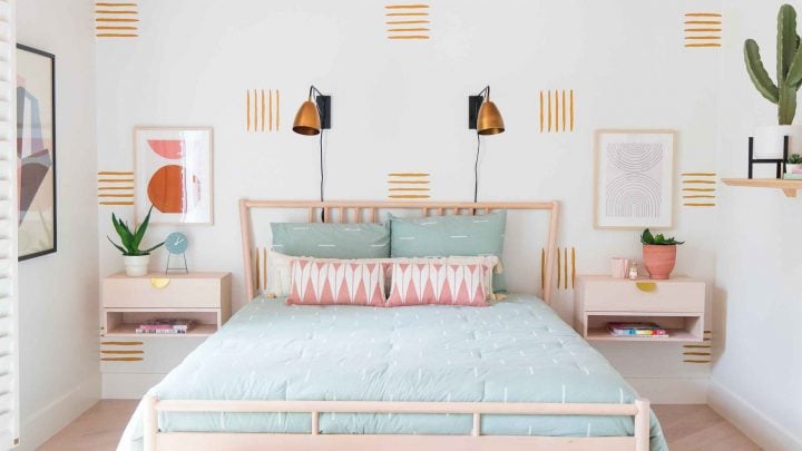
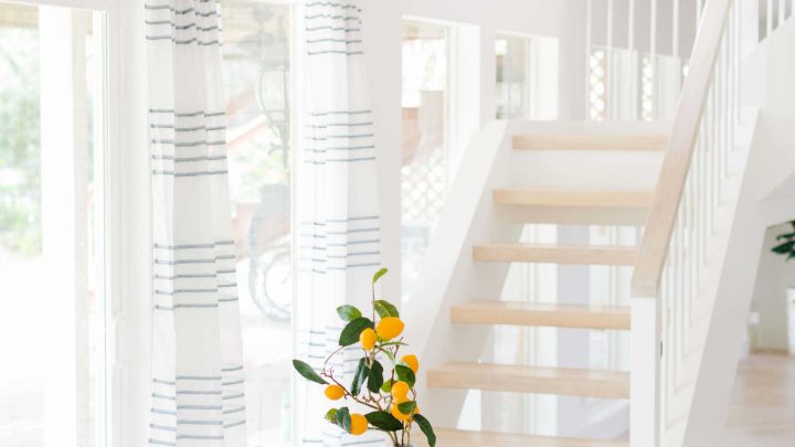
Our House Renovations
You can see more of our recent house renovations and design ideas from our 1970's remodel below...
Please note that we may earn a commission for some of the above affiliate links. However, products featured are independently selected and personally well-loved by us!
Thanks for the great tips! I love these after pictures. My sister bought a new home in the Ajax Paradise Developments community, and she says that she wants to remodel the bathroom there. I think she would love your wall pattern idea and all the color scheme that you used. Great job!
Major bathroom envy!! What a gorgeous remodel
Thank you, Julia!
Love the plan for this! That tile looks beautiful. Can’t wait to see the reveal!
We love the tiles too but still in search of a rug to match it!
We just redid our bathroom and it was the best decision ever. I can’t wait to see what yours turns out to look like.
You must’ve been so excited when it was done!
Oh my goodness! It looks BEAUTIFUL!
Thanks, Jennifer!
Can’t wait to see the reveal! I would love to use some of these ideas in our master bath
Thanks, Cheryl! Definitely feel free to use any ideas! xoxo
Maybe the guest room served as a nursery which would better explain creepy door lol. Otherwise excited to see the reveal!!
Lol. Maybe? That is a good reasoning!