Lakeside Kitchen Renovation Before & After
Check out our kitchen before and after! We’ve never been more excited about a room reveal than getting rid of our original old kitchen.
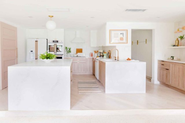
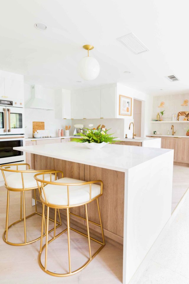
This post has been SUCH a long time coming! We shared our kitchen design plan a while back. But we literally cannot tell you how excited we are to share the kitchen before and after photos!
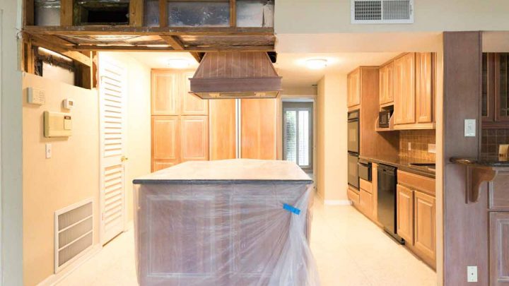
By far this was our most hated space from the original house listing photos. When we bought the house, the kitchen was really sectioned off, had an awkward layout, and generally just very dreary.
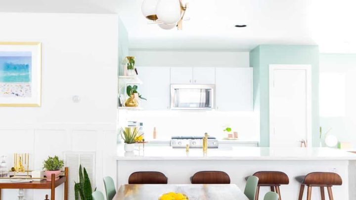
After redesigning the floorplan (see the changes we made right here!) and working with Genesis construction to gut and reframe the space, it’s now a much more inviting area.
We had about five thousand hurdles along the way, which we talk about in more detail here, However, we’re super happy with the finished product!
We’re not sharing photos of the walk-in pantry or breakfast nook off of the kitchen just yet. So stay tuned for those posts coming soon! We do, however, have an appliance closet off of the main island and it’s what KITCHEN DREAMS ARE MADE OF.
In case you’re looking for the cliff notes version of this before and after, you can scroll to the bottom of the post for the side-by-side before and after photos and the list of room sources!
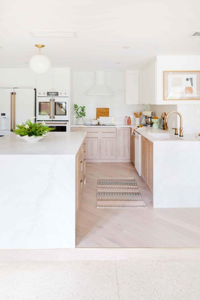
Our Kitchen Renovation Wish List
One of the non-negotiables of this renovation was getting rid of the weird ceiling drop down from before. The previous owner added ductwork to the house to flow into the family room addition just past the kitchen. And it made everything feel very confined.
In an ideal world, we would’ve done away with the ductwork drop down AND the step up into the kitchen, but it was too much for our budget. Plus, we were originally trying to keep the old terrazzo in the kitchen. Unfortunately, we weren’t able to salvage it.
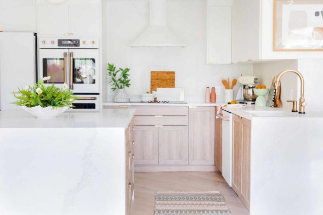
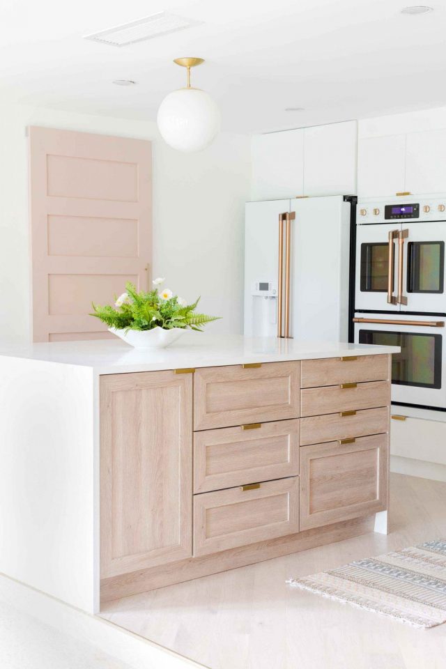
Kitchen Cabinets Ikea Hack
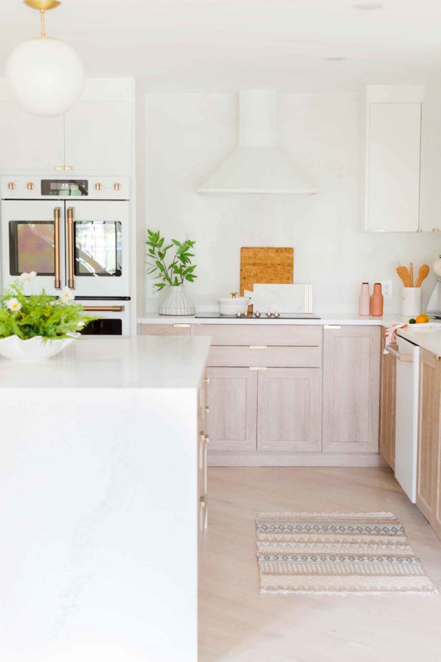
Because we couldn’t save the original floors, we opted for Stuga Studio Oak Cadence wood floors to compliment the Chris Loves Julia cove shaker cabinet fronts from Semihandmade.
The cabinet fronts are meant to be used on Ikea kitchen bases. And it gave us a custom look without needing all custom cabinetry for the kitchen and pantry!
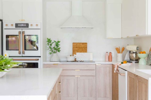
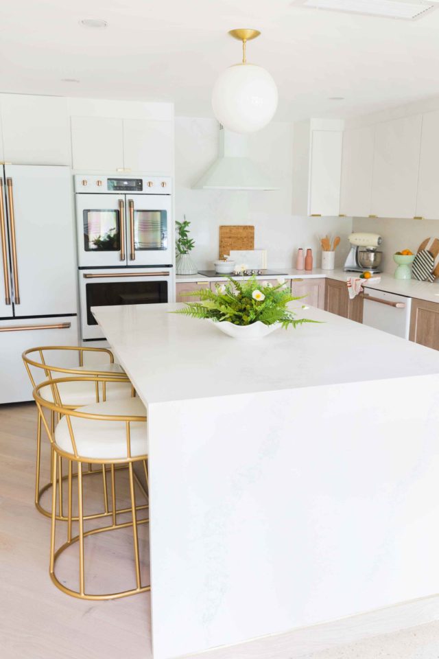
It gives the space a really serene feeling when paired with the white upper cabinets and walls. We also kept the countertops and backsplash very minimal with matching Caesarstone slabs in Calcutta Nuvo.
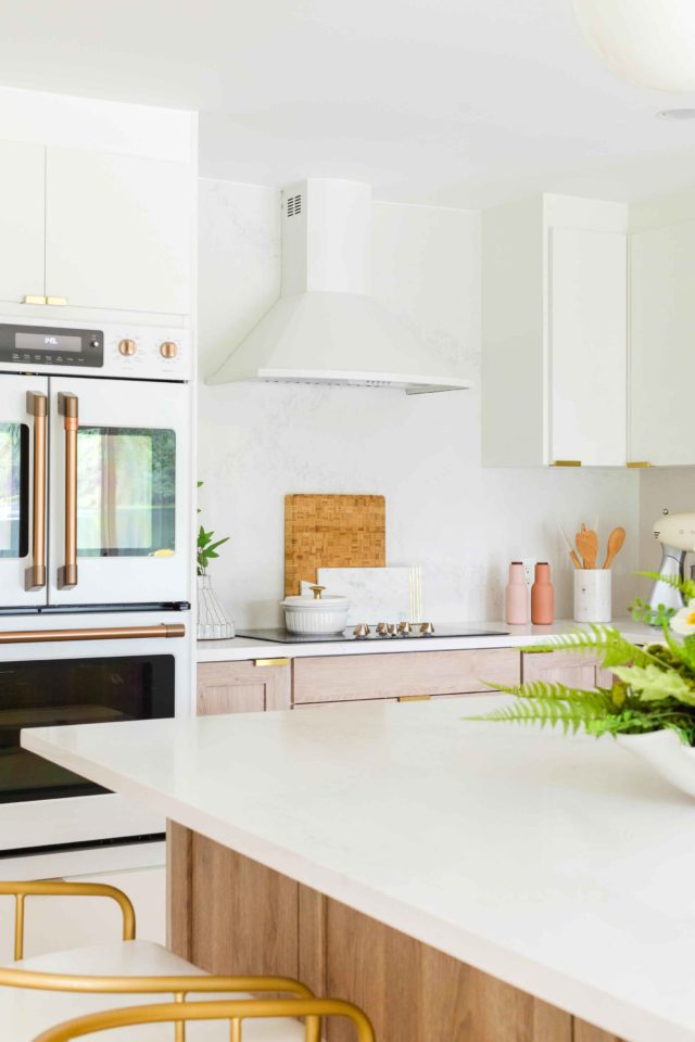
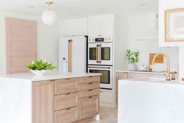
Our New Kitchen Appliances
We were dead-set on the appliances before we even began the design process!
The GE Cafe collection from Ferguson Showrooms was so so beautiful that WE HAD TO HAVE THEM!
Can you even believe that double door wall oven with bronze hardware exists in real life?!
We love that they’re a major focal point in the kitchen and so glad we were able to conceal our usual countertop appliances in the old pantry that we turned into an appliance closet.
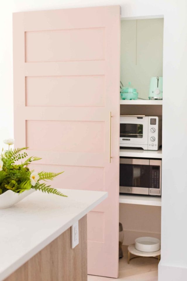
How We Concealed Our Appliance Closet
We wanted the appliance closet to be concealed rather than open. But because of the structural supports, we could only use a sliding door.
The traditional barn door hardware wasn’t the vibe we were going for in this room, and a Sugar & Cloth reader actually let me know about a concealed sliding door system.
It’s definitely pricey, but so worth it for a streamlined final look!
Our Kitchen Sink
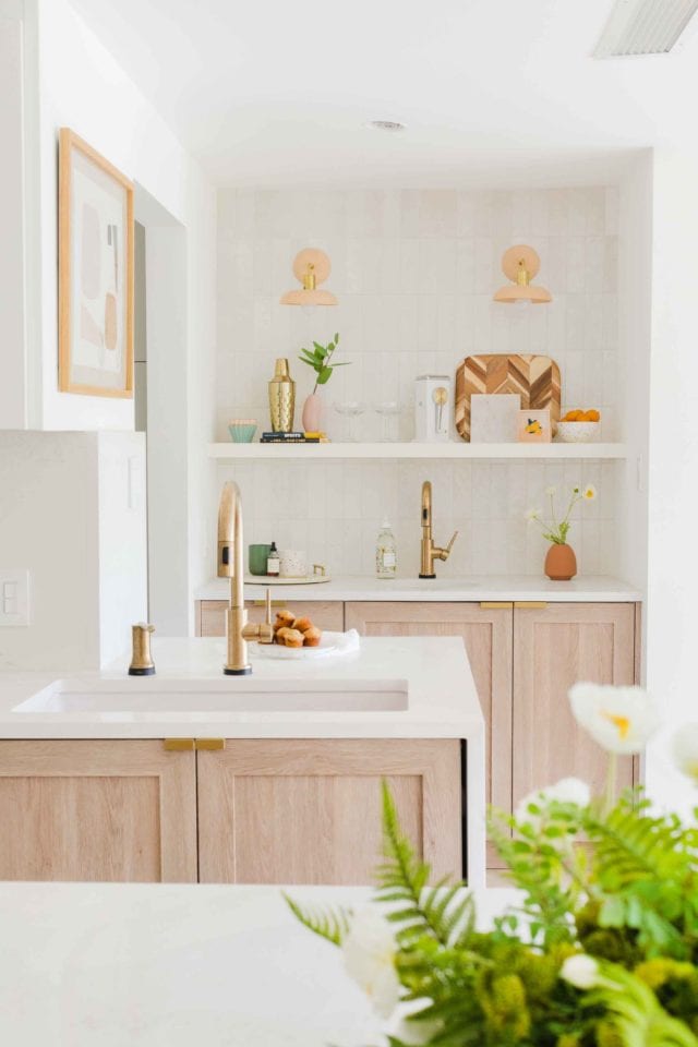
We also had some trouble trying to decide where to place the sinks since the only windows in this space are off the breakfast area.
We didn’t want to the sink to be in the island looking out because we don’t love the idea of sink clutter on the main entertaining surface.
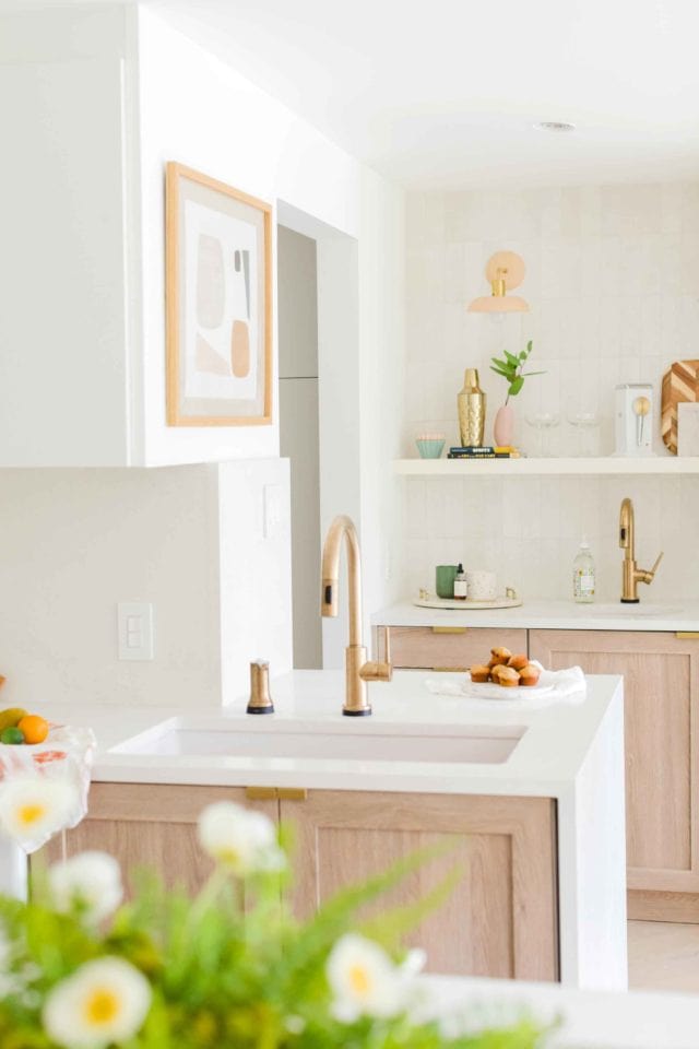
We ended up keeping the sink in the same place as the before layout but made it a bit shorter so that there was a walkway to the new walk-in pantry that leads to the garage.
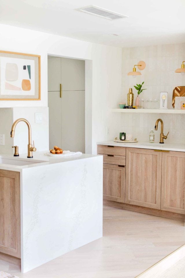
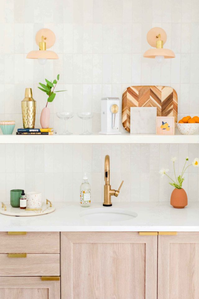
We also kept the previous wet bar sink but upgrade the look and opened the layout with the new pass through.
The sinks did get a major upgrade with new Delta Touch2o faucets and we’ve never felt more high-tech!
It’s especially convenient when you’re cooking with messy hands.
We’ve gotten so used to it that we go to friends houses and accidentally tap the faucet thinking it’s going to turn itself on magically!
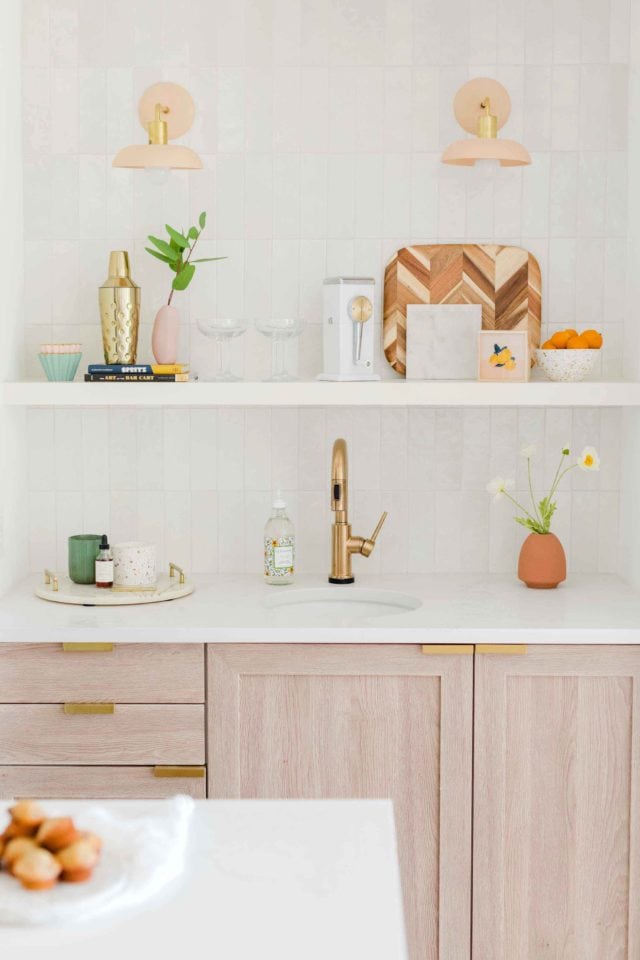
Kitchen Lighting Idea
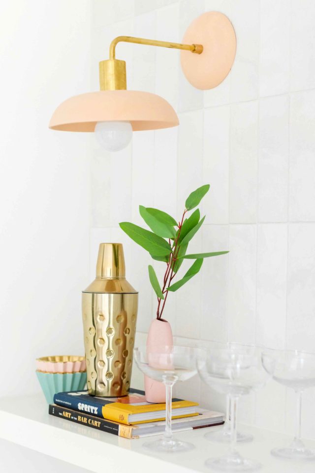
We LOVE the way the Cedar & Moss sconce lights are the perfect subtle pop of color on the distressed white tile!
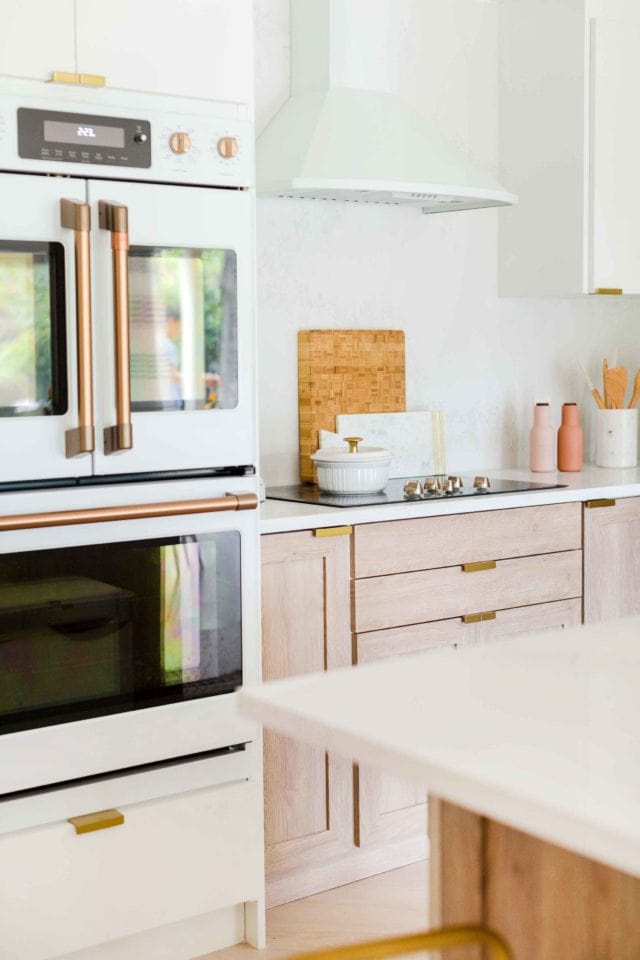
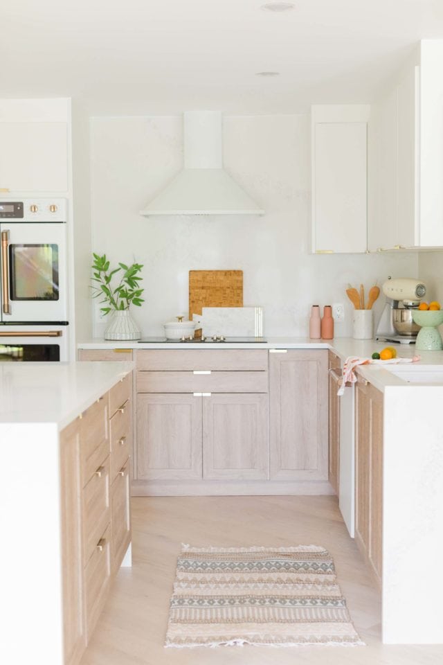
Honestly, we can’t express JUST how satisfying seeing these before and after photos is! Haha! It’s been quite a long road.
(If you follow along on Instagram, then you already know!) And it’s a sigh of relief to see how far we’ve come!
Also, let this be a testament that you can make a wonky layout work for you even if it doesn’t mean the traditional standards!
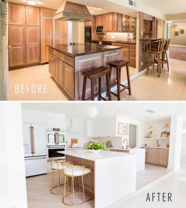
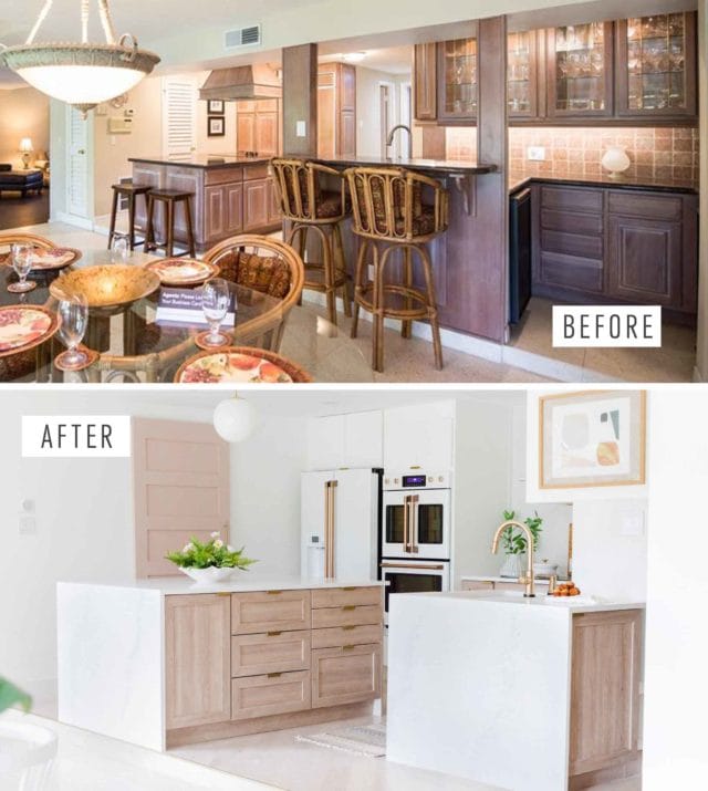
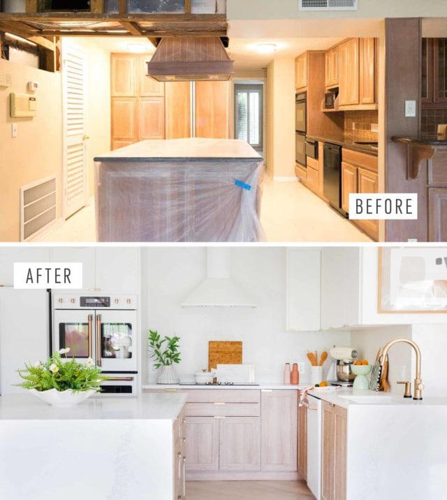
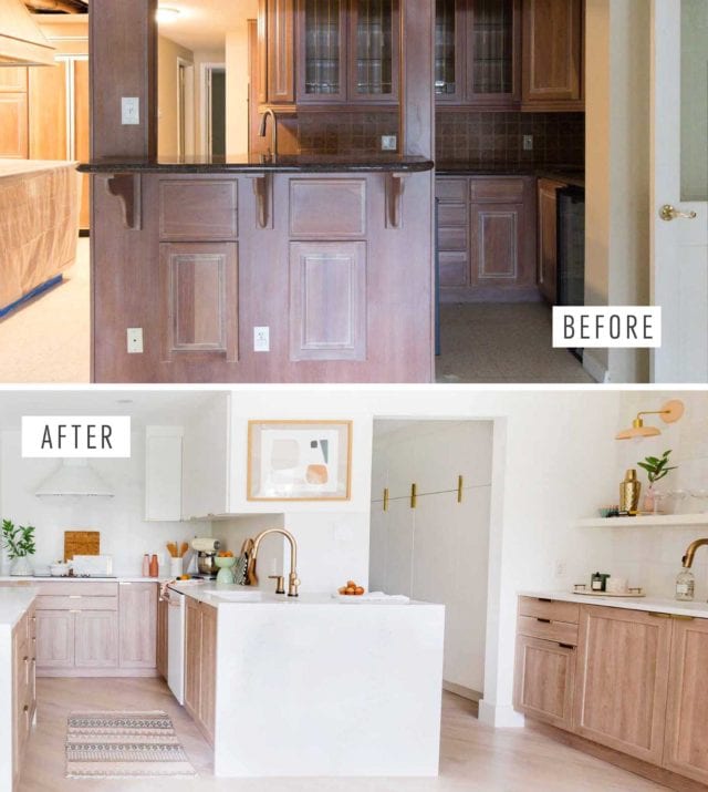
Kitchen Renovation Makeover Sources
- Caesarstone Calcutta Nuvo countertops and matching backsplash
- Undermount sink in white from Signature Hardware
- Undermount bar sink in white from Signature Hardware
- Cedar and Moss wall sconces for over the wet bar
- GE Cafe Refrigerator from Ferguson
- GE Cafe double wall oven from Ferguson
- GE Cafe electric cooktop from Ferguson
- GE Cafe dishwasher from Ferguson
- Chris Loves Julia for Semihandmade shaker cabinet fronts for lower cabinets
- Supermatte white slab cabinet fronts by Semihandmade for upper cabinets
- Delta Touch2o Trinsic Sink Faucet
- Delta Touch2o soap dispenser
- Stuga Studio flooring in Oak Alpine
- AKDY White range hood
- Sumner Street Finger Pulls
- Panel ready warming drawer from Ferguson
- GE Cafe microwave for the appliance closet
- Abstract art
- Lemon print
- Subtle pink sliding appliance closet door, painted in Sashay Sand
- Concealed sliding door hardware
- White distressed subway tile
- Rug in front of sink from At Home Stores
- Planter on our island is an upcoming DIY
Please note that we may earn a commission for some of the above affiliate links. However, products featured are independently selected and personally well-loved by us!
What an amazing design! I’m in the process of a kitchen reno and love the cafe appliances you chose with the same two tone kitchen cabinets from semihandmade! I’m wondering what range hood you used – I can’t find a pyramid style one in white which is what I really want! Thanks so much!
Hi Anita! Thank you so much. We linked our range hood in the blog post but you can find it right here also –> https://shopstyle.it/l/b3XvQ. It’s from AKDY and we got it from Wayfair.
Love love love this kitchen! From the floors to your ceilings, your choices are perfection. I think the sink placement worked perfectly too – it all looks great. Would love to hear how the timber floors are holding up in the kitchen.
Hi- I have the same oven and fridge, but not installed yet. In your picture they seem awfully close, does both the fridge and French door open all the way? How much spacing do you have?
Hi! Hoping you could provide the source of the pendant light over your island. Absolutely love!
Thanks, Rachel! They’re from Cedar & Moss.
Hi, beautiful kitchen! We are planning to use the same white cloe tiles in our kitchen. Your tile backsplash looks more muted than the tiled we received – curious if that is just the lighting/photography or if you removed the darker grey tiles before grouting.
Hi Leah! For the tile, we actually only used the grey-er colors so we did not remove anything. They aren’t too muted in our kitchen but we also have such an wide open space with lots of natural lighting. Good luck with your kitchen renovation! XOXO
Love your kitchen so much! We are looking to buy most of this for our kitchen remodel!!! Have so many questions. What is casing in the double oven? Is it caesarstone on the side wall or a cabinet? is the caesarstone backslash the same price per foot as the countertop? How do you like your appliances? Any issues with how they function?
Your kitchen is beautiful! How do you like having horizontal pulls on the cabinet doors? Any issues with ergonomics for opening/closing? The look is streamlined and would love to do this for my new kitchen, but concerned about pinching fingers. Thanks.
Hi Melanie! We totally get your concerned because we thought that would be the case initially too. But then we saw and used them at our friends’ and we also did a lot of testing at the showroom before the purchase. We have no issues with pinching fingers. It’s harder for kids to get into the drawers. Your clothes also don’t get caught in the handles which is the case for those long handle pulls. Definitely no issues with opening and closing. (We recommend soft closing cabinets though). And totally agree, they really do streamline the kitchen. Hope this helps! XOXO
Great renovation! I do love the color scheme you chose. White and beige is my favorite combination. If you are renovating your kitchen, you may learn more about different countertop colors and styles here.
You did a wonderful job! It’s bright, airy, and has just that small touch of whimsy, I would be all over those GE Cafe appliances too and my kitchen would have to work around it lol.
I’ve been looking for similar bar chairs – could you share more details on that?
Thank you! You can find more info on our bar stools in this post:
https://sugarandcloth.com/budget-home-decor-36-bar-stools-under-300/
. The stools are #12. Hope this helps!
where did you get your white grinder?
Hi Sina! It’s a vintage grinder so unfortunately, we don’t know where else it can be found.
Wow! It’s so gorgeous!
Thank you, Krissy!
Amazing! This will be super helpful when I decide to do my kitchen.
Yay! Glad to hear and good luck when you do redo your kitchen!
Amazing! Love the before and after!
Thanks, Melissa! XOXO
Such a gorgeous renovation!i love the kitchen!
Thanks, Ashley! We are so excited that it’s done!
I am drooling. This. Is. Gorgeous!!!! Can I hire you for my build in Oregon in a couple years?! You did an incredible job on this design!!! I am just staring over and over in awe.
Thanks, Anastasia! Lol. Message us back in a couple of years. Our house is taking forever and we don’t know if we ever want to deal with another renovation (yet). XOXO
Wow! What a glorious transformation! BRAVA!!!
Thank you, Bradford! XOXO
OH. MY. GOSH. Your kitchen renovation came out AMAZING. And the appliances??? They’re everything I need and more!
Rachel
http://www.hello-her.com
We especially love the new appliances! We are actually going to do a feature on them too. XOXO
Not enough heart eye emojis to convey my love. I’m super jealous of your double convection oven.
Lol. Thanks, Jillian! It’s been put to a lot of use already!