Lakeside Modern Living Room Before & After
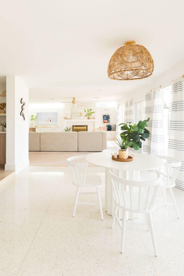
This bright white lakeside modern living room design is the perfect mix of modern, classic and cozy…
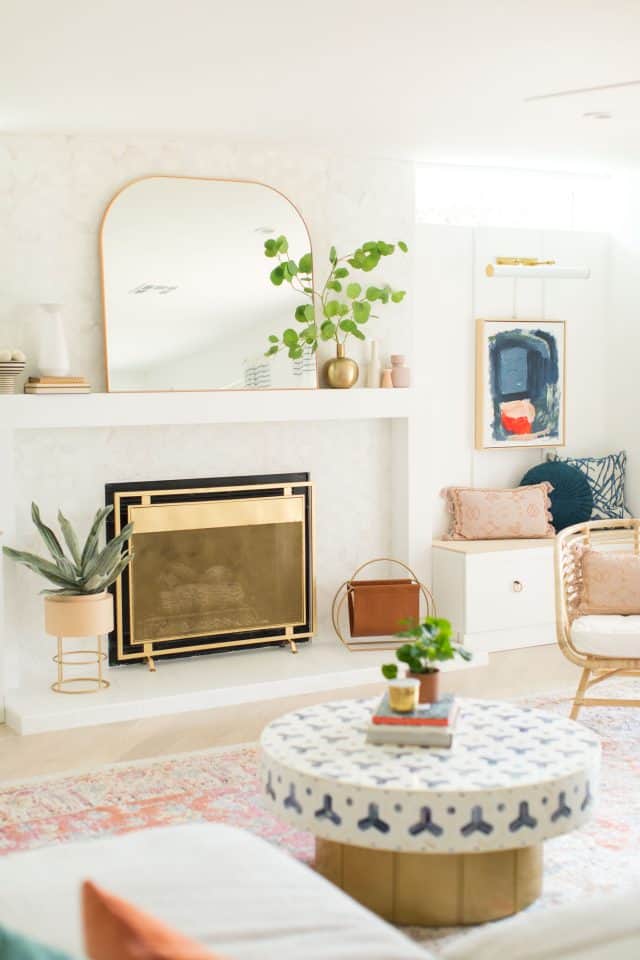
If you were following along during the renovations on our townhouse, you might recognize our old living room rug and general color scheme.
I LOVED our previous living room so much. And we only enjoyed the completed version for about a year before we ending up moving closer to family. So I recreated a similar feel in our new modern living room by the lake. And I’m loving it even more!
Genesis CP knocked it out of the park with this room renovation. It’s now the perfect lounging space and where we spend 90% of our time at home.
I mean, can you blame us with this crazy good High Fashion Home sectional?! We used all our tried and true design tips for our sectional living room ideas.
The Before
The before photos of this space are… drastically different to say the least! This room was actually an addition to the original layout of the house. And it definitely felt that way.
It didn’t have any actual air from the HVAC going to it. Unfortunately, the tile and lack of natural light made it feel even more stark.
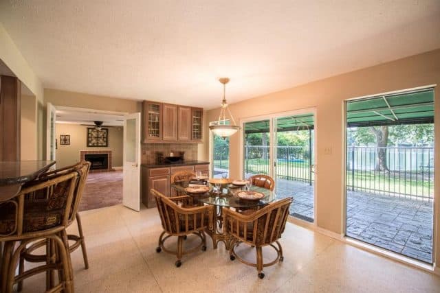
I also wanted to take down the wall that divided the breakfast area from the new living room so that it felt more open. Plus, being able to check on the kids easily was a must.
The first thing Genesis did was remove the wall and put in a support beam since it was load-bearing. They also busted up the old tile and installed additional heat and air ducts.
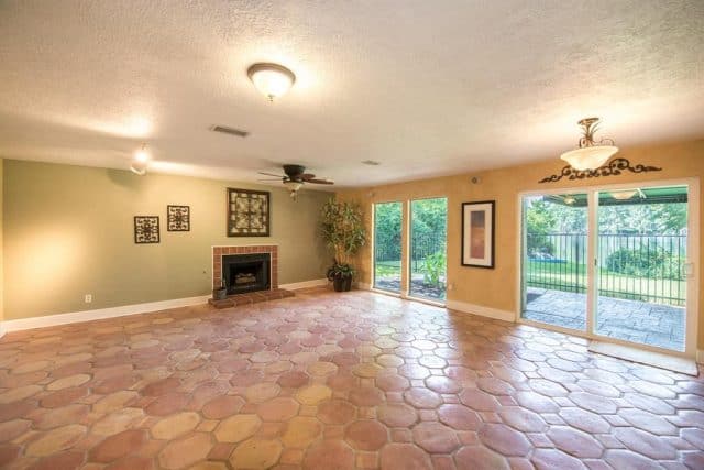
One of my other pet peeves about this room was how the fireplace felt like an afterthought.
There were also five million different types of lighting and sound systems scattered through the room, so all of that got removed and replaced with clean recessed lighting and a single Hunter Fan Hepburn light.
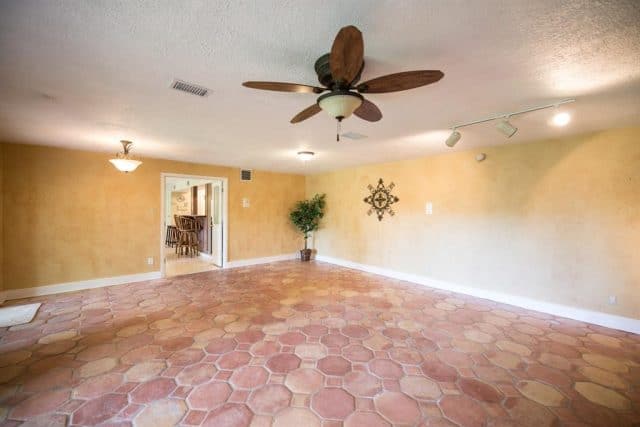
In place of the tile, we installed new Stuga Studio Elderflower flooring that matched the rest of the first floor with the exception of the original terrazzo that we left.
Having the consistent flooring and wall removed did wonders for making the room not feel like an addition but it was still pretty dreary.
The After | Our Living Room Makeover
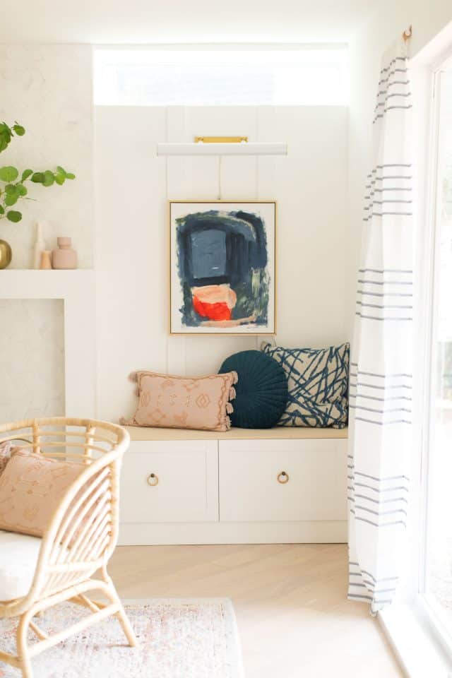
Thank goodness for patient contractors because this was the point where I decided to add the two clerestory windows on either side of the fireplace.
As annoying as the set back was on adding these as a last-minute part of the renovation, it was SO worth it. They honestly made the room in my opinion!
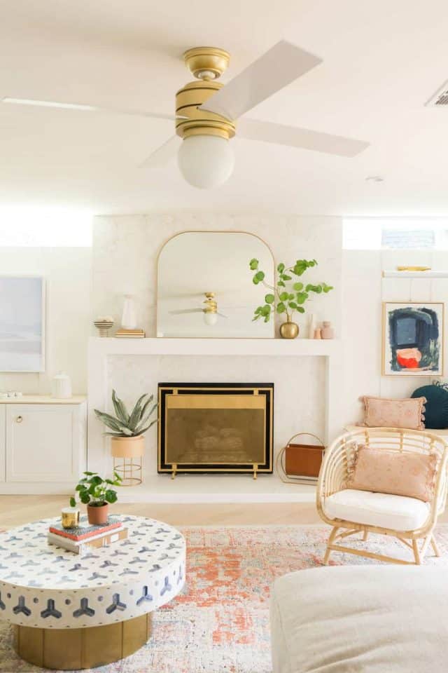
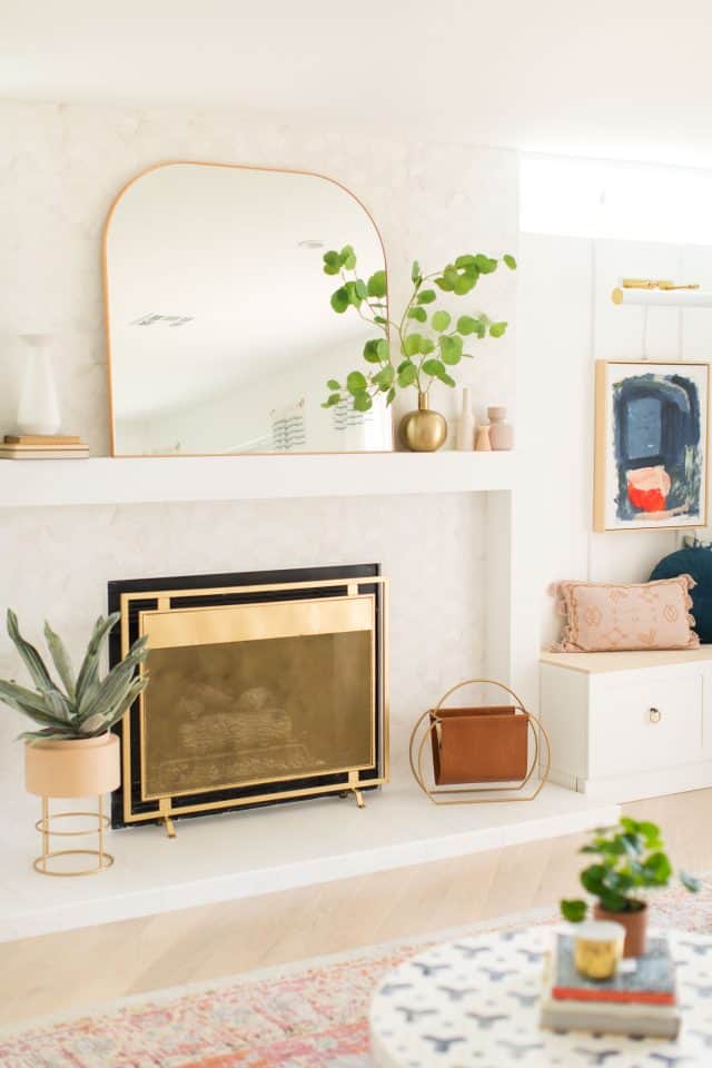
The next main focus was to ground the fireplace. To do that, we designed a streamlined mantle built from the ground up that was the full width in between the new windows.
They also built up the hearth so that it wasn’t flush to the wood flooring, which helped differentiate the fireplace as well. Check out more fireplace makeover ideas here.
We paired that with a statement tile, Bianco Puro combed hexagons from The Tile Shop, that was just neutral enough while making a big visual impact.
Now that the room felt brighter and more intentional, I wanted to add an element that made it feel cozy.
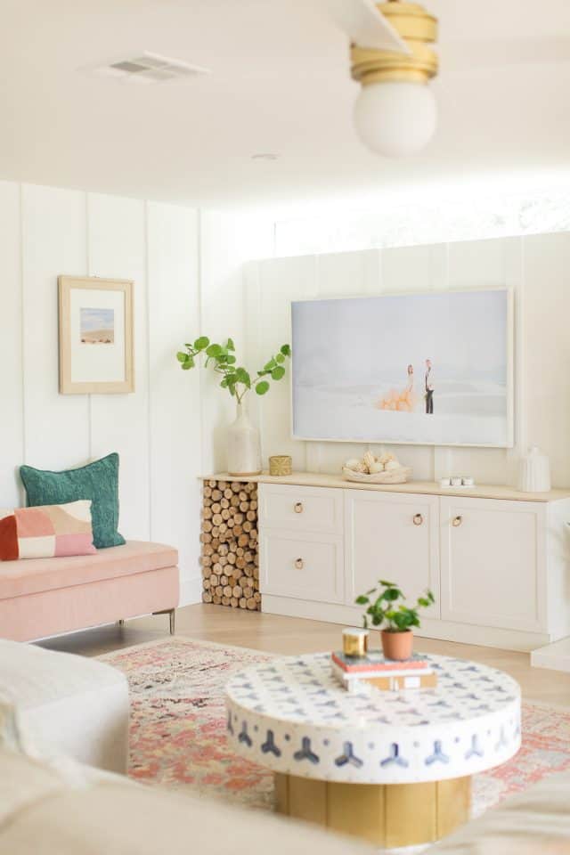
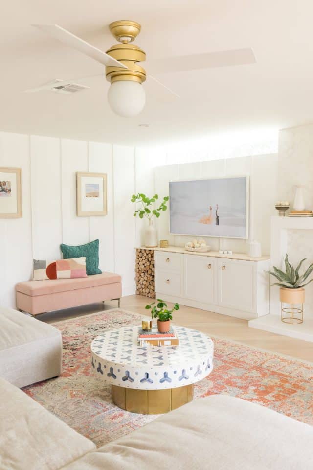
To do that, we added floor to ceiling molding on the two main walls in the room and painted them the same wall white. It’s a simple concept but really made a big difference!
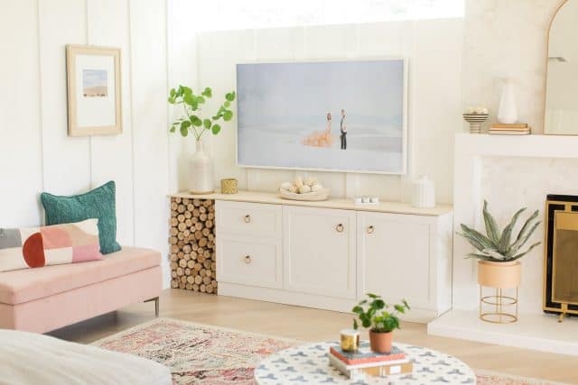
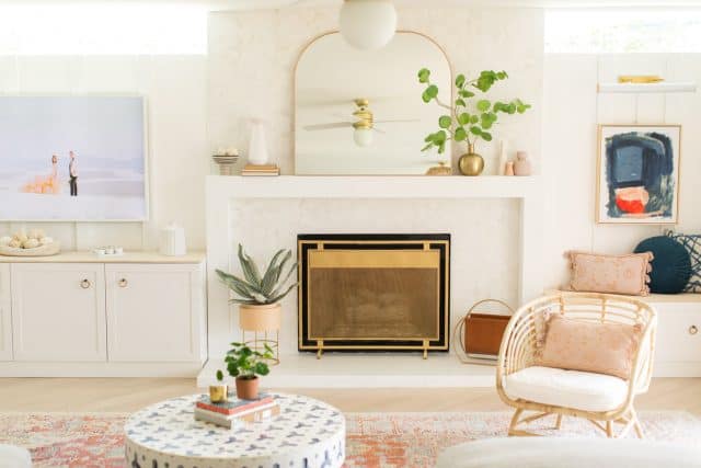
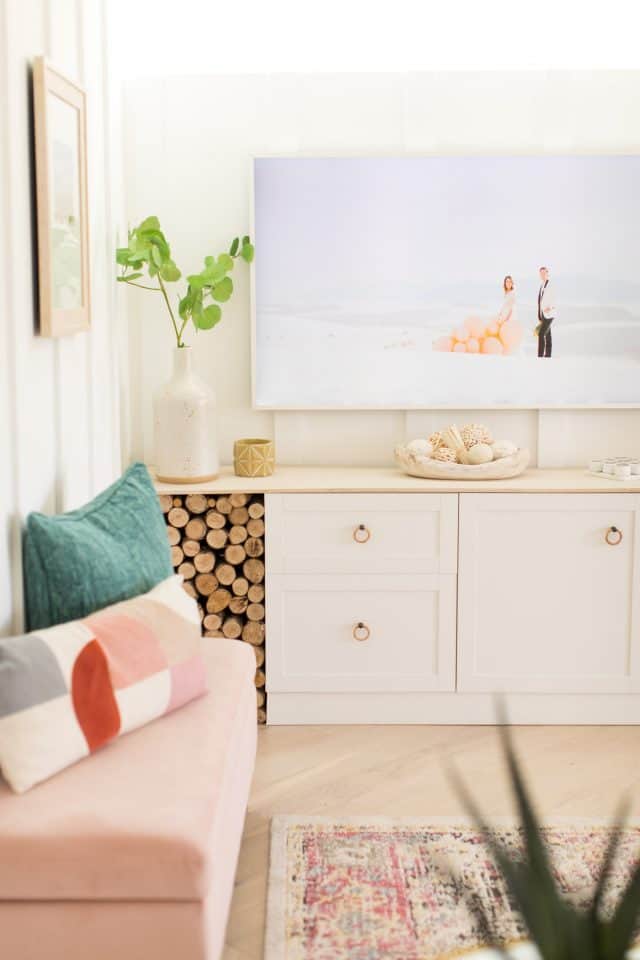
Rather than paying for actual built-in cabinets on each side of the fireplace, we used IKEA besta cabinets with a white toe kick and a stained wood to match the floor for the top.
Since we couldn’t customize the measurements of the cabinets, we filled the space leftover next to the TV cabinet with birch wood logs for visual warmth. We mounted the Samsung Frame TV on one side and a simple piece of artwork and Mitzi wall art sconce on the other.
Having cabinets on both sides was a major bonus to hide all of the girls toys! Let’s just say this room gets verrry messy from them playing on the weekends.

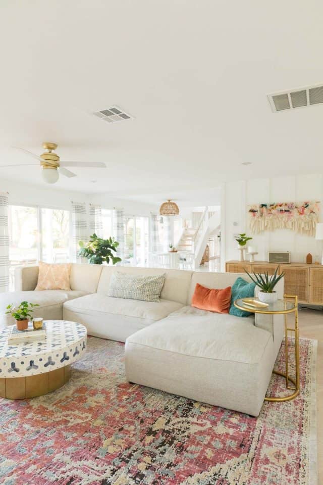
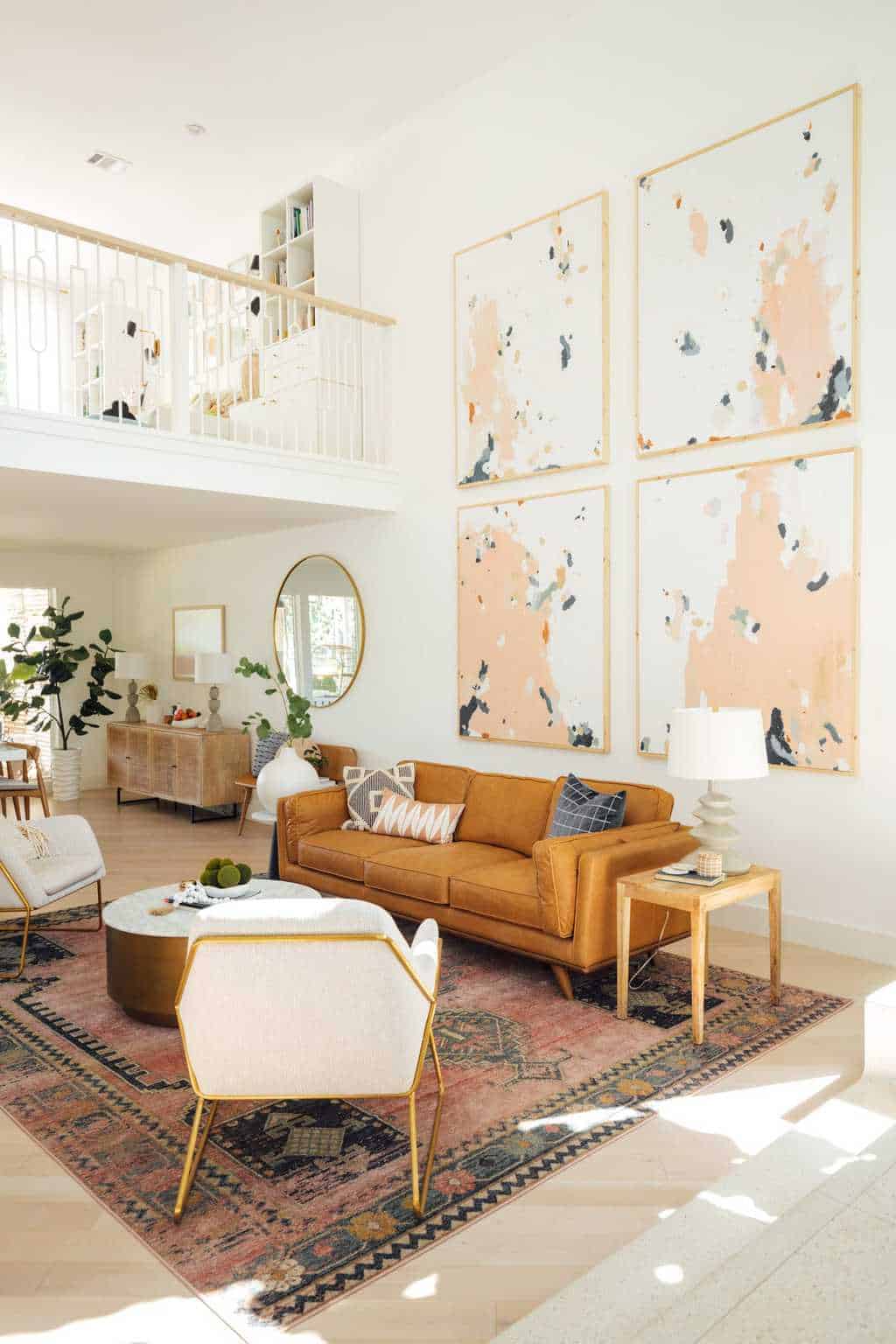
Now we were able to get to the fun part of decoratiing with new furniture pieces! We reused our Loloi rug from our previous living room and combined it with the neutral but modern Haven sectional from High Fashion Home.
It was SO, so convenient being able to touch and feel sofas in their Houston store before picking one. Plus, they have four floors of all of the beautiful home decor things you can imagine, so it was great styling inspiration!
If you’re in Houston and you’ve never stopped by their showroom, then you need to hop to it. And in case you’re not local, don’t worry, you can still shop them online
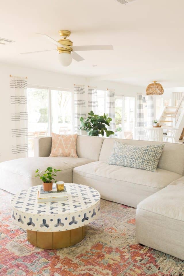
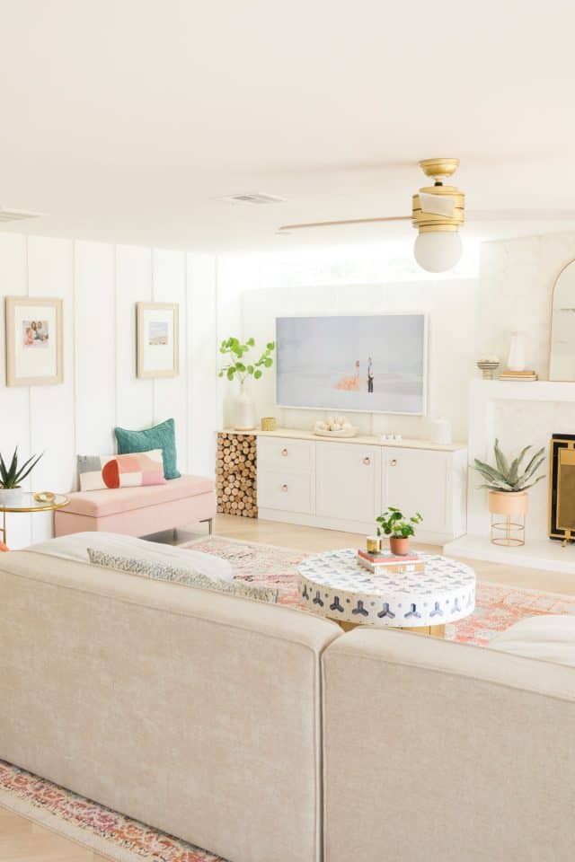
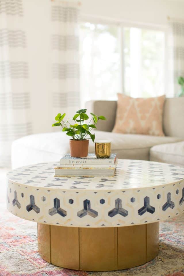
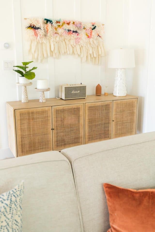
We ended up selecting our sectional, inlay Faye coffee table, and carmel cane sideboard from there as well.
I didn’t leave the store without a few extra accessories, like our sofa pillows, because I’m shameless like that. But also supporting our local Houston shops so it’s especially justified. Ha!
Modern Living Room Furniture Sources
- Construction by Genesis CP in Houston
- Elderflower flooring from Stuga Studio
- Haven Sectional in Champagne Twill from High Fashion Home
- Faye Round Coffee Table from High Fashion Home
- Samsung Frame TV (updated version here)
- Sofa Pillows from High Fashion
- Bianco Puro Fireplace Wall Tile from The Tile Shop
- Holly Sconce in White and Brass by Mitzi
- Naomi Table Lamp by Mitzi
- Fireplace gate screen from At Home by by Arcilla Elemental as an empty fireplace idea for styling
- Ikea Besta cabinets
- Javari Berry Sunrise Rug from Loloi
- Framed navy artwork from Kate Spade
- Hepburn ceiling fan: This is the same fan we used in our office bedroom makeover and green bedroom design.
More Sugar & Cloth Makeovers
What do you think?! I’d say we accomplished the modern living room pretty well without being too stark, don’t you think?! You can see more of our house renovation posts here and a full list of room sources below! —
- Our guest bathroom remodel
- Master bathroom reveal
- Modern kitchen before and after
- Mid-century living room and dining room before and after
How to Paint a Porch for an Easy Home Upgrade
Looking for a quick makeover to your exterior? We’re sharing…
Continue Reading How to Paint a Porch for an Easy Home Upgrade
We’re Moving!
That’s right, we’re moving! I know, I know. A ton…
Our Revamped, Open Concept Living Room & Dining Room Design
Explore a harmonious blend of style and functionality as we…
Continue Reading Our Revamped, Open Concept Living Room & Dining Room Design
Lakeside Master Bedroom Design Before & After
Lakeside Master Bedroom Design — We’re finally revealing the before…
Continue Reading Lakeside Master Bedroom Design Before & After
Please note that we may earn a commission for some of the above affiliate links. However, products featured are independently selected and personally well-loved by us!
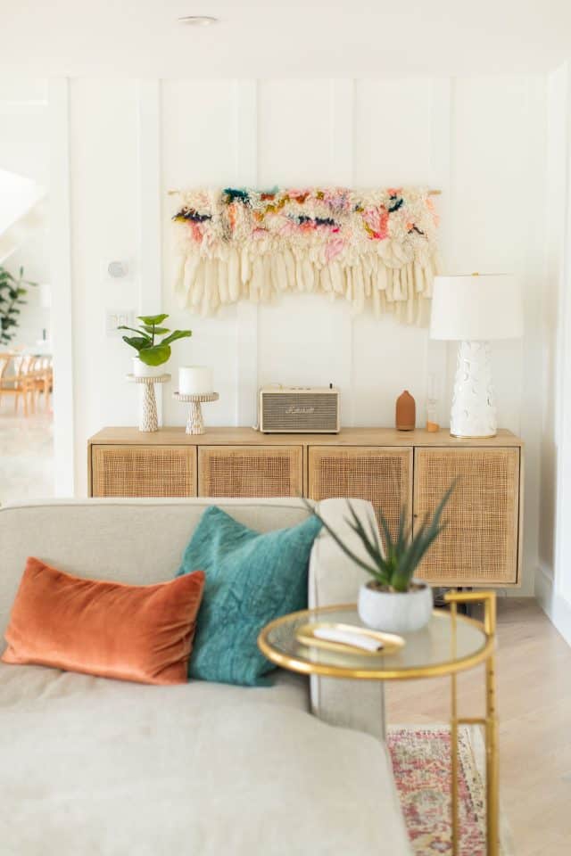
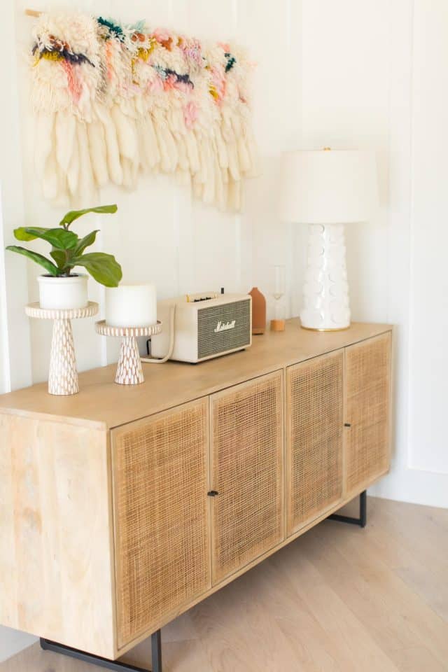
Could you tell me where you got the woven wall art over the console table? Your design is beautiful!
This is absolutely gorgeous! Can you share where the blue/white stripe window panels and the navy/coral framed painting to the right of the fireplace came from? Thank you!
Hi Megan! The navy/coral framed painting is old piece from Kate Spade. It’s currently sold out so we didn’t link it. The curtain panels are new but we purchased them in the store from At Home. Unfortunately, they are not available online. XOXO
You do have a beautiful house, decorated with very good taste. And this view! :)
Thank you so much, Elodie! It’s our dream home.
I am in love! You brought in just enough color. It’s so gorgeous.
Thank you, Ashley! XOXO
I really like the concept of BEFORE & AFTER OUR LAKESIDE MODERN LIVING ROOM
Hi! Where did you get the big wall art on the second picture? I could not find it on your list. I love everything about this room. Thank you Monica.
Hi Monica! That’s actually a photo from our wedding on Samsung Frame TV. So it’s really our TV! We wrote a post about the TV here: https://sugarandcloth.com/how-we-decorated-our-home-for-christmas/.
You have totally changed the look of your living room and now the look became more simple and good looking.
These pics are looking amazing and the colour combination is very good.
McAfee support
Enjoy reading the above article, really explain everything in detail, the article is very interesting and helpful. I am very grateful and hope that you will continue to write more articles like this. https://basketballstars.online
Lovely! Where are the curtains from?
Such a stunner Ash! I absolutely love it and this transformation is INCREDIBLE!!!!
Thanks, Brittni! Come check it out in person anytime! ;)
Such a difference! It’s so bright and cheery now, and I love the color scheme. It’s definitely not too stark. I love that inlay coffee table! I’m going to have to send my mom to high fashion home’s show room! And maybe check it out myself the next time I’m in town. Thanks for sharing!
Thank you, Meredith! Glad to hear you love it. The High Fashion show room is huge so there’s so much to find there. XOXO
That coffee table is giving me life! I’m absolutely obsessed!
Paige
http://thehappyflammily.com
Thanks, Paige! We definitely wanted a fun coffee table!
This turned out so beautiful! Literally a dream room!
Thanks, Rachael! We feel so lucky cause it really is our dream room.
Love how light and airy the room seems now. Beautiful!
Thank you, Kellie! That’s exactly the vibe we are going for! XOXO
Beautiful work, thanks for post!
Como Fazer o Cachorro Parar de Latir de Madrugada
What an incredible makeover! So light and airy and I love the modern feel of the room mixed with that gorgeous old style carpet!